Nick Sullivan (Layering/Contrast)
|
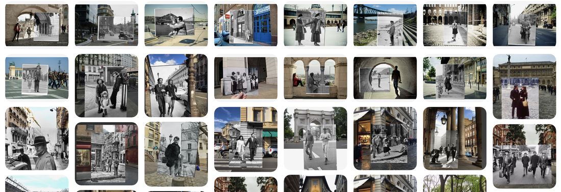
Nick Sullivan is an artist who loves to revive the past through photographs. He travels to beautiful cities like New York, Paris and London, and there he merges some iconic images from the past with the present by capturing the same location thus making breathtaking overlap photography. Not only that Nick visits some of the most famous sites in mentioned cities, but the people on his photographs are also quite famous. Legends such as Bob Dylan, The Beatles, Cary Grant, Picasso and many more icons from modern history have found their place in Nick’s time-merging photographs. Of course this is not a new thing in modern photography but the incredible thing about these images are unbelievably accurate details. The artist doesn’t just possess amazing accuracy, he breathes life into these photographs by choosing perfect and soulful moments captured in the past. With his perfect technique, Nick creates a window to the past, a portal which allows us to travel through time. |

|
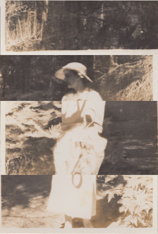
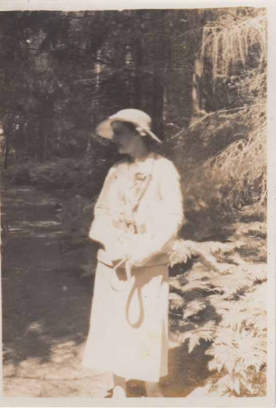
My version of Nick sullivans photography
WWW
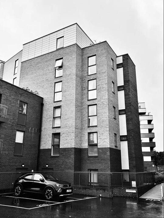
What went well In these photos I have managed to photograph a variety of different types of buildings and structures which then means that when I move on to editing and adding in the lines around the buildings I have more ways in which I can do different line designs
EBI
These photographs could be even better if I could have have photographed more diverse locations and places like Nick Sullivan does in his line of photographs where he takes pictures of famous locations and people and combines them
Edits
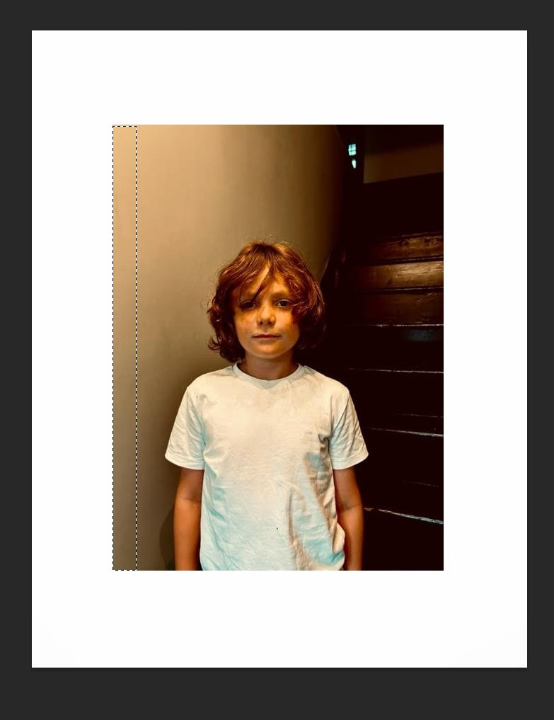
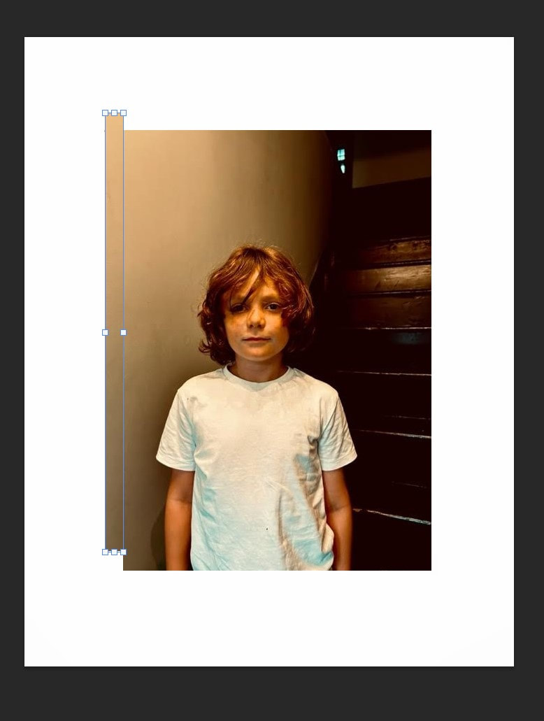
For my version of Nick Sullivans contrasting photographs i have used two different photographs each taken at the exact same place but at different times, i have then gone onto make one of the photos black and white through the use of photoshop leaving the other one the in colour after that i combine the photographs so that the black and white version is layered over the top of the original coloured photo i then make sure to line up all the buildings or objects in the photo so it matches up.

|

|

|

|
WWW
What went well in these photographs I think I have managed to aline the two photo well so that they match up to create one
photo with the two contrasting parts which is consistent with the work of Nick Sullivan
EBI
These photographs could be even better if I managed to get a wider variety of photographs that incorporate different
buildings and structures as well as people
Alexey Bogolepov (Lines/Shapes)

|
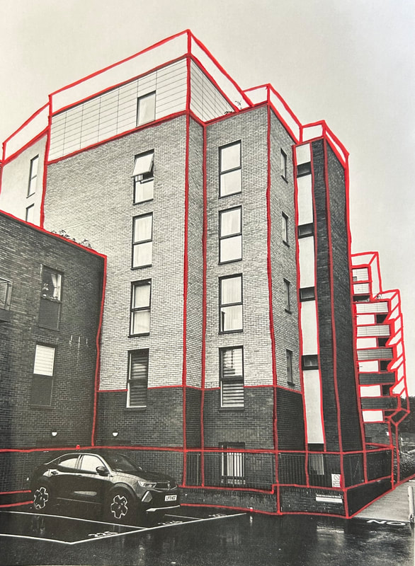
(b.1985) Alexey Bogolepov is an artist currently living and working in Saint Petersburg, Russia. His work comprises architectural photography, sculpture, video and installation in a broad exploration of modernism both in the post-Soviet states and worldwide. He is interested in making analytic art that produces political commentary on the subjects of power structure, ideology of space, planning practices and systemic vision. To portray this message he photographs different buildings making them black and white after photographed then moving onto photoshop to draw vivid red lines over the top of the now black and white picture he uses these red lines to create straight lines in different geometric designs tracing the the shapes already shown in the buildings construction, these bright lines contrast with the black and white building they are layered over this helps them to stand out more making them more vivid and eye-catching |

|
Editing process

|
|

|
In this process i first take lots of photographs of different buildings and structures like Bogolepov has done in his work after i have all my desired photos i can then pick out my best photographs after that i can then move on to photoshop to make these best photos black and white, finally instead of continuing with photoshop Alexey Bogolepov does i instead move onto do the rest physically to do this i print out the six best photographs then i use a bright red pen to create the geometric lines outlining the building.
My version of Alexey Bogolepov's photography
WWW
What went well with these pictures is that I have managed to photograph buildings with different structures which will later be useful when I move on to editing and adding in the different lines over these buildings and structures
EBI
These photographs could be even better if I found more isolated buildings like Alexey Bogolepov does in his series of these type of photos, when the buildings are isolated it allows of the buildings/ structures to be the centre focus of the picture
First edits


|


|


|
WWW
What went well with these photographs is that by making them black and white I can highlight the structure and
lines of the buildings
EBI
What would be even better if these photographs were taken on a clearer day so there was not as many clouds in the
sky and was more seamless
What went well with these photographs is that by making them black and white I can highlight the structure and
lines of the buildings
EBI
What would be even better if these photographs were taken on a clearer day so there was not as many clouds in the
sky and was more seamless
Final Edits

|


|


|
WWW
What went well in these final photographs is that because I ultimately decided and the red lines physically with a red acrylic paint pen instead of digitally in photoshop like Alexey Bogolepov does in his version of this photography series,
doing it physically allows for more control over the lines which means I can make them into a type of outline or frame for the
structure of the buildings or structures, I think I have done this aspect successfully
EBI
I could make these photographs even better if I were to fixed the quality of the the black and white which got slightly altered and discoloured when I printed out my chosen photographs to make them physical so that I could draw on it, so if I were to retake
this photoshoot I would focus more on fixing that
Cara Barer (Manipulation/Patterns)

|
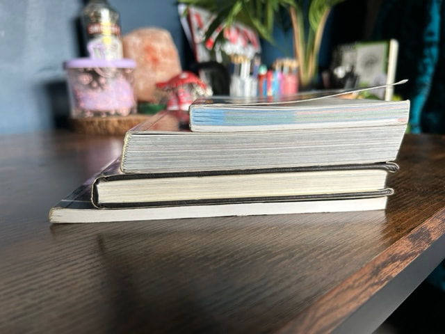
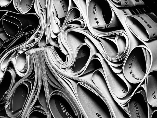
Cara Barer is an internationally recognized established American photographer known for her abstract compositions of books and printed material. In her experimentation with curling irons, clothes pins and water, Barer transforms volumes of irrelevant and outdated information into coiled, crumpled objects of beauty. Her work with old unused books creates interesting sculptures out of discarded literature by curling and folding the pages she creates mesmerising patterns which are captivating to the eye. |

|
Making process:
|
|
|
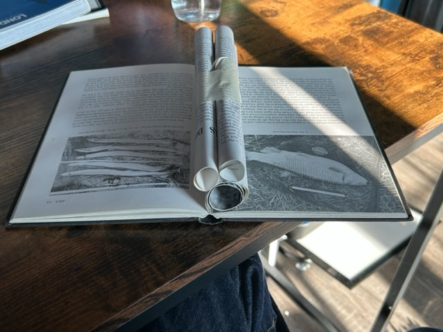
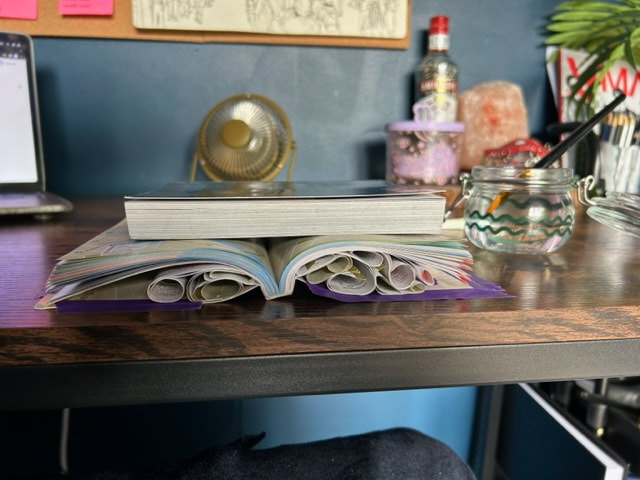
For my own response to Cara Barer's work i have used multiple old discarded books to make these sculptures out of ,
to do this i have put water onto the pages that i want to manipulate this then makes it easier to change and bend the paper it also allows for the shape i change it too to stick in place better i also use masking tape to keep it in place,
i then go on to repeat this with each page making different unique shapes to ultimately create the aimed pattern.
My versions of Cara Barer's photographs
WWW
What went well with these photos is that I have managed to incorporate a wide variety of different shapes and patterns within
the books pages and paper I have also managed to highlight the different colours that are in the pages
EBI
These photographs could be even better if I could create more of a monochrome back ground so that the soul focus of the
photographs are the books and their patterns
First development
I am choosing out of my three previous photoshoots to develop on from my Cara Barer inspired book photography which focuses around the word manipulation,
instead of caring on with photographers Nick Sullivan (Layering/Contrast) or Alexey Bogolepov (Lines/Shapes).
To develop on from fear work I want to try and look closer at the up close patter and shapes made by the pages and the shadow that are created within the shapes to help with this development I have a look at the work of Keneth Josephson which follows along
the lines of the things I want to look at such as a close up look at the patterns and shapes that are created.
Keneth Josephson

|
Kenneth Josephson is recognized as one of the pioneers of conceptual photography. He has explored the concepts of photographic truth and illusion throughout his career, producing a varied pieces of work that utilizes a range of techniques from collage and construction to multiple exposures and single negative photographs. Focusing on what it means to make a picture, Josephson’s work playfully highlights the illusive nature of photography |

|
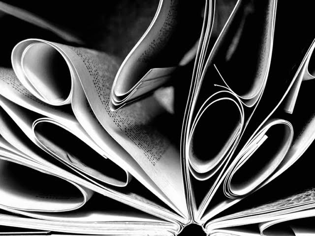
The work of Keneth Josephson's that I am most interested in for this project is his work that looks close up at
the paper and pages of books it really highlights the patterns and textures within the books he also unlike Cara Barer who I was previously was looking at in this project his photographs are in black and white make
the paper the soul focus
the paper and pages of books it really highlights the patterns and textures within the books he also unlike Cara Barer who I was previously was looking at in this project his photographs are in black and white make
the paper the soul focus
My version of Keneth Josephson's photos
For my version Keneth Josephson's photos I have chosen to do close up photos of the patterns and shapes I can make within
the books in particular different sized and shaped circles/rolls
the books in particular different sized and shaped circles/rolls
WWW
What went well in these photographs is that by zooming in on the the pages I have fixed the issue of the background allowing
the shapes and patterns to be the soul focus it also gives a closer look of the shadows created within the shapes made
EBI
These photographs could be even better if I could incorporate different types of shapes instead of just circular type
shapes to create more variety
Edited versions
To finish off i move to photoshop where like Keneth Josephson I adjust the photos to make them black and white and also then adjusting the contrast and brightness to enhance the shadows and different textures with in the photographs


|


|
WWW
What went well with these photos is that the black and white allows for the shadows to be further highlighted showing the different shaped shadows cast with the variety of patterns
EBI
These photographs could be even better if I could incorporate different types of shapes instead of just circular type
shapes to create more variety
Second development
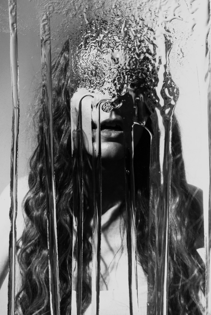
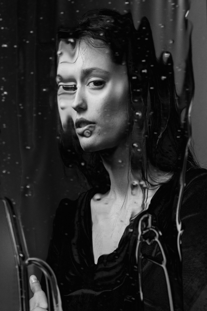
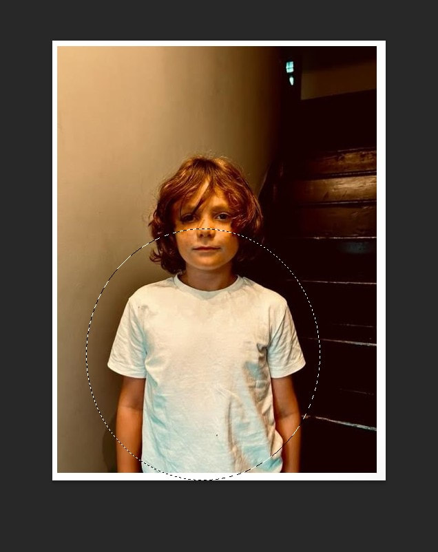
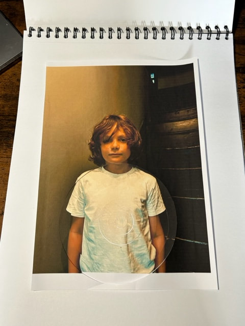
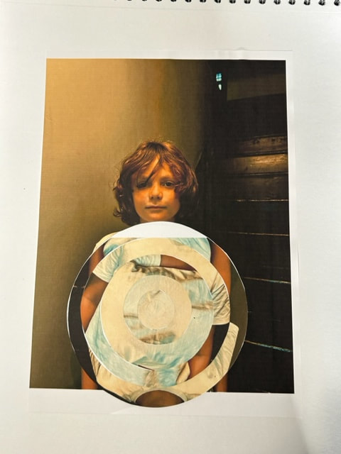
For my second development of the word manipulation I have decided to look at the idea of manipulating the environment around in the photograph for instance here I have used a person as a subject for this photograph and then had them behind a sheet of glass instead of manipulating an object like the book and its pages and having that the subject like I have done in my previous development, to have this manipulated effect I have used water and hand soap to help distort the image making the face of the person behind the glass all distorted and messed up
NICK FANCHER
|
|
|
Nick Fancher is a photographer and Author , who specializes in creating in-camera effects,
often employing the use of bold colors and dramatic lighting. He is particularly known for his efficient method of working,
which is with the use of minimal gear and often in unconventional locations.
Nick graduated from Ohio State University with a BFA in photography in 2005 and has authored several books on his photography techniques. Nick Fancher is based in Columbus and Los Angeles and is available for photo commissions worldwide.
Nick Fancher begins to figure ways to control and manipulate the honey in his strata portraits. He now uses a mirror for his honey images, while he still use a large sheet of glass for the oil shots.
Rather than cleaning off the mirror between shoots, he leaves it to lay flat, allowing the honey to settle (and collect dust and grit).
Once he is ready to shoot, he then stands it up and dab it with his fingers th then create a raised areas for a few minutes.
The reflection from the honey can get really extreme, mimicking the distortion from a funhouse mirror.
Fanchers favourite parts of the images are the areas where the face/skin begin to split away from the body, as if to disintegrate.
Photographs taken
Taking inspiration from the work of Nick Fanchers behind glass photography,
I have used water and hand soap to help distort the image making the face of the person behind the glass all distorted and messed up like in a funhouse mirror like Nick Fancher does in his photoshoots.
I have used water and hand soap to help distort the image making the face of the person behind the glass all distorted and messed up like in a funhouse mirror like Nick Fancher does in his photoshoots.
WWW
What went well with these photos is that all the different textures made by the soap and what which I used to distort the
portrait of my subject
EBI
These photographs could be even better if I could of instead of using soap and water could try using honey or oil like Nick Fanchers does in his photographs as this creates more of a trickle effect like syrup
Edited versions of my photographs
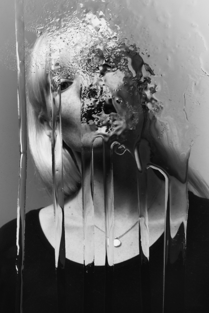
When editing these best versions from the photographs taken in my photoshoot I have used photoshop to make these pictures
black and white I have also adjusted the contrast and brightness to make the distortion standout even more
black and white I have also adjusted the contrast and brightness to make the distortion standout even more

|

|

|

|
WWW
What went well with these photos is that by making them black and white it helps to further emphasise the effect of the distortion
on the face of the person behind the glass
EBI
These photographs could be even better if I could of instead of using soap and water could try using honey or oil like
Nick Fanchers does in his photographs as this creates more of a trickle effect like syrup that can later be further highlighted from
the editing in photoshop especially by making them black and white
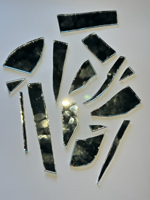
Third development
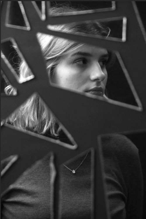
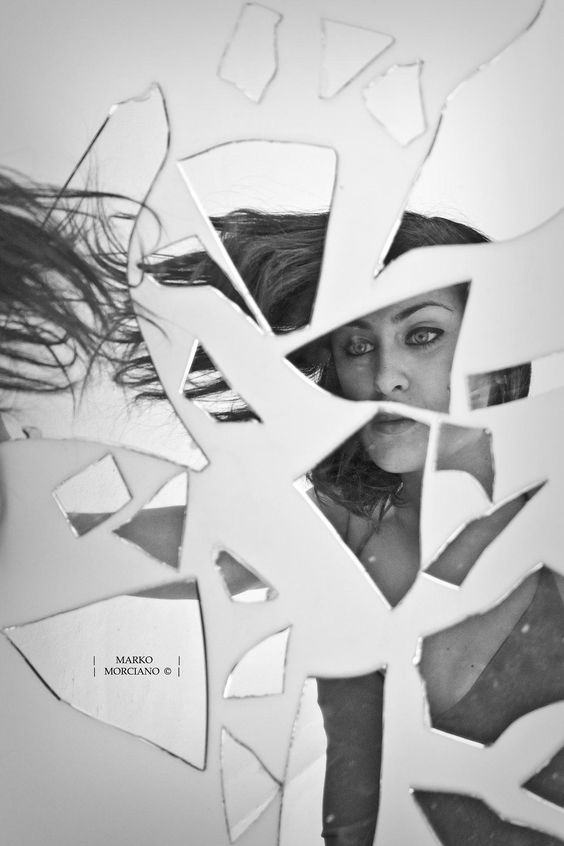
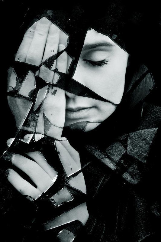
For my third development of the word manipulation I have decided to look at the idea of manipulating
reflection taking inspiration from these type of photographs that use a variety of different broken mirrorshards to show a
distorted portrait like image
reflection taking inspiration from these type of photographs that use a variety of different broken mirrorshards to show a
distorted portrait like image
|
|
|
Making process
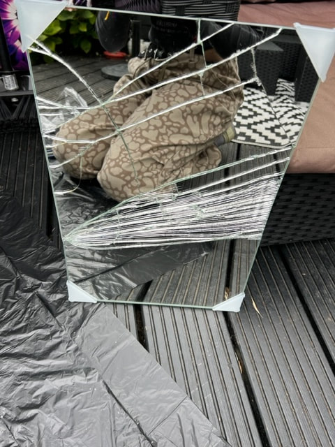
For the process of setting up this broken mirrorshard based photoshoot I have used a hammer to smash a large sheet of mirror,
creating the cracks in the surface I have then moved on to use a crafting knife to separate the larger pieces and I have
finally then used double sided tape to attach the different shards to a large sheet of paper
creating the cracks in the surface I have then moved on to use a crafting knife to separate the larger pieces and I have
finally then used double sided tape to attach the different shards to a large sheet of paper
|
|
|
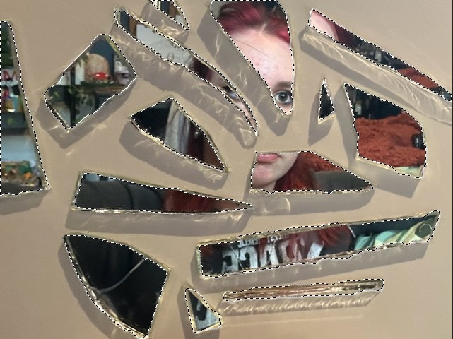
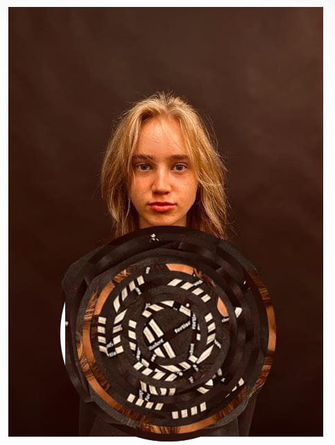
My response
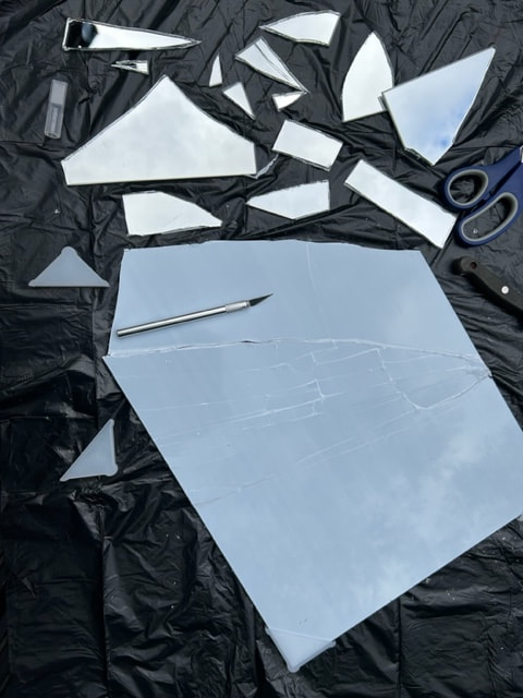
I have used double sided tape to attach the variety of different shaped and sized shards to a large sheet of
paper I have tried to mix up the order and patterns to get lots of different pictures as well as adjusting the angles so the picture is different and unique each time I have also done several photos where I am holding mirror shards
with my faces reflected back at the camera
paper I have tried to mix up the order and patterns to get lots of different pictures as well as adjusting the angles so the picture is different and unique each time I have also done several photos where I am holding mirror shards
with my faces reflected back at the camera
www
What went well with these photos is that the image of the face is effectively distorted and fractured which creates a unique picture the different angles also creates a wider variety in the photographs
EBI
These photographs could be even better if I could change the order of the mirror shards around to create more of a variety with the patterns of the mirror pieces
Editing process
|

|
When editing these photographs in photoshop have started by using the select tool and picking out each shards outline and then selecting the inverse tool so that the background is the only part outlined on the photo now

|
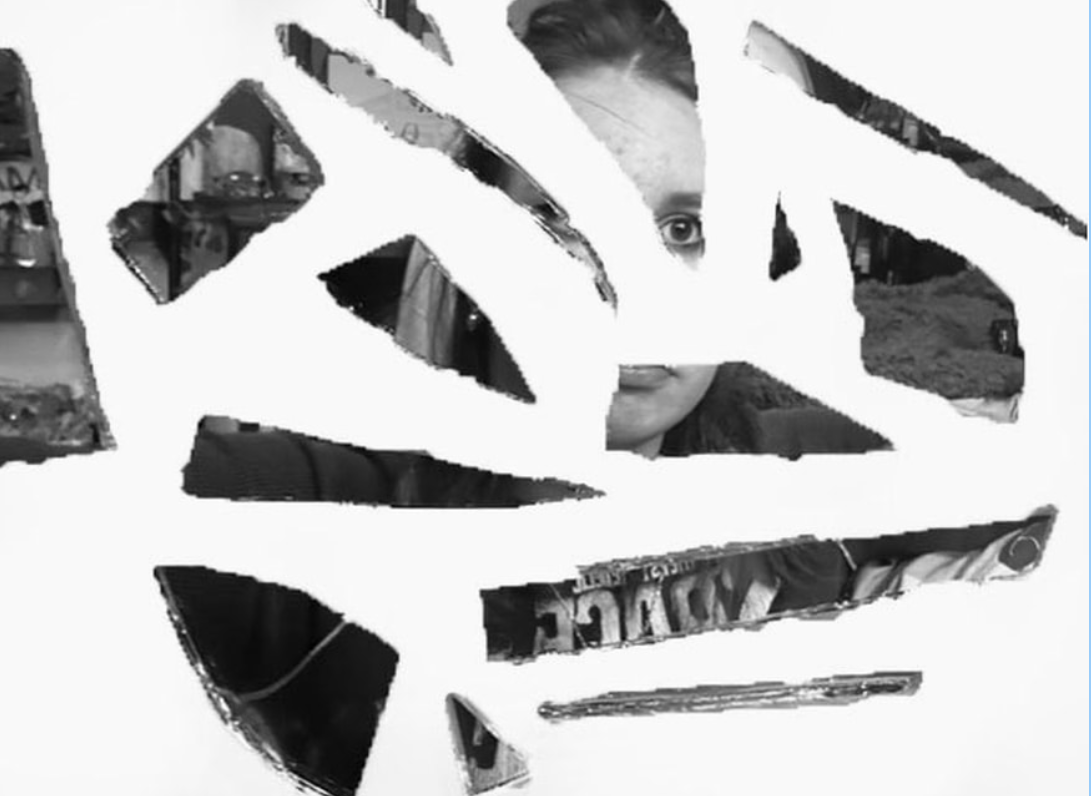
|
Now that I have the background of my photograph completely selected I can start to use the paint brush feature to
colour in the background white not worrying about painting the shards by accident, now that the background is
completely white It helps to make the main focus which is the picture captured within the broken shards of mirror standout even more, and finally I adjust the filter to make the picture completely black and white helping direct focus to
the distorted photograph in the pieces of mirror
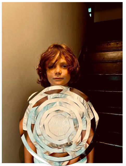
Edited versions


|


|
WWW
What went well with these photos is that white background helps to draw attention to the images shown in these mirror shards
the black and white helps to highlight details within the photo images
EBI
These photographs could be even better if I could try to create sharper lines with the mirror shards to create a cleaner picture
Fourth development
For this fourth development i have gone back and looked over and analysed which of the three previous developments of the word manipulation that i want to continue with those being looking at reflection, distortion through glass and finally
manipulation of objects in the photograph from that i have gone onto decide which of these three different approaches best fits
the photography direction i want to go with from here on and that has the best results.
I have ultimately decided that the work looking into Cara Barer and Kenneth Josephson's paper sculpture based
photography is the most successful of the three previous developments so as i move forward i want to continue with the idea
of manipulating objects and creating different small sculptures, to help continue this idea i have gone onto look at the surrealist work of photographer Chema Madoz, this photographer take everyday household items and combines them to appear as something
they are not creating abstract pictures with these small sculptures.
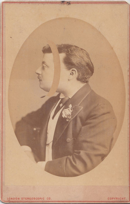
Chema Madoz
The Spanish photographer Chema Madoz is acclaimed for his surrealistic photographs that nod equally to the readymades of Marcel Duchamp and the dreamscapes of René Magritte.
He takes at the minimum two objects that are unrelated to each other yet when they are paired together in Madoz's abstract way,
they entirely and surprisingly blend as one to create interesting and absurd pictures.
Often the objects are placed in visually unpredicted settings but they coincide with the idea of creating a new meaning
and picture altogether.
Chema Madoz is a recipient of the 2000 National Photography prize, the work by Madoz is influenced by surrealism and visual poetry. His images contain a magical and complex universe in which objects are never what they seem or look like that which they are not.


My version of Chema Madoz's photos
I have taken inspiration from the fact that each of Chema Madozs photographs use everyday objects to tell a different
story for instance in my photoshoot version of Madozs photos I have used everyday objects to tell four different stories and four each picture like in with Madozs photos I have used two unrelated photographs in each of the pictures
story for instance in my photoshoot version of Madozs photos I have used everyday objects to tell four different stories and four each picture like in with Madozs photos I have used two unrelated photographs in each of the pictures
WWW
What went well with these photos is that i have done four different and unique themes for the photographs each with different ideas
in mind, i have also successfully isolated he photo subject to make it the main focus
EBI
These photographs could be even better if I could try to incorporate more of Madozs photography ideas he uses a lot more
photoshop to make his abstract ideas come to life further
Edited photographs
In these edited photographs of the best versions for each of the four different item combinations
that I have photographed I have gone on to adjust them in photoshop so that the filters have been adjusted to black and white
and the contrast and brightness is raised so that the photograph subject is more highlighted to make it stands out
that I have photographed I have gone on to adjust them in photoshop so that the filters have been adjusted to black and white
and the contrast and brightness is raised so that the photograph subject is more highlighted to make it stands out


|

|
WWW
What went well with these photos is that by editing them to make black and white it helps to further highlight the subjects making
them more eye catching to viewers
EBI
These photographs could be even better if I could incorporate more of a variety of normal household objects line Madoz
does in his versions of this type of photography
Fifth Development:
For this fifth development i want to try and continue with the theme of manipulating the photograph subject but this time i want to bring in the portrait aspects of the other two developments that I have previously done, as well as bringing back the reoccurring theme of paper manipulation that has been in this line of photographs so to do this I have decided to look at the work of Nigel Tomms who is a photographer who creates 3D portrait images of ruined photographs of primarily women this is meant to serve as a call out to modern day media and sexualisation and objectification of women in their photographs.
Nigel Tomm
Nigel Tomms photography work creates a 3D type photograph by manipulating the images scrunching,
crinkling and folding up the photos effectively distorting them and creating a new picture.
His work is constructed and often uses lighting, shadows and angles when photographing the original photo that
he eventually moves onto manipulating.
The black and white aspect of his photos suggests neglect and that the person could be hiding emotions,
Nigel also tends to use female models to help highlight his beliefs and show his message of how
women are objectified in todays modern media.


Nigel Tomm is a photographer who was born in 1979, his aim is to make note of the realities with in fashion
photography by taking near-perfect magazine style photos,
and then destroying what the image marketer is try to convey in these photographs. He wanted to change the beauty in an image by distorting it into something different he has done this by scrunching, crinkling and folding up the photos.
In his work work he blends magazine images with his own images to show how we are
shown to look in the media with one of his own models.
I really like Nigel Tomm's work because of how original it is, making it interesting to look at.
One of the most interesting aspects of Tomms work is his passion and strong beliefs against modern media and how it objectifies women. This clearly presented throughout every piece of his work.
Another interesting aspect is his boldly presented work and how he successfully shows his message through a simple concept.
Portrait photographs taken:
For these photographs I have used three different people as models primarily women like Nigel Tomm does in his photos,
I have focused on having a strong lighting source and including a variety of different angles which will be helpful when I move
on to distorting the photograph print outs it will help diversify the final results.
I have focused on having a strong lighting source and including a variety of different angles which will be helpful when I move
on to distorting the photograph print outs it will help diversify the final results.
WWW
What went well with these photos is that I have successfully got a variety of people as models as well as taking clear pictures with strong lighting
EBI
These photographs could be even better if I could incorporate more different face angles and try to get photographs in more of a magazine style which is what Nigel Tomms aims for in his work
First edited photographs:
For these photographs i have selected six of the most successful photographs from my previous photoshoot and i have then scrunched them up into small balls so when i unfold them each of them is distorted in a different way i then move onto taking the pictures of these ruined pictures i make sure i have a strong light source which i constantly change and move so that i can get a variety of different shadows and angles in my pictures.
WWW
what went well with these printed out photographs is that I have successfully captured Nigel Tomms them of distortion by scrunching
up my printed out photos to create this destroyed look that Tomms captures in his photography
EBI
These photographs could be even better if i could incorporate more of a magazine editorial feel to them like Tomms does in his work this could be done through using different type of paper to print on and by making the pictures black and white]
Photograph process

|

|

|

|
The editing process for this Nigel Tomms inspired photoshoot is in two parts one done physically and the other on photoshop.
To do this I start by selecting some of the best photos from my previous photoshoot and then printing them out after i have the physical photograph i can crumble it up in a ball and once i unfold it i can see it is all distorted and ruined now that i have the final physical product i can take the photos, once i have my pictures taken i can move onto photoshop first thing to do is pick out the most successful pictures and then i can move onto adjusting the filter to make them black and white and i finally change both the contrast and brightness to help highlight the shadows further emphasising the distortion.
To do this I start by selecting some of the best photos from my previous photoshoot and then printing them out after i have the physical photograph i can crumble it up in a ball and once i unfold it i can see it is all distorted and ruined now that i have the final physical product i can take the photos, once i have my pictures taken i can move onto photoshop first thing to do is pick out the most successful pictures and then i can move onto adjusting the filter to make them black and white and i finally change both the contrast and brightness to help highlight the shadows further emphasising the distortion.
Final edited Photograph:


|


|
WWW
What went well with these photographs is that by making them black and white in photoshop it has helped to further emphasis the contrasts with the shadows and the paper highlighting the distortion made by manipulaing the photographs
EBI
These photographs could be even further improved if i had them printed out on to shinny magazine type paper this would help to further push Nigel's narrative of the media and increase the magazine feel of my photographs
Gallery Visits:
National portrait gallery visit
Paul McCartney Photography exhibition
1963–64 -Eyes of the Storm
This exhibition at the national profit gallery showed photographs Captured by Paul McCarthy using his own Pentax Camera, the exhibition holds more than 250 photographs taken between November 1963 and February 1964, showing the critical time period in which The Beatles became international superstars. The photographs were rediscovered in Paul's personal archive in 2020 nearly a thousand photos had been taken, these were taken from Liverpool and London in 1963 to Paris and America in 1964 .
The photographs in this exhibition were organised chronologically as well as by countries and most of the photographs were presented in their original black
In this show, they focus on portraits captured by McCartney, using his own camera, between December 1963 and February 1964 – a time when The Beatles were catapulted from a British sensation to a global phenomenon. These are never-before-seen images that offer a personal perspective on what it was like to be close to the group – and adjusting from playing gigs on UK stages, to performing to 73 million Americans on The Ed Sullivan Show.
At a time when so many camera lenses were on the band, Paul McCartney’s photographs offer a crucial new perspective on the story of a band creating cultural history – in one of its most exciting chapters.
The gallery's archives include photographs of The Beatles taken by big names such as David Bailey and Don McCullin, but these new images, where the camera has been passed back to the subject, offer a unique insight. "The essential difference is that it’s his perspective on the band and what’s happening. They were never meant to be publicised or shared. They're private," explains Broadley. "It's about what he was interested in, who he wanted to remember, and it’s not really so much about The Beatles – it's about Paul and the experience that he was having with his friends, who happened to be The Beatles."
McCartney, a working-class man who previously had holidayed in budget resorts in the UK, was just 21 in 1963, and the photographs reflect his unworldliness and his curiosity about the new worlds he was discovering. The novelty of travel is clear from the many photographs taken from planes and his touristy snaps of the Arc de Triomphe and the White House; while shots of posters and billboards with the band’s name on them suggest a baffled pride at their celebrity so far from home. "Looking at these photos now, decades later, I find that there is a sort of innocence about them," writes McCartney. "Everything was new to us at this point."
American dream.
Photographs of the exhibition
Evelyn Hofer
In this exhibition of Evelyn Hofer's photography work a larger variety of Hofer's work is shown varying from, large format portraits, landscapes, cityscapes, still life's and domestic interiors, many of which demonstrate her preference for the complex colour dye transfer process.
It shows photographs from black and white portraits in London and wales to the vibrant colour of street and park life in New York and Washington, Hofer shot in colour and black and white throughout her career, depending on which she thought would be right for her subject.
With a keen sense of class structure, her portraits give equal measure to her subjects: from a waitress at the Garrick club in London and gravediggers in Dublin, to the uniformed joint in Washington's corridors of power.
Imbued with a sense of timelessness, Hofer's work contrasted with the ‘shoot-from-the-hip’ style of contemporaries such as Robert Frank and William Klein.
This major retrospective spans 45 years of image-making, featuring over 110 black and white and colour images, as well books.
Evelyn Hofer is produced in collaboration with Galerie m, Bochum, Germany and the Estate of Evelyn Hofer. Supported by Simon Blakey
Born in Marburg, Germany, in 1922, Evelyn and her family left Germany following the Nazi's rise to power. Moving to Geneva in Switzerland when Evelyn was 11, they later moved to Spain, and finally settled in Mexico in the early 1940s.
Hofer’s early training included apprenticeships in two commercial portrait studios, and an induction in photographic theories and techniques with the German-born Swiss photographer Hans Finsler in Switzerland. Finsler was a pioneer of the ‘New Objectivity’ movement in German art that arose during the 1920s as a reaction against expressionism. Photographer August Sander was also a member of the group.
This formative period acquainted her with modernist theories of aesthetics and technical and chemical processes as well as traditions which considered applied and fine art photography on an equal footing.
In her early twenties, Hofer moved from Mexico, and settled in New York – a city that provided a great source of inspiration. The city offered a dynamic cultural scene and here artists Richard Lindner and Saul Steinberg became life-long friends.
She began working for Harper’s Bazaar, which was under the artistic direction of Alexey Brodovitch at the time. More editorial commissions for other magazines followed.
However, it would be a series of photobooks published throughout the late 1950s and 1960s – focusing on US and European cities including New York, Washington, London and Dublin – that offered her the opportunity to develop a distinctive style.
Johny Pitts: Home is not a place

In 2021, award-winning poet Roger Robinson and acclaimed photographer Johny Pitts rented a red Mini Cooper and decided to follow the coast clockwise in search of an answer to this question. Leaving London, they followed the River Thames east towards Tilbury, where the Empire Windrush docked in 1948. Too often, that is where the history told about Black Britain begins and ends – but Robinson and Pitts continued out of London, following the coast clockwise through Margate to Land’s End, Bristol to Blackpool, Glasgow to John O’Groats and Scarborough to Southend on Sea. Here, the authors found not only Black British culture long overlooked in official narratives of Britain, but also the history of Empire and transatlantic slavery to which every Briton is tethered.
Home Is Not a Place is a free-form composition of photography, poetry and essays that offers a book-length reflection upon Black Britishness – its complexity, strength and resilience – at the start of a new decade.
In 2021, photographer and writer, Johny Pitts, and poet Roger Robinson travelled around the British coast in search of an answer to the question 'What is Black Britain?' Their collaboration became Home is Not a Place - coming to The Photographers’ Gallery this June.Travelling in a red Mini Cooper, Pitts and Robinson’s circumnavigation encompassed the coastal, urban, rural and suburban, via the places in-between. Following the coast clockwise, together they set out to document and respond to the many manifestations of Black British culture, and to present an alternative to official and media narratives.
In the exhibition and accompanying book Robinson's poetry sits alongside Pitts' images from around the country. The show's title comes from a quote by American writer James Baldwin ‘perhaps home is not a place, but simply an irrevocable condition’.
Pitts invites you to come in, take a seat and feel right at home - to experience what home means to him - whether you’re flicking through family photo albums, chatting and sharing ideas, or listening to pirate radio playlists from Pitts’ 1980s youth.
Sixth development:
To continue further with this development theme of paper manipulated portraits, i want to keep the successful aspects of my previous Nigel Tomm related photographs i would like to keep the black and white photograph idea and continue on with the idea of having a destroyed printed out portrait, but instead of having only black and white this time i want to incorporate colour at the same time to create a kind of contrast between the pictures of which i want to have two one in its original perfect state and the other destroyed, but this time instead of using a destructive way of manipulating the paper through scrunching and crumbling it up i want to try using a more uniform neat way such as folding it or even incorporating origami.
To0 do this i have decided to look at the work of photographer Alma Haser who does this exact thing except for the contrasting colour schemes in which i intend to incorporate.
To0 do this i have decided to look at the work of photographer Alma Haser who does this exact thing except for the contrasting colour schemes in which i intend to incorporate.
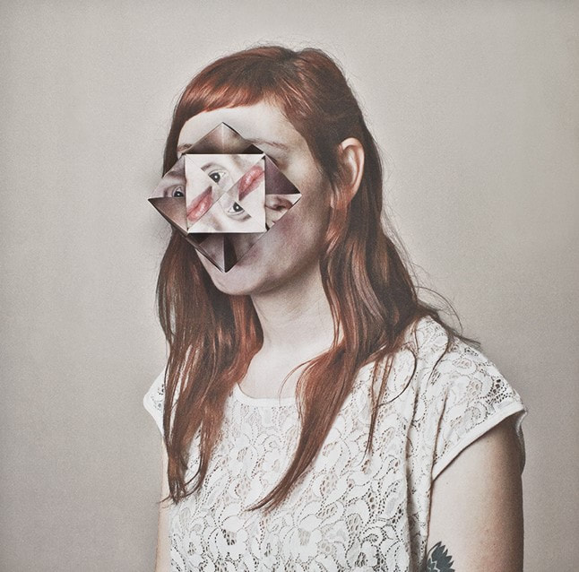
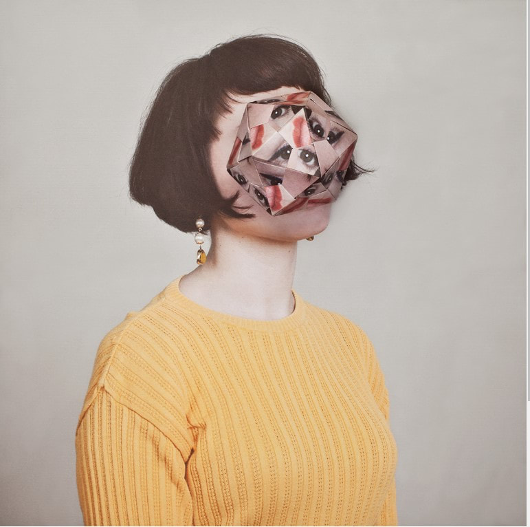
Alma Haser
|
|
|
Alma Haser born in 1989 into an artistic family (Both of her parents are artists, so that influenced her quite a bit, Haser's mum was the one who got her into photography) in the Black Forest, Germany, Haser is now based in London and on the southeast coast.
She is known for her complex and meticulously constructed portraiture, which are influenced by her creativity and her background in fine art.
she goes on to combines photography with collage, origami techniques and and mixed medias to create layers of intrigue around her subjects; manipulating her portraits into futuristic paper sculptures and blurring the distinctions between two to create work that seeks to expanding the dimensions of traditional portrait photography and reflect on her artistry.
She has made her name in contemporary photography by using these techniques that are traditionally associated with craft, such as weaving, folding, cutting, stitching, and painting.
Portrait Photographs taken
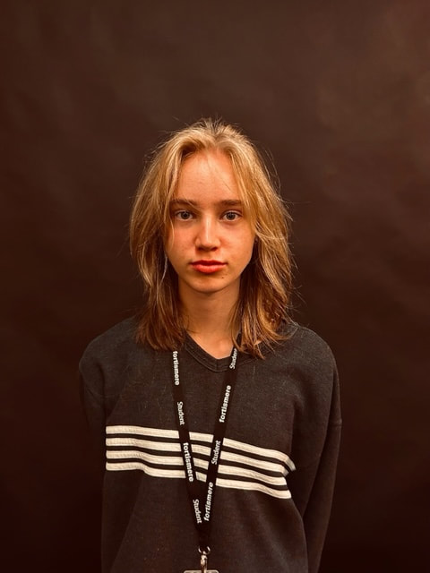
I have decided to take new portrait photographs for this strand instead of reusing the previous photos from my last photoshoot, for these ones I have used to different models one male and the other female and I make sure to take the photos with a blank background so that the model is the main focus, I have also taken these pictures from further away then the previous photos so that the upper body is included in the photograph like Alma Haser does in her photography
WWW
What went well with these photographs is that the blank backdrop helps draw focus to the person in the picture and strong lighting helps to make my photographs more focused and in detail which is helpful fore later when I have to print and fold these pictures in an origami style
EBI
These photographs could be even further improved if I could try to incorporate more vivid colours like Alma Haser does in
her photography of people
Making/Editing process:
First thing that I have to do in this process is to select two of the best photos I have taken in the previous photoshoot I chose on of
each of the models I have photographed I then move these pictures to photoshop to make them black and white, after that is
complete I can then print out these pictures and start to physically edit them I make sure to print out two copies of each picture the
edit black and white version and the original in colour photo, now that I have my physical photographs I can move onto starting
the origami first thing I do is research and find two different shapes I want to do for these pictures I have chosen a tetrahedron and a triangular prism I then draw this shape net onto the back of the original in colour version of my photograph making sure
its lined up with the face of my subject.


Once I have the net drawn onto the back of the original in colour version of my photograph I can then start to cut it out making
sure I have included the tabs which I can use to connect the sides when I am assembling them, I have used glue to on the
tabs to secure the shapes sides together when I have my completed shapes I then place them on top of the other edited black
and white printed out photograph I try to aline them together and take pictures of the shapes in lots of different angles.
Final edited photographs:
For these final photographs I have mad sure to include a wide variety of different angles with the shapes this helps to capture different types of shapes and creates more variety in my photos.
WWW
What went well with these photographs is that by changing the angles of the shapes I have capture different shapes which helps create more
variety in my taken pictures, I have also effectively captured the contrast between the coloured origami style photograph and the black and white edited photo that it is placed on top of
EBI
These photographs could be even further improved if I could keep some of the sharper quality of the black and white photograph after
it has been printed out
Best final photographs
For these final photographs I have selected four of the photos that came out the best two of each model, I have then taken these pictures into photoshop so that I can adjust the saturation of the colours, the contrast and brightness this goes on to highlight the contrast between the black and white and the coloured photograph on top of each other enhancing the overall effect to the viewer


|


|
WWW
What went well with these photographs is that by adjusting things such as the the brightness, contrast and saturation it has even further highlighted
the difference between the coloured origami style photograph and the black and white edited photo that it is placed on top of
EBI
These photographs could be even further improved if I again could try to keep some of the sharper quality of the black and white photograph after
it has been printed out
Seventh development:
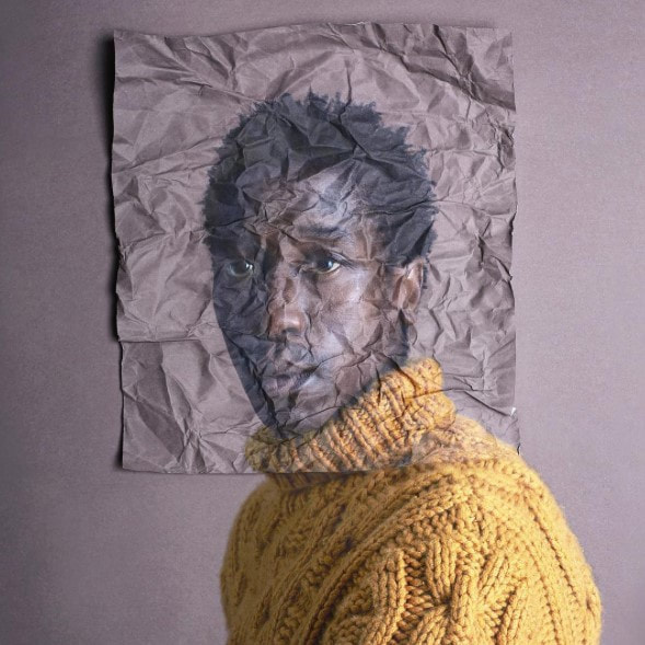
I want to further develop this idea of manipulating the paper or photograph but in a more uniform neat way like I have done previously with my Alma Haser origami inspired photography but instead this time I want to bring in the surrealist work of Chema Madoz an artist who I previously looked at he take household objects and changes them to tell a different story I want to do this but with my photos instead, taking the photo and changing the narrative by manipulating the paper in doing this I have looked at the photographic collage work of Kensuke Koike who portrays this idea well in his work.
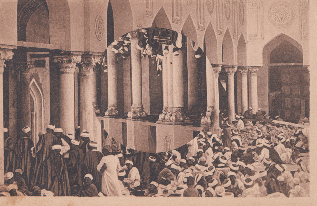
Kensuke Koike
Kensuke Koike is a surrealist/contemporary visual artist aiming to challenge the possibility of Image Making by bringing new meaning to archive found photography.
Koike was born in 1980 Born in Japan and now lives in Venice Italy, the artist spends his days buying old photographs at fleamarkets and distorting them in his studio to bring us often incomprehensible work that is exhibited around the world.
He is a graduate of the Academy of Fine Arts, Venice and the Università Iuav di Venezia Faculty of Arts & Design.
Koike's work starts from painting; it was in Venice, during his years of studies, that due to circumstances he decided to shift his attention to photographic images, especially those yellowed and abandoned by time, which would lead him to develop a style close to collage art.

|

|

|
Kensuke Koike is best known for his collages he creates unique artwork by manipulating found, vintage, photographic materials.
The artist spends his days buying old photographs at flea markets and distorting them in his studio. His approach revolves around the idea of using the assets found within an image to create a contemporary visual with a new narrative.
This process for the artist often starts as a puzzle begging to be solved with each image setting its own unique challenges.
He does this particularly well in his series of photographs called 'single image processing' which I want to look at for this piece of work.
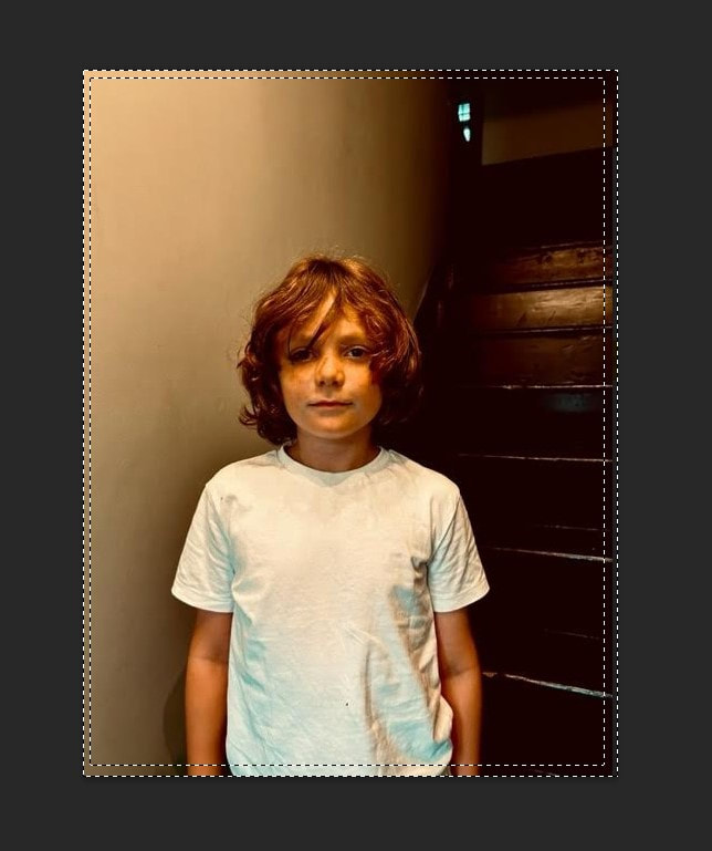
Portrait Photographs taken
Like Koike does with his collage photography I wanted to try with using photos from a previous photoshoot and then later using photoshop to play with and adjust the colours to give my pictures the same vintage like effect that Koike has in his versions of these collage art styled photography
Editing process:
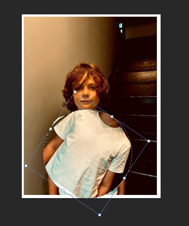
I wanted to edit these portrait photographs to make them seem older and have a vintage feel to them like Kensuke Koike has in the photographs that he uses for his collage photography work, so to do this I have selected one of the best take photos and
then taken it to photoshop the first thing I do is to change the filter from its original colour to one with more of an orange brownish
tint to it this goes on to help make the photograph seem more worn and old.
then taken it to photoshop the first thing I do is to change the filter from its original colour to one with more of an orange brownish
tint to it this goes on to help make the photograph seem more worn and old.
|

|

|
|
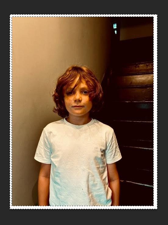
Now that I have this new orange brownish filter over my original photograph I can move on to adjust the tones of the photo such as the saturation, vibrance and the warmth in the colours of the picture these thing all go towards helping getting the right old vintage like look I am aiming for like Kensuke Koike has in his photographs.
First edited versions

|

|
|
WWW
What went well with these photographs is that by changing the filter over the picture I have created a successful orange/brownish
tint over the photograph similar to Kensuke Koike's photographs which were genuinely vintage and from places
such as flee markets and such
EBI
These photographs could be even further improved if I could have less orange and more darker tones like Kensuke Koike's
photographs maybe I could even make my photos more damaged and worn giving a more vintage and worn feel to them
Editing process:
|
|

|
For this photoshop editing process I start off by bringing my already edited photograph into photoshop I then create a white boarder about the edge off this photo like Kensuke Koike has in his vintage photographs I do this by selecting the border and then using the paint tool to colour in the selected area, once that is done I use the circular shape to select a circle on my photo I make sure to hold down shift so the circle is the right proportion, once i rotate this I then modify the circle to contract making it smaller I continue this process until I am close to the centre of the circle.
Final edited photographs
For these edited photographs I have decided to use photoshop instead of by hand so that I when I later do the physical editing I can compare the two different results and decide which is more successful and then the more successful one will be the version that I can continue to develop throughout this project
|
|
WWW
What went well with these photographs is that by using photoshop I can create a cleaner manipulated look than I could get by
cutting up and then manually rotating them myself
EBI
These photographs could be even further improved if I could have got a more even circle on one of the photographs
so that gaps wouldn't appear on my photo
Second Edits
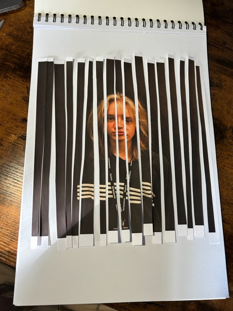
For my second digital edits i want tot try a different style of manipulation in the style of kensuke koike i previously tried to cut then rotate circles within the pictures, i now want to try cutting strips into the photographs and changing their positions.
Editing process:

|
|
|

|
For this next editing process i have first had to create a white background behind the photograph so that i can then start to edit the photograph without creating any blank space when moving the pieces, to move these strips i have selected a rectangle shape from the picture once i have that done i can move the piece up or down without moving the position around i then repeat this over and over till i reach the end of the photo i make sure to change the sizes to add verity and i then have my final piece of photography.
Final photographs

|

|
WWW
What went well with these pictures is that because i am using photoshop it is easier to get straight lines which create a
cleaner final photograph
EBI
These pictures could have been even better if i could try a variety of different ways to manipulate these photos with different lines such as tryin
to go sideways or even layering them
Third Edits
For this third edit i want to attempt to recreate the previously edited in photoshop photographs but for these photos i want
to try physically editing them by hand to do this I use just glue and scissors and an extra backing piece of paper to
back the photograph onto
to try physically editing them by hand to do this I use just glue and scissors and an extra backing piece of paper to
back the photograph onto
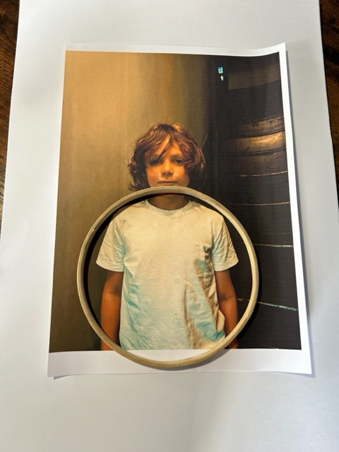
Editing Process

|
|

|
To make this edited picture I simply print out the best version of the same photograph I used for the previously photoshop
edited version, once I have my print out I start using my scissors to cut the photograph into different strips in a verity of different
sizes I try to cut the strips as straight as possible which is difficult but not essential to my final picture which I make by gluing down
the individual paper strips at different positions.
Editing Process
|

|
|
|
This editing process is a bit more difficult then the other physical edit as it was majority just citing in a straight line and with out having to really mark out the lines but for this print out I have used a circular ring to mark out a perfect circle because this will effect the final result, I keep making out smaller circles using different objects within each other next thing I have to don is cut these circles out to get a better result I use a craft knife cause it allows for more control over the curve of the circles, once I have them all cut I can put them bake into place and the rotate each cut out in different directions to get my final picture.
Edited Photographs

|

|
WWW
What went well with these pictures is that by using my hands to move add stick down the pieces of print out it means that i have more control over how i place and overlap the sections allowing for a better manipulation effect
EBI
These pictures could have been even better if I could have gotten cleaner lines like I did with the photoshop versions especially
with the circular photograph
Eighth Development
For this fourth and final edits inspired off of the work of Kensuke Koike I want to incorporate the theme of taking old vintage photographs and giving them a second life and manipulating them to give them a new narrative so to do this I have gone to a vintage shop and bought a collection of old forgotten photographs, I have got a verity of different pictures ranging form portraits to landscapes and some old post cards, I want to manipulate the pictures like Koike does and I have also decided to use photoshop to edit these photos as they have previously allowed for a cleaner out come when I compared both versions of the final edits so I want to go with this editing process from now on.
Collected Photographs
Final edited photographs
|
Edited
|
Original


|
WWW
What went well with these pictures is that by using these old vintage photographs I could get the idea of giving these photographs
a new narrative across better also by deciding to use photoshop to manipulate these pictures means that I can
have a more seamless edit
EBI
These pictures could have been even better if I could have tried to create a storyline of sorts by using objects or elements from these different photographs like Kensuke Koike does with he's photos
Ninth development:
For this ninth development i want to try manipulating and combining photographs so i am combining all the elements of my previous developments, particularly the idea of taking these old forgotten photographs and giving them a new narrative but instead of manipulating the subject of the picture i want to manipulate it by taking the subject and moving them into another photograph which has a modern setting contrasting with the old vintage images for this combining concept i am taking inspiration from the collage style work of Sean Hillen.
sean hillen
Born in 1961 in Newry, just beside the Irish Border, Hillen now lives and works in Dublin.
He studied first at Belfast College of Art, then went to London to study Media/Fine Art at the London College of Printing and then at the Slade School of Fine Art, London. He lived and worked in London from 1980 to 1992.
His works often involve photography and traditional paper photo-collage, sometimes with his own photos, and have often used humour to deal with serious subjects. His earliest serious artworks were black and white documentary photos taken starting in his teens, during the ‘Troubles’ era of conflict in Northern Ireland, which have since been acquired as a Separate Permanent Collection by the National Library of Ireland Photographic Archive.
A selection were published as a book: ‘Melancholy Witness’ by The History Press UK and republished by Trafalgar Square Press in the US. It was a Publisher’s Weekly ‘Annual Pick’ of 2014. The book has 120 of the photos and 7,000 words of captions by the artist.
His 1980’s photo-collage works in series like ‘Newry Gagarin..’ and ‘Londonewry..’ based on those documentary photographs mixed with tourist, toy packaging, religious and fantasy material were at different times highly praised and widely published, and at other times considered ‘controversial’ and heavily censored.
Hillen has been described as “the most censored artist to come out of Britain or Ireland since Joyce” (Irish Times).
Irish Times Chief Critic Fintan O’Toole wrote that they “remain the best expression of what it felt like to be in Northern Ireland during the Troubles”
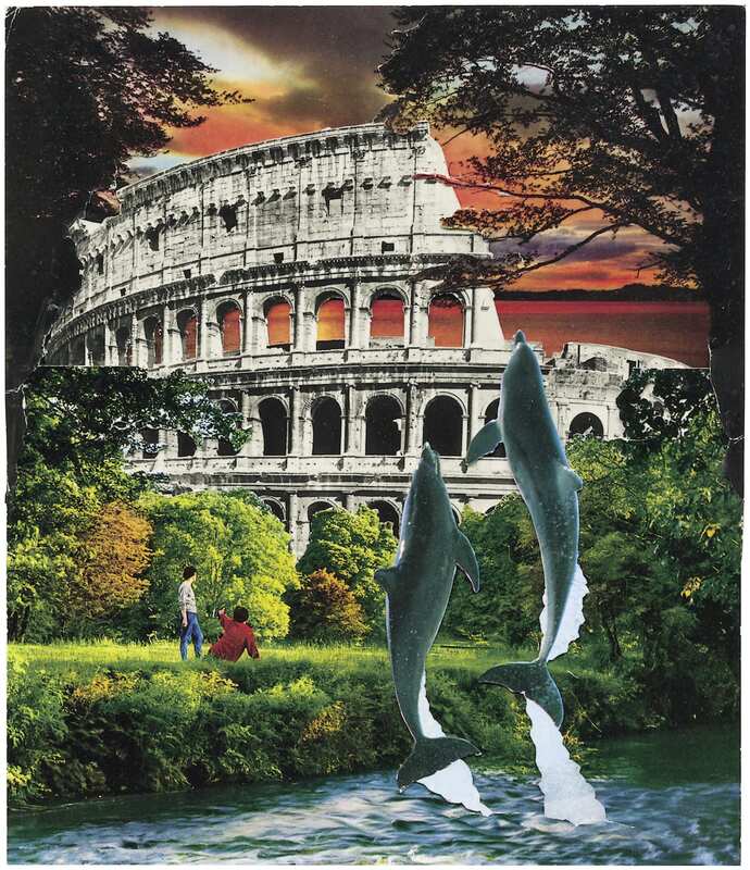
|
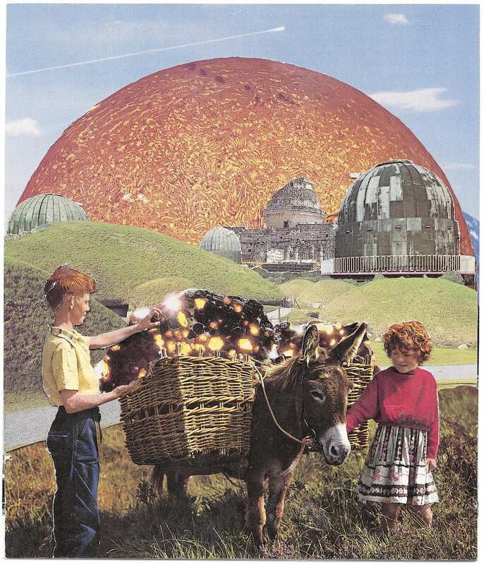
|

|
Photographs taken
These are photographs i have taken which will be representing a modern setting to contrast with the reused vintage photographs,
i have tried to photograph a variety of different modern well frequented locations such as car parks, shopping centres, busy
sidewalks, inside department stores and even street crossings
i have tried to photograph a variety of different modern well frequented locations such as car parks, shopping centres, busy
sidewalks, inside department stores and even street crossings
WWW
What went well with these pictures is that I have taken a wide variety of different pictures including different locations so when
I move to making the collages in photoshop I have a more opportunities
EBI
These pictures could have been even better if I got pictures of bigger architecture or vast landscapes like
Hillen does with his collages
Editing process

|

|

|

|
For this editing process of adding in figures from my collected vintage photographs into my modern everyday life pictures i have to do several steps first one being to open up my selected picture into photoshop,
the next thing i do is to use the selection tool to outline my figure i then inverse this selection so that everything but my figure is selected meaning using the eraser i cant get rid of the background, once i have done this i can go onto copy the figure then pasting it into an everyday picture and adjusting its position so it blends in more.
the next thing i do is to use the selection tool to outline my figure i then inverse this selection so that everything but my figure is selected meaning using the eraser i cant get rid of the background, once i have done this i can go onto copy the figure then pasting it into an everyday picture and adjusting its position so it blends in more.
First attempt Photographs
|
|
WWW
What went well with these pictures is that I have managed to edit in these figures so that they are proportional and seamless
in the photographs
EBI
These pictures could have been even better if I could make it more like the figures were interacting with the surroundings in the photographs it would also be better if I could adjust the colour of the photographs because their current colour makes them blend in more when I want them to stand out I can fix this by making them black and white maintaining the vintage feel to them
Second attempt photographs
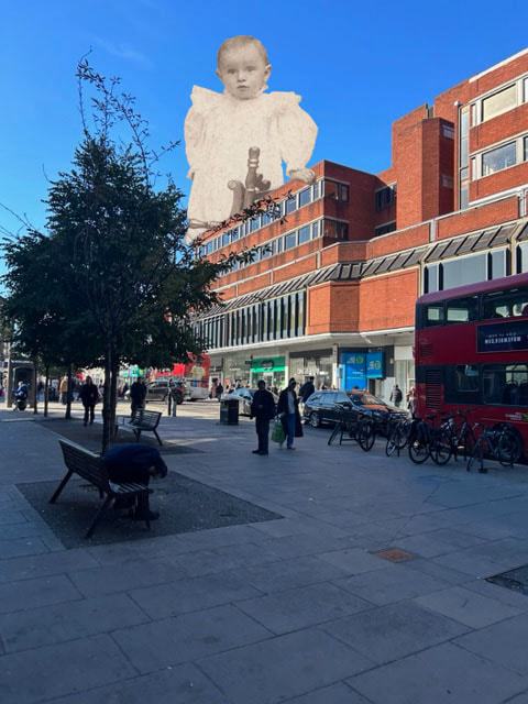
|
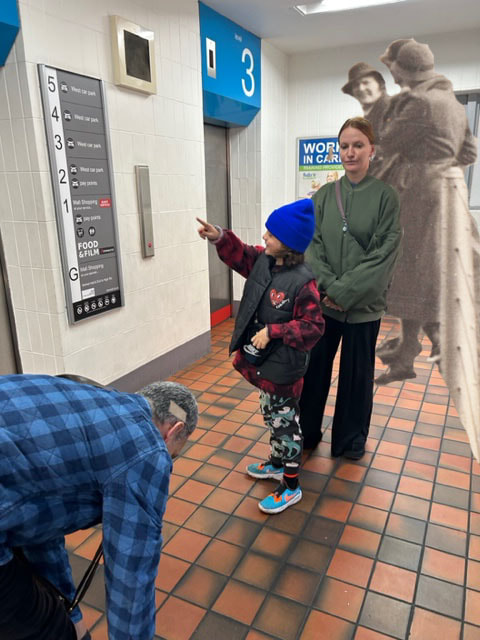
|
WWW
What went well with these pictures is that I have adjusted the colours of the added in figures to make them darker which makes them
standout better from the surroundings I have also edited it so that the figures are now interacting with the pictures
EBI
These pictures could have been even better if I
Tenth Development
For this development I wanted to focus more on the idea of having my subject interacting with the environment around them to make them seem more a part of the scene, I also wanted to capitalise on the concept of contrast by making the figures black and white in photoshop and having very bright and vivid colours in the surroundings.
Photographs taken:
For the surrounding of my photographs I wanted a lot of vivid colours so I went to place such as arcades and bowling alleys
both places with lots of neon bright lights
both places with lots of neon bright lights
WWW
What went well with these pictures is that I have successfully photographed the neon lighting in good quality also taking pictures where I can have my subject interacting with the environment they are in
EBI
These pictures could have been even better if I could try to photographs more architecture around London city
with more people in the pictures such as busy streets around London
Photograph editing process:
To start this editing process I need to select two photos one of my collected vintage photos and one of my taken photographs of different areas I need to make sure that these are compatible with each other once I have them I start my getting rid of the background in the subjects photo to do this I use the selection tool to select the the person I then inverse this so that now everything but the person is selected meaning I can use the rubber to erase the background with out damaging the figure when this is done I copy it and past it in my second photograph.
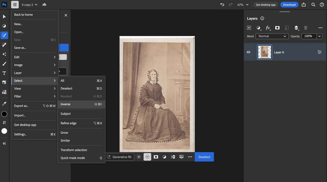
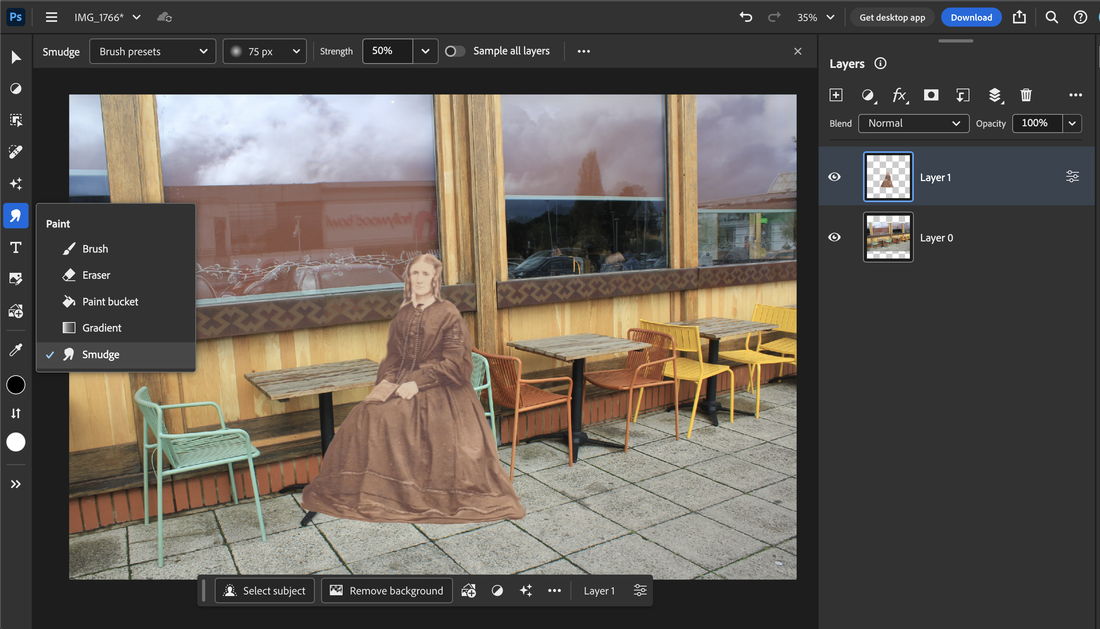
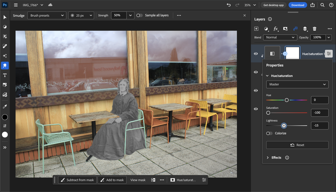
|
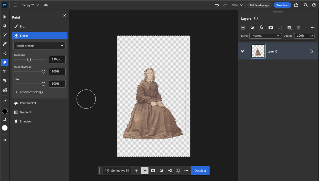
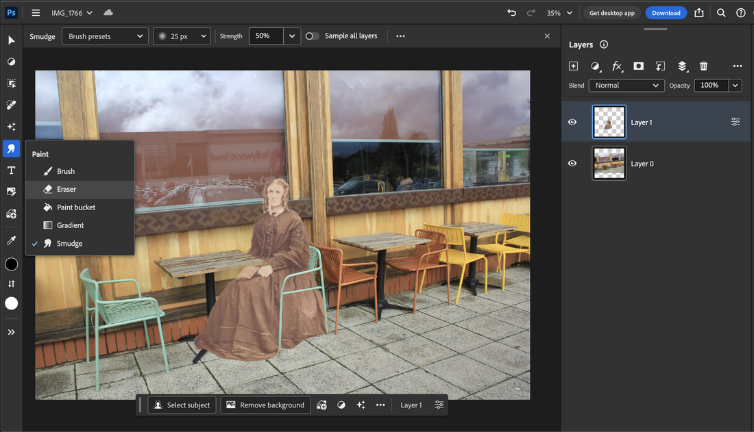
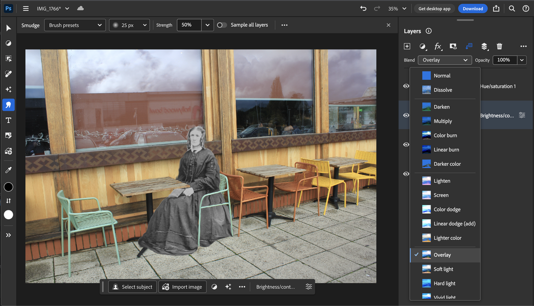
|
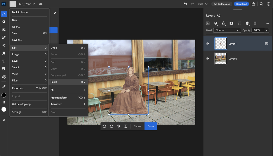

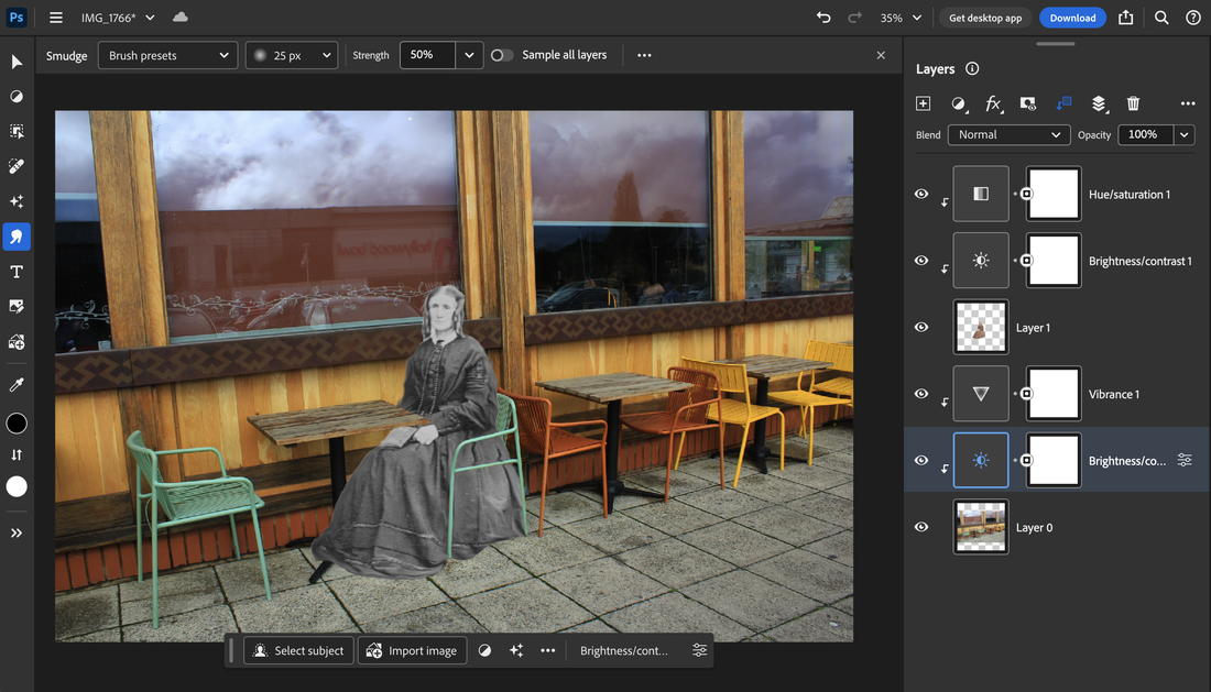
|
Now that I have these two photographs I can stat to move the figure around finding a way to make them more a part
of the scene for instance because the lady is sitting in this picture I can put her into one of the seats to make this more realistic I lower the opacity so that I can see the seat at the same time I then erase the areas of the subject where the seat would be
over such as the arms of the chair, I finally make my figure black and white to further the contrast showing a separation between
the figure and the environment she is in.
Final photographs
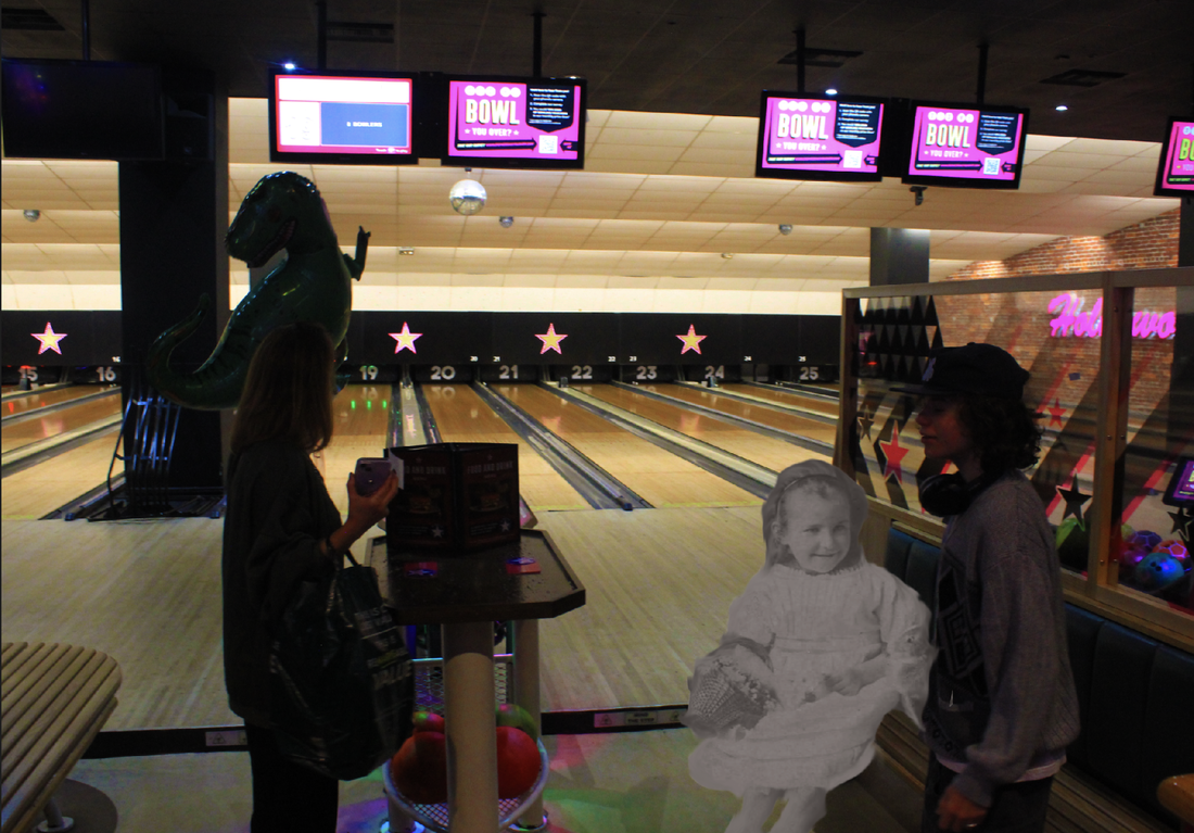
|
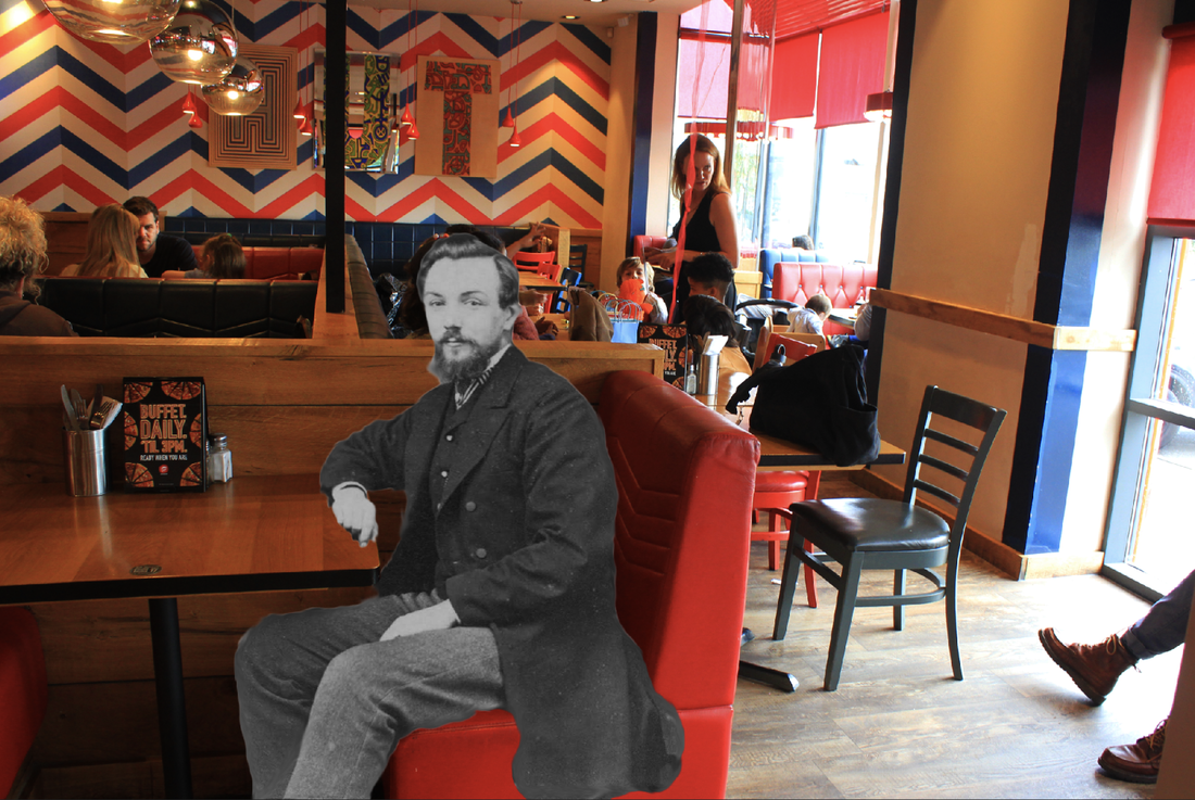
|
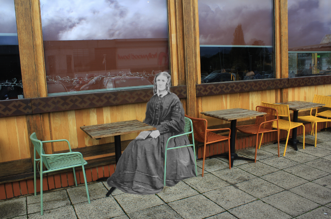
|
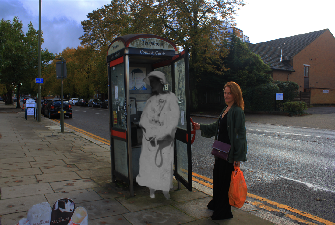
|

|
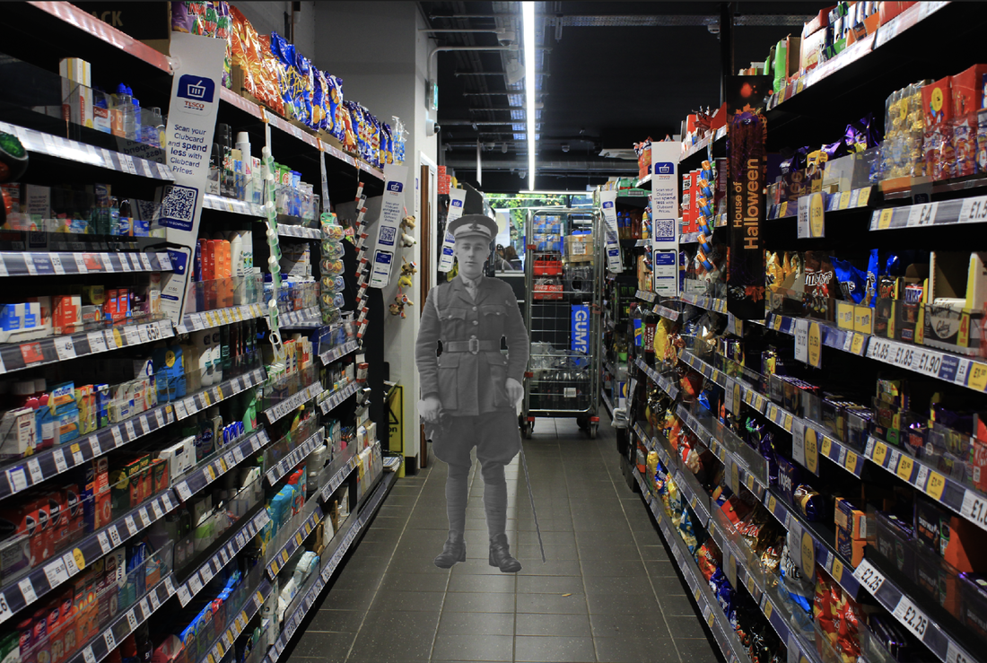
|
WWW:
What went well with these pictures is that I have edited the pictures so that the colours really standout against the
figures whilst also editing it so that that figure fit in smoother than in my previous attempts this is furthered by the black and white scheme in these figures
EBI:
These pictures could have been even better if I could bring in more of a storyline as well as different materials to make
the concept more creative and further the idea of combining the past with the present into one images
Eleventh development
Erwan Soyer:
After studying at the Estienne Paris school, Erwan Soyer has been developing his photography work since 2010 doing mainly collage work inspired by surrealist poetry and Land art, crossing multiple fields, themes and techniques, he uses books that are used or intended to be thrown away as a material. He explores a technique of folds inspired by baroque art, working the paper material in a raw and organic way. Deeply inspired by the European Surrealist collages of the early 20th century,
Erwan Soyer's collages are extraordinary works of art. Each piece is "one-of-a-kind" and entirely hand-made. Using recycled materials, pages from old books and vintage illustrations, Soyer crafts his collages into being using a scalpel and traditional bookbinding methods. Erwan learnt much of his technical collage technique from book-binding professionals,
who taught him how to understand and handle paper textures and conserve collage effectively.
In his works, characters travel across dreamscapes and explore crackled, undulating paper mountains. A beautiful female morphs into the Eiffel Tower. A man travelling in a newspaper hot air balloon peers down at the tiny dots of people on a beach below with a telescope. Tiny soldiers stand to attention against a landscape of newspaper print and black and white war photography. Erwan’s imagination is limitless and the boundaries of his surreal dreamworld are endless.
Erwan’s collages have explored themes such as politics, history, mythology, "utopia", science-fiction and the exploration of dreams. Aside from their intriguing and thought-provoking subject matter however, the collages are in themselves beautiful examinations of texture and surface. Erwan enjoys exploring the three-dimensional effects of the medium itself and has recently started experimenting with folding paper to represent dense geological forms.
Erwan studied Literature, Art & Cinema at the Diderot University in Paris, before completing a Graphic Design course at the Ecole Supérieure Estienne in Paris. When not producing collages, Erwan works as an artistic director and freelance illustrator in Montpelier in the South of France.
Due to their refreshing singularity, Erwan’s collages have been commissioned internationally. He recently produced illustrations for the Munich Opera and a book cover for the publisher George Braziller in New York. One larger collage is currently on display at the “Shooting Star” luxury ranch in Wyoming and he produced a large-format triptych for the beautiful Alpina Gstaad Palace in Switzerland.
Examples of his work:
I want to adapt his ideas to fit in to my previous work by using other materials such as paper I can move my photographs away from photoshop into more physical editing with cutting out and gluing down the different pictures.

|

|

|
Photographs taken:
I have taken photographs in and around London mainly photographing the different architecture and the busy day to day life that is happening around the city, I have taken pictures in places such as Oxford street, china town, covent garden and around soho
WWW
What went well with these pictures is that I have managed to capture photographs of lots of different types of architecture
with many different colours and designs, I have also made sure to photography the busy streets full of people
EBI
These pictures could have been even better if I could try to get better quality photographs by shooting on a clearer day
which would help to get clearer photographs
Photographs collected:
This time when collecting these old abandoned photographs instead of buying random ones I had a clearer idea of the type of photographs I wanted to buy, I focused on getting pictures with people sitting or standing in as well as photographs with vehicles because these are better for editing into photographs
Editing process
In making these photographs I first started off by selecting four different pictures of London that I have taken then I also select four of my collected photographs which I think would fitting the pictures I print out these eight photographs, I then cut out the figures so that they are the soul object meaning I can add them to the other photograph.

|

|

|

|
Then with the city pictures I add in a piece of paper to cover the picture then I manipulate it in some sort of way so that it will show the photograph that is under it I make sure to glue this all down and then finally I can add in my different figures I have manipulate each photograph so that they will fit together more.
First edit
These are the first edits before I have edited them at all in photoshop to add to the final picture


|


|
WWW
What went well with these pictures is that I have manipulated the paper separating the two photographs in each picture so that they fit together well telling more of a story and even adding some humor into the final images
EBI
These pictures could have been even better if I could get a clearer image as the photograph is quite grainy due to being photographed multiple times
Final edits
For these final images I have edited them in photoshop to make them more seamless for instance I have adjusted the brightness making the white paper on the background much smoother over all I have also altered the saturation to get a more vibrant picture which adds to the contrast between the people and the city scape

|

|

|

|
WWW
What went well with these pictures is that I have lasted the saturation making it much more vibrant and I have changed the brightness so the background is more seemless
EBI
These pictures could have been even better if I could in corporate more everyday materials such as newspapers or books furthering the idea on present verses past as a theme
Twelfth Development
Photographs taken in London:
|
|
|
|
For this development I have taken more pictures of London but this time I have focused more on location and quality taking better picture of architecture which I can print out and manipulate to make a whole different picture but this time incorporating materials such as a current newspaper and a new book to add to the idea of past invading the present
WWW
What went well with these pictures is that I have managed to photograph a wide range of locations around London with a variety of different architecture making for more opportunities when editing
EBI
These pictures could have been even better if I could have photographed more inside or crowded areas
Editing process:
This editing process followed the same frame as the previous edit but this time instead using a single pieces of plain
white paper I have decided to use pages from modern newspapers and book pages I have ripped up and created different frames
around each other the pictures which I chan then put my cut out figures onto
white paper I have decided to use pages from modern newspapers and book pages I have ripped up and created different frames
around each other the pictures which I chan then put my cut out figures onto


Final photographs
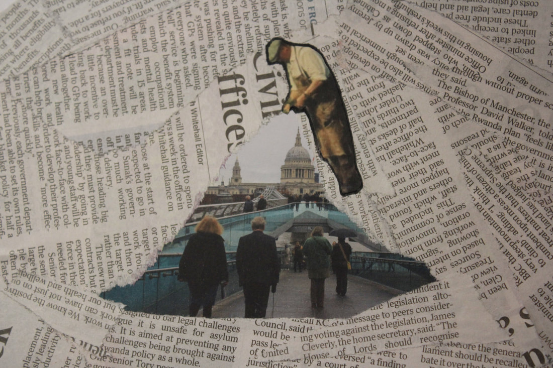

|


|
WWW
What went well with these pictures is that I have found ways of making it seem as though the figures are interacting with the surroundings and the frame helps to separate the photographs at the same time
EBI
These pictures could have been even better if I could have gotten clearer print outs for both the surroundings and the people
Editing process:
I have also decide to edit these pictures in photoshop creating a barrier between the figures and the city photographs I have done this by selecting areas around the edge of the cityscape using the selection tool and then erasing them this creates a separation between the images, I have also adjusted the brightness, saturation and contrast to enhance the photograph further.
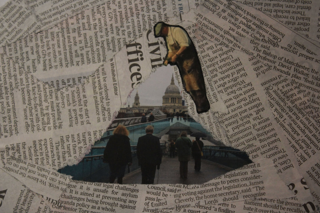
|
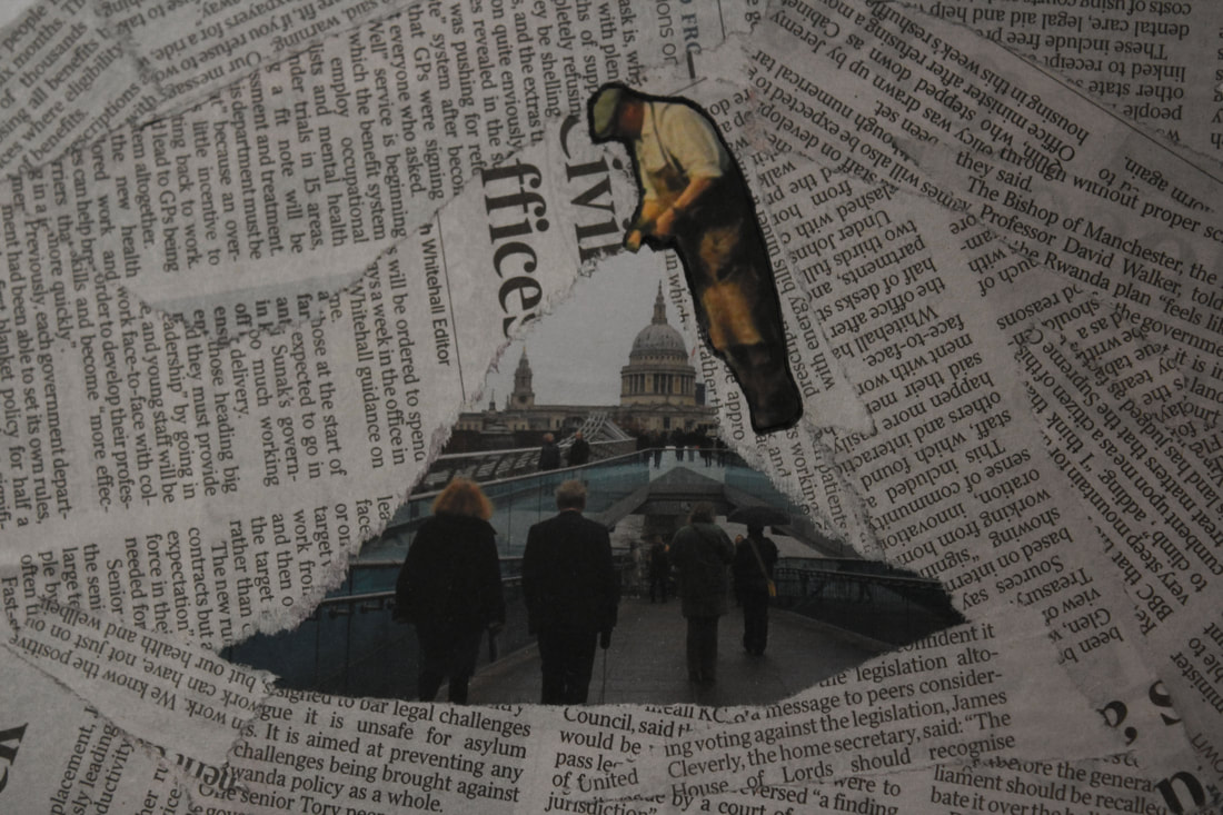
|
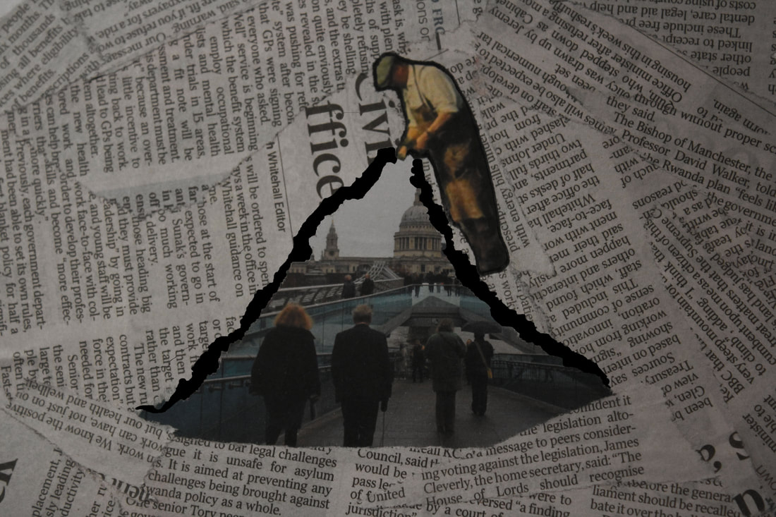
|

|
Final edited photographs


|


|
WWW
What went well with these pictures is that I have edited them in photoshop to created a barrier which greatly helps to add to the effect of both photographs helping them standout against each other more
EBI
These pictures could have been even better if I could have gotten sharper images since some quality was lost after I printed
them out
Thirteenth Development
Lisa Kokin’s
Lisa Kokin creates her art using recycled and reclaimed materials she has found at flea markets, thrift stores, and recycling centers she has worked with buttons, photographs, and other found objects. Kokin’s deft sewing skills stem from childhood; her parents worked at an upholstery company so her spare time was spent sewing unlikely materials together. Her early work involved stitching together found photographs, often resulting in startlingly surgical creations of children, weddings, and other subjects. She later worked with buttons to compose portraits utilizing the colors and shapes of the material. Kokin then began deconstructing books and using the paper and covers as her medium. She uses a blender that was handed down from her family to shred and pulp the paper so that she can morph it into various shapes, sometimes preserving select words or pieces of text, or creating anagrams from letters of the text.
SEWN FOUND PHOTOS I am intrigued with other people’s photographic recording of their lives both for the generic quality they possess -- the family and social rituals, studio portraits, vacation shots -- and for the feeling of sadness and nostalgia that acquiring other people’s memories provokes in me. I feel somehow that it should be illegal to own them, yet since they are for sale it might as well be me who buys them.
Sometimes there are inscriptions on the back (“Susie, 7 years old”) but more often they come to me stripped of all identity. I sit in my studio and speculate about the nature of the photographed people’s lives. I will, of course, never know the truth, so I feel it is my job to give them new lives and rescue them from the obscurity they would be headed for were it not for me, humble servant of the arts. I try to invent an altogether different identity for them but of course, in the final analysis these works are more about me than any of the hundreds of anonymous individuals who appear in my work.
Examples of her work:
|
|
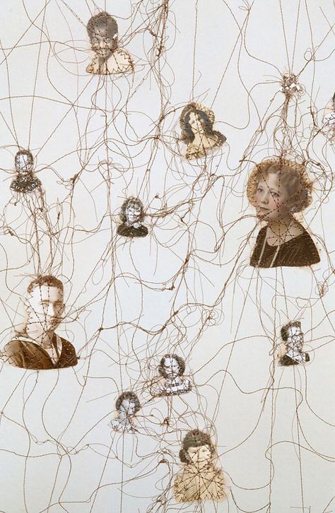
|
Editing process:
To make these pictures I have printed out eight separate pictures, four of todays city scape of London and another four of old vintage photographs I have paired these pictures so that they fit together, first thing that I do in combining these is using a lighter a burn a hole in the rough shape of my figure this is to add to the dated vintage feel of the photographs

|

|

|

|

|
I then add in a frame using either newspaper or book pages and repeat the burning process once I have my frame I can add in my figures and to do this I use sewing thread to sew them to the inner frame so that they are suspended in the centre of the photograph.
First edited/Final edited versions
|
|

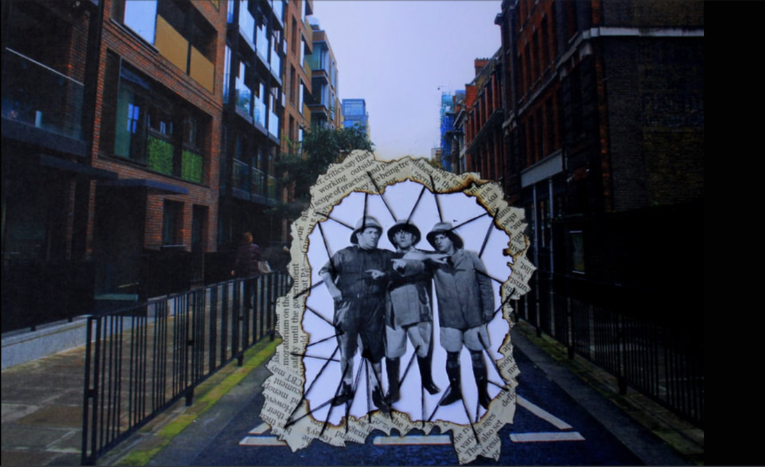
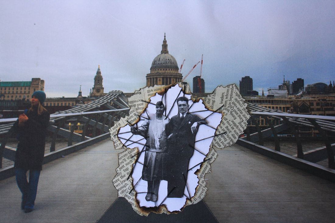


Final edit:


WWW
What went well with these pictures is that I have managed to have both images interacting whilst also separated at the same time
due to both the frame and the stitching
EBI
These pictures could have been even better if I could have gotten less fuzzy final printouts
What went well with these pictures is that I have managed to have both images interacting whilst also separated at the same time
due to both the frame and the stitching
EBI
These pictures could have been even better if I could have gotten less fuzzy final printouts
Fourteenth Development
For this development I want to experiment with the materials I am using I want to try transferring my taken and my collected photographs onto fabric with them on fabric I have more ways of manipulating and editing the photographs
Making process:
To transfer my photographs onto fabric I have to follow several steps first thing I do is to print out my selected pictures onto my transfer paper once that's done I cut out the pictures as well as a matching piece of fabric when I have both cut outs I can transfer the picture to do this I lay the picture over the fabric right side down and I layer over some sugar paper to stop any burns from the iron which I put onto its hottest setting when I have ironed on the picture I can peel off the transfer paper leaving the image on the fabric
|

|

|

|
All final ironed on images
WWW
What went well with these pictures is that I have transferred a wide verity of different pictures in back and white incorporating both taken and collected photographs as well as printing them in a range of different sizes the transfer process leaves worn looking photographs that add to the vintage theme in my photographs
EBI
These pictures could have been even better if I could experiment with different fabrics with different textures and colours
Fifteenth Development
Now that I am working on fabric I can explore different ways of making my images more creative one medium I particularly want to explore is embroidery with this I can bring both colours and patters to my work.
Flore Gardner


Flore Gardner is a Scottish-French artist living and working in Edinburgh.
Flore Gardner is a visual artist and her practice explores drawing different forms, from small diary drawings to embroidery and knitting to monumental installations of cord. the idea of line is essential to her work, be it the drawn 2D lines or the embroidered/knitted/sewn 3D thread.
She obtained a doctorate (Ph.D) inn fine art at sorbonne university in Paris in 2007 and has been exhibiting work in the UK, France and internationally since 2004.
No matter the material, each work centers on a primary interest in drawing and utilizes the same techniques and principles that fill the pages of her notebooks.
One of Gardner’s series, titled (Her)Stories, overlays vintage, black-and-white photographs largely sourced from flea markets with vibrant stitches. As the name suggests, the collection focuses primarily on women, and the embroidered elements obscure faces with dense patches, add dimension to a subject’s body, or highlight their figures by drawing a contrast to the backdrop.
Revitalized with color and texture, the portraits and posed group shots take on a new narrative with the artist’s thread drawings and “modify the ‘reality’ of the photos, revealing hidden things underneath (eg. unseen naked bodies under wedding clothes, invisible haloes, hidden thoughts) or on the contrary hiding certain details (threads shroud the inevitably dead figures or ‘ghosts’).” She explains further:
The needle is an instrument for hurting and for healing—a photograph (or human skin) can be damaged by its treatment and simultaneously repaired/recreated. This needle makes hundreds of little holes in each photograph, once a precious object, and these, along with the threads, transform the flat, smooth, untouchable photographic support into a relief surface, which can be touched and even, in a certain way, read like Braille.
My attempt of Gardners work:
I have taken four different images on fabric to embroider onto I have used vibrant colours and a variety of patterns and techniques exploring how the work with the fabric images

|

|

|

|
WWW
What went well with these pictures is that I have taken four of my previously transferred photographs and I have embroidered over the top of them what I think was particularly successful was the contrast between the black and. white photographs with the vibrant coloured embroidery threads that I have used
EBI
These pictures could have been even better if I could get cleaner transfers with no ripples on the pictures and if I cloud further experiment with the embroidery
Sixteenth Development
To further explore I want to try transferring my images onto a different material and in colour for this I have chosen tape.
To transfer my images onto this see through tape material I start by printing out a selection of both my taken and my collected photographs this time choosing to print them in colour.
To transfer my images onto this see through tape material I start by printing out a selection of both my taken and my collected photographs this time choosing to print them in colour.
|
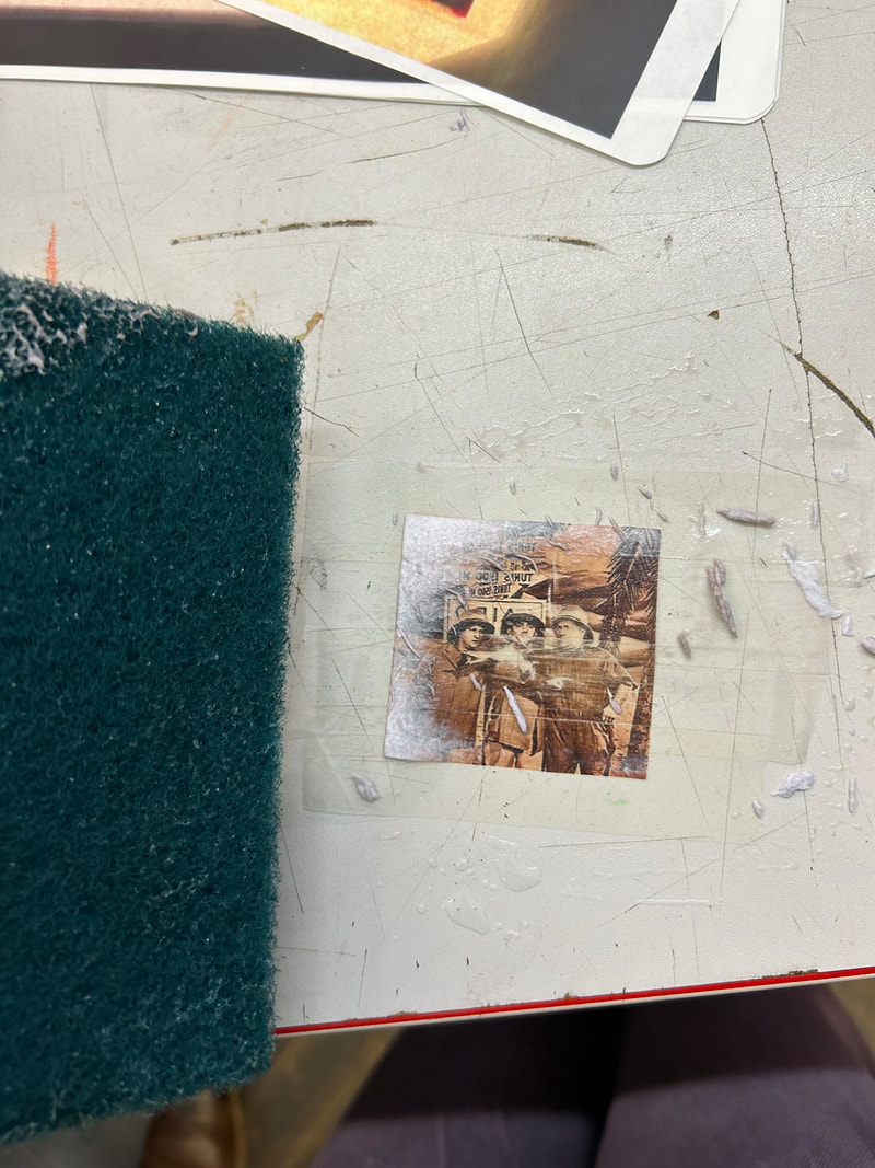
|

|
once I have my print outs I can cut them down to my desired size, once that is done using a clear roll of tape I cover the front of the photograph and using a damp sponge is start to carefully scrape off the back of my photograph leaving only a coloured imprint on the plastic with no paper left.
Transferred photographs:
WWW
What went well with these pictures is that I have successfully transferred these images with the colours coming through clearly creating these interesting distressed, see through images on plastic
EBI
These pictures could have been even better if I experiment with using a different material than tape as it is more difficult to work
with but the results are effective
Seventeenth Development
For this next development I wanted to take I wanted to bring together all these ideas into one piece so I take ideas from each of my previous developments and collage them onto one piece of cut out fabric, I take one of my plastic transferred pictures, one of my fabric transferred pictures and a piece of either newspaper or book pages and using glue I stick them all together onto the fabric
My collages:
WWW
What went well with these pictures is that I have successfully managed to collage all my different transfers together and show
the different sizes and designs on one piece of fabric, by overlapping thee plastic transfers with the fabric you can the the more see through aspects
EBI
These pictures could have been even better if I could get a clearer versions of my fabric transfers which did not have a
wrinkles or creases in them
Eighteenth Development
I wanted to start to incorporate more materials to do this I bring in the theme of embroidery, with thread I create different creative boarders around my pictures this thread also helps to secure the pictures to the fabric
Bordered versions:
WWW
What went well with these pictures is that I have sewn a wide variety of different creative borders these not only help to secure
the pictures onto the fabric but also help to further frame these transferred photographs
EBI
These pictures could have been even better if I further explore the different patterns I could create with this
embroidery thread
nineteenth Development
once I have my embroidered boarders around my picture I wanted to add in some coloured embroidery in different patters around the outside of the pictures I made sure to choose bright and vivid colours to create more contrast between my darker coloured transferred photographs the bright colours of the embroidered patterns
Coloured embroideries:
WWW
What went well with these pictures is that I have managed to come up with different creative patterns for each of the collage pages
and I have tried to pick colours that go well with the pictures and are bright and vivid
EBI
These pictures could have been even better if I could experiment with these patterns so that the interact with the photographs
or so that they have more of a narrative to go with them or even correspond with the actual photographs and
what they are showing
My final piece


For my final piece I wanted to bring together all of these separate pieces of fabric and using a sewing machine join them all
together to create one big final piece that shows all of these different pictures together and all the different techniques I have used to embellish them
together to create one big final piece that shows all of these different pictures together and all the different techniques I have used to embellish them

WWW
What went well with these pictures is that I have machine sewn the collages together so they are all together to make one big pieces and them being side my side help to show all the individual pictures and it helps convey all the different techniques I have used in making this big piece such as embroidery and different photo transfers such as on fabric and plastic
EBI
These pictures could have been even better if I could get a clearer final image of this piece it could also be interesting to experiment with the way I attach these pages together using techniques like crochet or knitting
