Abstract Photography

Abstract photography consists of images created using photography materials and equipment that don't have an
immediate association with the physical world.
Abstract photographers often use perspective, movement, and light to transform the world we see into an
unexpected unrecognizable image.
The main characteristic of Abstract Photography is Form, Colour and Texture. Form – Form refers to the shape of the subject.
This generates the bulk of the image and leads to the subject of abstract photography.
Colour – Vibrant colours or the lack of colour really play a huge role in abstract photography.
The conventional job of the photographer is to select and capture a small portion of reality in a relatively faithful manner, Unlike other visual art forms which begin with a blank space or surface that has to be filled by the artist with a subject or model abstract photography is a more flexible style.
However, it could be argued that all art, including photography, is essentially abstract.
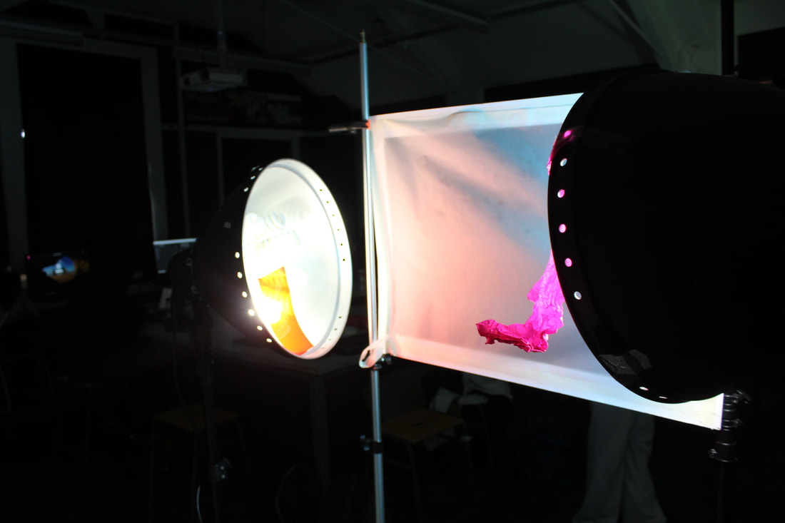
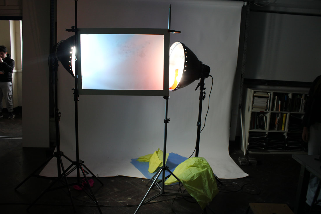
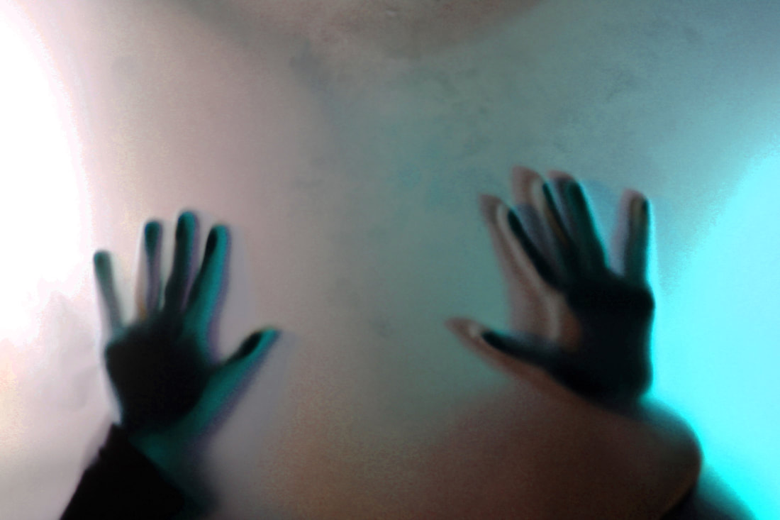
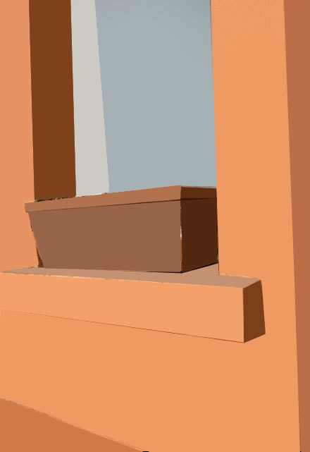
The white paper test
To produce these images named white paper test i used three things: first i and most importantly need a normal sheet of plain paper which i then move onto fold/ crumple it up to make different interesting shapes, second i need different coloured plastics which will the cast all of the different colours, lastly i need a torch for this instant i used my iphone torch which is then placed behind the coloured plastic the colour will then be projected to cast the light over the misshaped paper
Best photos


WWW
In these pictures i have made use of a wide variety of colours like blue, red, green, purple, and orange i have successfully combined a lot of these colours so that they contrast as well as blend together. The different ways that I have manipulated these pieces of paper meant that the light hits the paper differently casting more effective shadows creating more contrast
EBI
These photographs could be even better if next time I could try to include more ambitious types of origami to help add to the
effect of the photographs
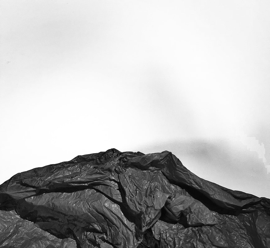
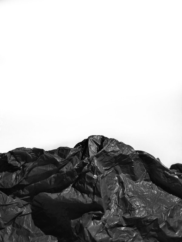
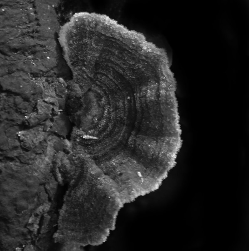
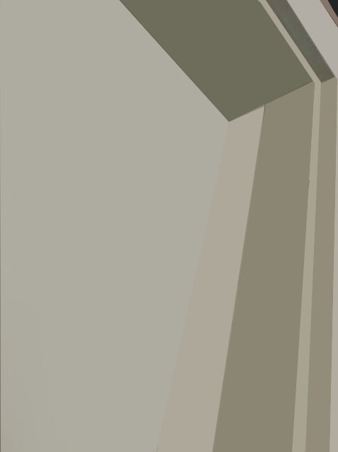
Brendan Austin
Looking at this artist helps to continue on with the theme of manipulating paper and using lighting to enhance the photographs but instead of using different colours I am experimenting with the effects of using a black and white colour scheme


Brendan Austin creates mountainous type landscapes out of crumpled up pieces of paper.
Austin examines what we mean by nature and the way humans have impacted upon it, he uses simple materials which are used to carry an important message, his process is also an important aspect of the work, By printing the original mountain onto thin newsprint material and then working by hand on the paper to destress it giving it texture to look more rock like and mountainous, then photographing the results and repeating several times, He calls these pieces of work 'paper mountains'.
His photography represents the isolated desert city running on oil generators, the Mars like landscapes of a volcanic environment and the mountains made from paper all attempt to start a conversation concerning the loss of meaning and reality, Building a sense of desertification in the various bodies of work.
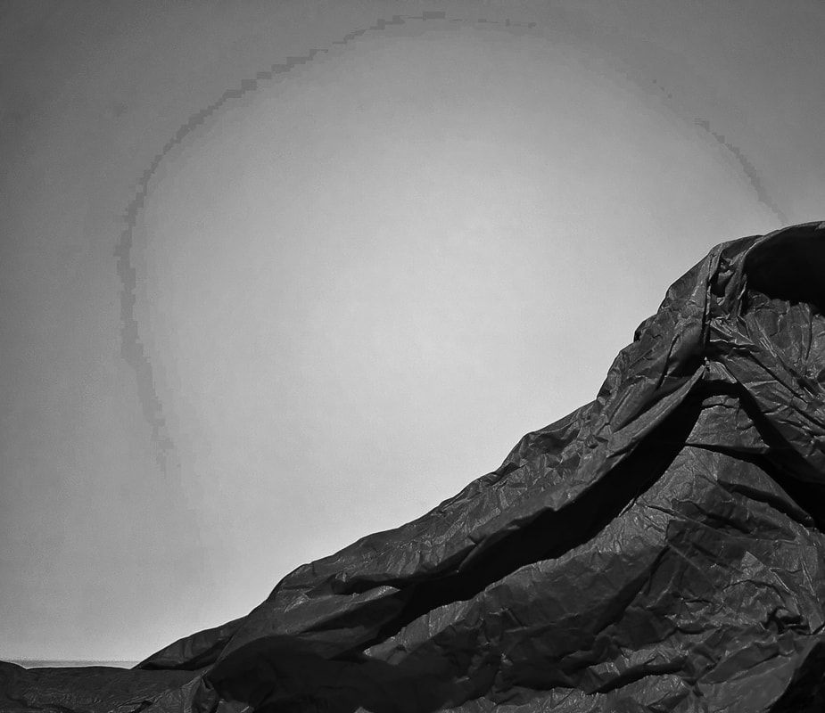
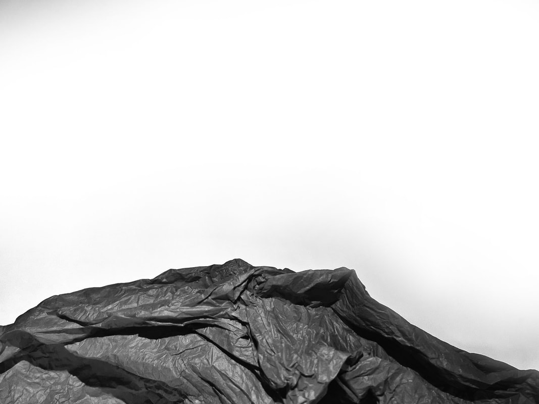
My first Response
For my process i use coloured tissue paper unlike Brendan Austin who uses thin newsprint material which he thens prints the original mountain onto i have decided to use this coloured tissue paper a more simplistic and easier approach,
i have chosen a darker a colour which will contrast better against the plain white background the actual colour do not matter cause i will edit the best photos to be black and white in photoshoot in the end.
To make the rock like texture i have crumpled up the paper and the rearranged it for each picture to make a wide variety of mountainous like forms.
WWW
What went well with these picture is that I have taken a wide variety of pictures managing to photograph lots of different
formations in the paper as well as taking clear shoots against this white background meaning it will be easier to edit in the next stage
of the project.
EBI
These pictures could be even better if could have gotten a cleaner background without as much shadows it also would have been easier if I had already used black paper meaning I wouldn't have to edit that in photoshop
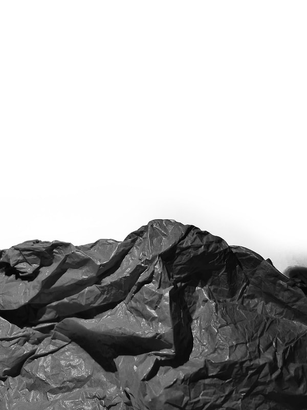
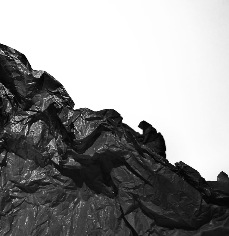
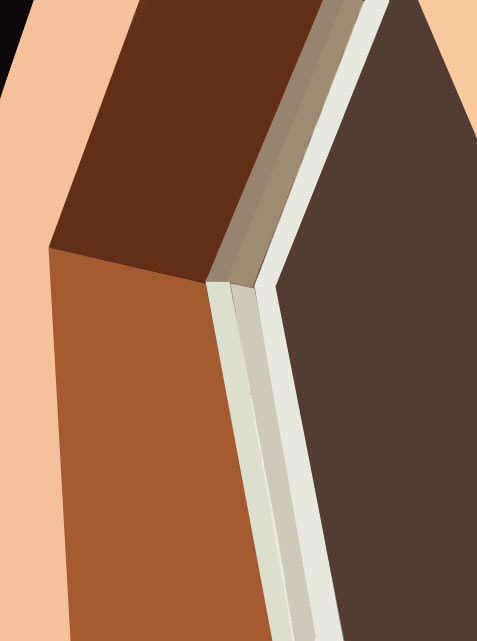
Edited Version's
To finalise this process i first pick the best photos from the selection of the pictures i took, after that make i most importantly adjust the colour to make the photo black and white to reflect Brendan Austin's style,
next i adjust the brightness and contrast which then emphasises the more rock like textures during this process the plain
background gets slightly adjusted casting shadows which i have later gone back and fixed in photoshop i have done this by using a layer mask to make a plain background again which helps the contrast with the paper
WWW
What went well with these picture is that by editing these pictures and only focusing on the paper I can get the best
result adjusting the brightness and contrast were very effective in highlighting the folds and wrinkles in the paper making it look more realistic and adding to the effect
EBI
These pictures could be even better if the background wasn't effected as drastically so I would not have had to fix that
further in photoshop
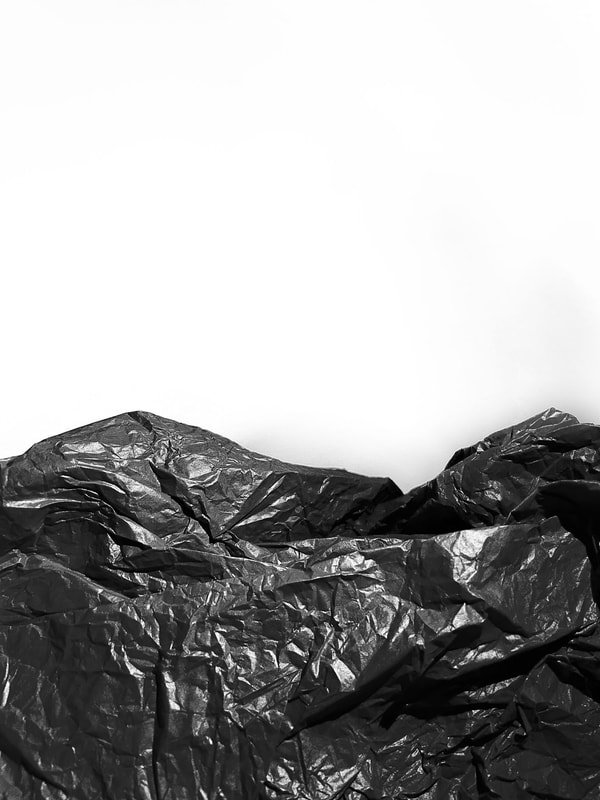
Best Photo's first edits
These are the first round of edits on these paper mountain photos using photoshop in these pictures
i have mainly focused on editing the paper meaning that the background now has some shadows and imperfections so my next stepping this editing process is to go back into photoshop and fix this creating a plain white background so that the paper is the soul
focus of the photograph
i have mainly focused on editing the paper meaning that the background now has some shadows and imperfections so my next stepping this editing process is to go back into photoshop and fix this creating a plain white background so that the paper is the soul
focus of the photograph


|


|


|


|
Second/final edits
For these final edits i have used a layer mask to fix the background making it plain white again, with the layer mask i
have adjusted the brightness and contrast to make the background plain again then i have layered the picture over the
previous one using the paint brush to show the bottom layer where the paper is leaving me with a final image
of the previous rock like paper and a new blank background
have adjusted the brightness and contrast to make the background plain again then i have layered the picture over the
previous one using the paint brush to show the bottom layer where the paper is leaving me with a final image
of the previous rock like paper and a new blank background


|


|


|
|
WWW
What went well with these picture is that now that I have edited the background in photoshop to make it plain meaning it
won't take away from the main subject of the photograph also allowing for the paper to standout more against the blank background building onto the contrast
EBI
These pictures could be even better if next time I was able to push the illusion even further to make it more realistic like Brendan Austin does with his photograph maybe even exploring with colours to create the effect of greenery
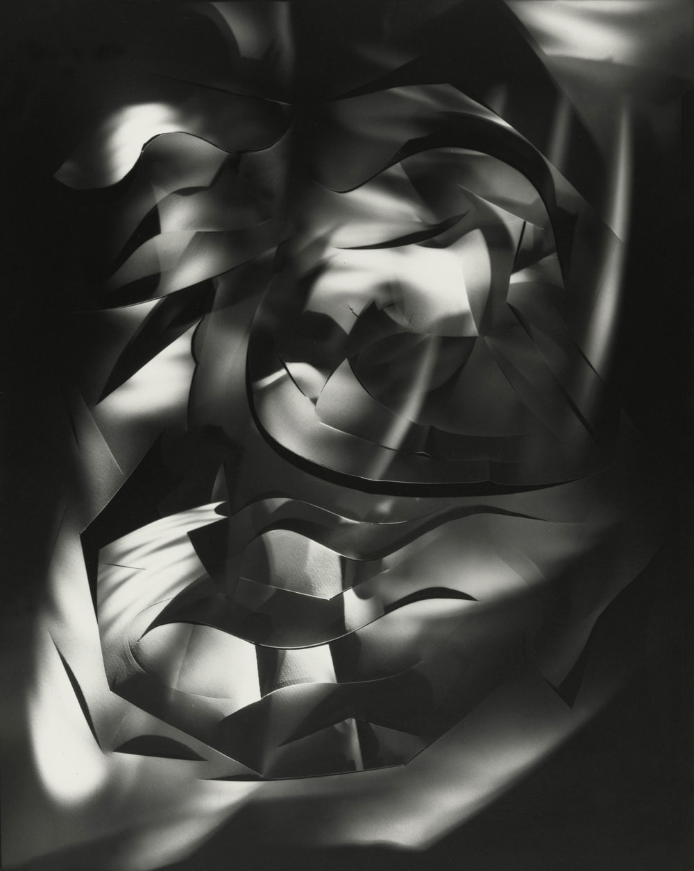
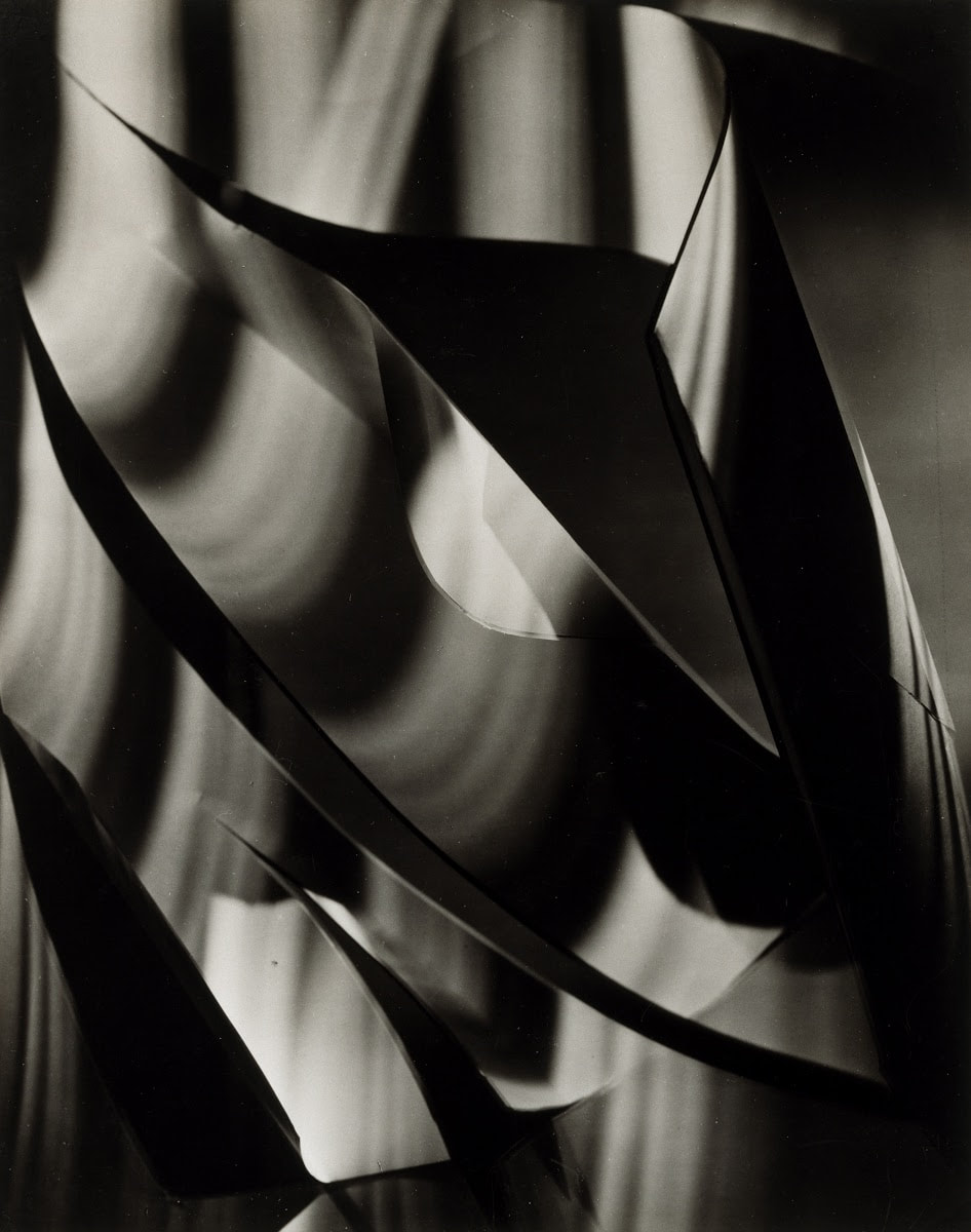
Francis Bruguiere
Francis Bruguiere was an American photographer who moved to London in 1928 where he began to experiment with non representational photography his photography work consisted of cut up paper in a abstract style which
results in a dark shadowed photo,
Francis Bruguiere works by exploiting the mediums of both paper and light, manipulating both in order to create complex patterns that form a variety of captivating shapes made from lights and shadows
results in a dark shadowed photo,
Francis Bruguiere works by exploiting the mediums of both paper and light, manipulating both in order to create complex patterns that form a variety of captivating shapes made from lights and shadows
|
|
|
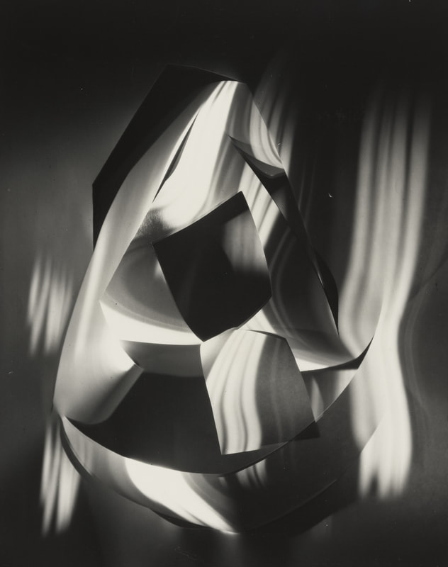
My Response
For my photographic response to Francis Bruguiere's paper shadow photography i have used a dark backdrop adding
to the effect i have then used a A3 sheet of paper cutting shapes into it mostly curving lines which create a nicer shadow later on, after that i have cut up more paper making shapes i have then used this sheet to cast the shapes onto the previous paper i have used
a torch to do this making a final image which i can then edit in photoshop to enhance the effect to make it
more in the style of Francis Bruguiere
WWW
What went well with these picture is that I was effectively able to create a shadow and lighting effect with the cut up paper,
I have also managed to create a wide variety of different images that show different patterns which is helpful for when I come
to editing later on In photoshop
EBI
These pictures could be even better if I could have gotten the the shame darker colour scheme that Francis Bruguiere gets in his photographs instead of having to fix this in photoshop
Final Edited Version's
These are the final images which i have all edited in photoshop to make them more in the style of
Francis Bruguiere i have started this process by making all the pictures black and white like Francis Bruguiere does in
his photography after doing this i then adjust both the contrast and the brightness to further emphasis the shapes
making them sharper and more prominent, finally in my editing process i crop the images to get rid of any ruff edges
choosing to keep focus on the main picture
WWW
What went well with these picture is that I by making these photographs black and white in photoshop I have managed
to much further enhance the already existing contrast between the light and shadow as well as better highlight the different patterns made by the cuts in the paper
EBI
These pictures could be even better if I could incorporate more light like Francis Bruguiere does in his versions of this
type of photography style
Best Photo's
These are the best images from the selection of edited photographs i have done previously in photoshop I have made sure to present the variety of different patterns I have captured especially using both light and shadow


Edward West
Ordinary to Extraordinary
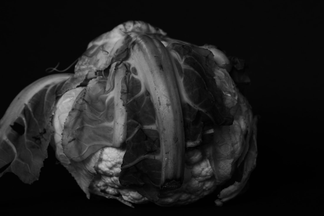
Edward Weston (1886-1958) was a 20th century American photographer who has been called one of the most innovative and influential American photographers and a master of photography and composition.
His career spanned 40 years and he photographed an expansive set of subjects, including landscapes, still-life, nudes,
portraits, and genre scenes.
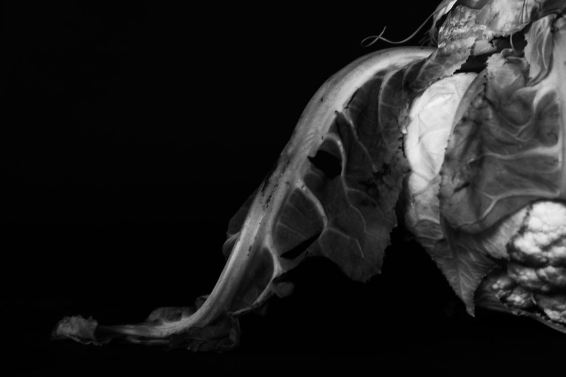
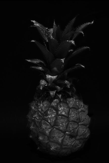
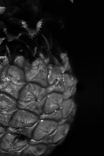
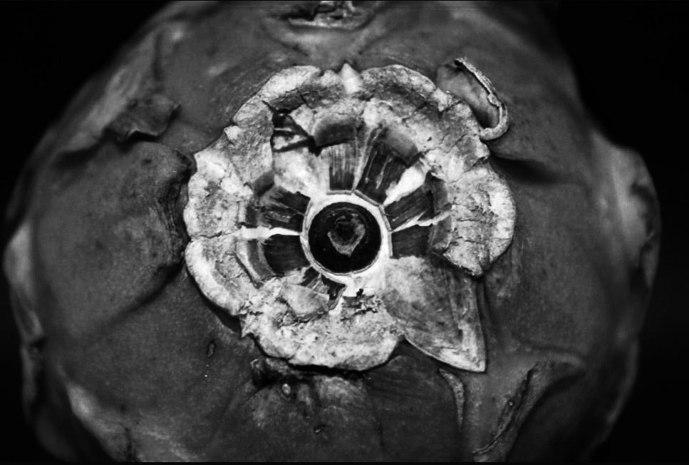
Some of Edward Weston’s most famous work was close-ups of vegetables and fruit, photographed in a way that captured the “essence” of the object by taking them out of context.
By creating photographs that transformed his subjects into abstractions of shapes and patterns, he helped to bring photography out of the shadow of painting and stand on its own as a credible art form.
He manipulates a combination of light and shadow which helps to emphasises shape, texture and form.
In his photography he primarily using an 8×10 large format camera, and was known widely for his black and white “landscape like” still lives.
Edward Weston (1886-1958) was a 20th century American photographer who has been called one of the most innovative and influential American photographers and a master of photography and composition.
His career spanned 40 years and he photographed an expansive set of subjects, including landscapes, still-life, nudes,
portraits, and genre scenes.
Some of Edward Weston’s most famous work was close-ups of vegetables and fruit, photographed in a way that captured the “essence” of the object by taking them out of context.
By creating photographs that transformed his subjects into abstractions of shapes and patterns, he helped to bring photography out of the shadow of painting and stand on its own as a credible art form.
He manipulates a combination of light and shadow which helps to emphasises shape, texture and form.
In his photography he primarily using an 8×10 large format camera, and was known widely for his black and white “landscape like” still lives.
Examples of his work

|

|

|
My Response
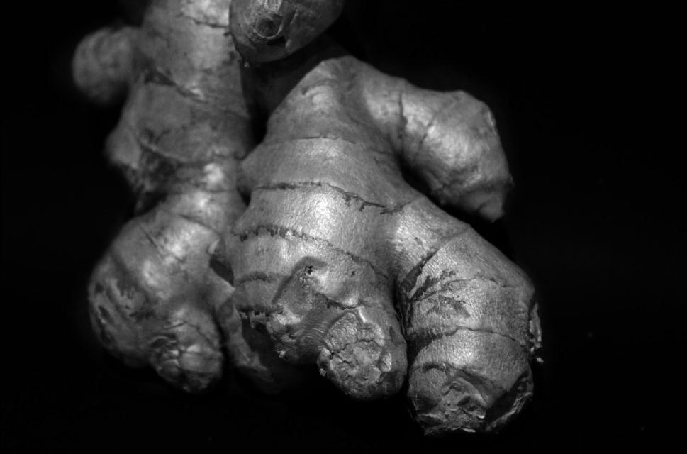
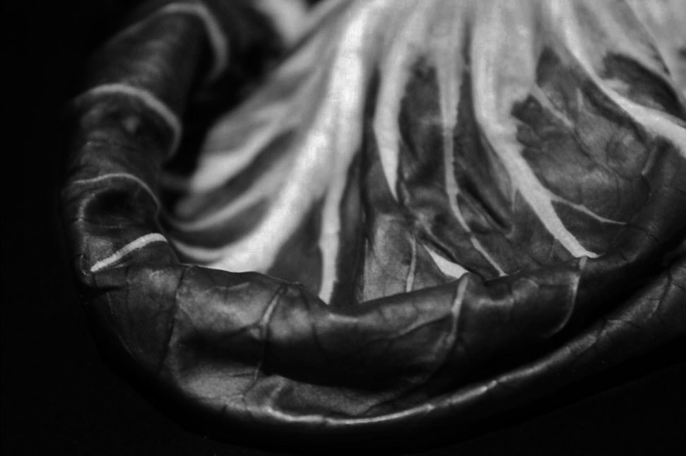
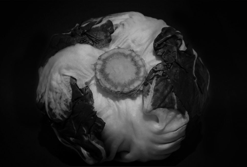
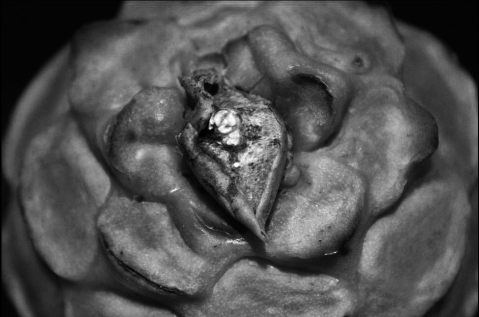
In response to Edward Weston's 'ordinary to extraordinary' fruit and vegetables photography work,
i have taken a wide variety of pictures using both fruit and vegetables as my subject
like Weston does i have used lighting and a black background to get the pictures i will next move onto photoshop
to make them more in the style of Edward Weston such as making the pictures black and white
like his photographs
WWW
What went well with these picture is that I captured photographs of a variety of different vegetables and fruits to photograph I
have also successfully used the dark backdrop with the over heading lighting to create nice contrast and highlight onto
the different subjects
EBI
These pictures could be even better if I take photographs of more obscure shapes highlighted within the vegetables
and fruits like Edward Weston has done in his photography series of fruit and vegetable
photography
Editing process

|

|

|
|
1
First step in photoshop editing process i select one of my more successfully taken pictures from my selection i then adjust the colour balance to make the picture black and white 
4
Once the image is cropped and the subject is edited i move onto editing the background i use a layer mask to create a complete black background with no shadow to enhance the contrast making the subject the primary focus |
2
Next i adjust the contrast to make the details stand out better enhancing the effect of the picture 
5
This layer mask works by me making two copies of the photo i am editing the original and another i then adjust the brightness and contrast on the second copy to make a completely black background after that i use the brush tool to erase the top layer revealing the original subject with the new background |
3
I then crop the image to make the subject the primary focus of the photograph 
6
I then get this as my final image |
Final edited versions

|

|


|

|
WWW
What went well with these picture is that through editing these picture into black and white I have been able to
emphasis the highlights and contrasts on the different vegetables and fruits much more and by making the background completely
dark it helps to further this even more
EBI
These pictures could be even better if could have more edited full photographs of the different vegetables and fruits
Daylight version
For this daylight photoshoot based off of Edward Weston's 'ordinary to extraordinary' fruit and vegetables photography i have used natural light instead of the artificial lights which i have used in my previous photoshoot to light-up my photographs to test out and compare the different results that I get between the two different photoshoots
What went well with these picture is that I was able to get much fuller photographs but I had a much milder light source compared to the previous photoshoot this made for much evener photographs with less drastic highlights and shadows which allowed for much smoother final photographs after editing due to the softer lighting on the subjects
Edited versions

|

|

|
|
|

|
What went well with these picture is that is that because of the softer lighting source I was able to get much smoother
images after editing them and adjusting aspects such as the saturation to make the black and white I was able to get more shades instead of just black and white more greys as well if I were to redo this photoshoot I would try to use different vegetables
and fruits that were more obscure to create more interesting photographs
At home photoshoot
My Response
For this at home photoshoot based off of Edward Weston's 'ordinary to extraordinary' fruit and vegetables photography
work i have tried to select more of a variety in the fruits and vegetables i am using as subjects for instance i have taken
colour, texture and shape into consideration this time to try and make a more interesting picture,
Edward Weston's photos focus of creating abstract images from the ordinary objects i am trying to convey
that more in these photographs
For this photoshoot I have taken all the successful elements and the notes from the previous shoots and combined
them for this final photoshoot, so for this shoot I have mirror the previous set up using a black background with a over head light but a more gentle one so I still get the highlighted shadows but also the different shades I have also selected more
obscure vegetables and fruits to enhance the effect such as dragon fruit and ginger
Edited versions
|
|
|
|
|
|

|
|
I have edited these photographs in the same fashion as I have done with the previous photoshoots what went
well with these photographs is that I have include a variety of different subjects shoot from different angles and using photoshop
I have highlighted the shadows and still highlighted the different tones throughout the subjects, if I were going
to do another photoshoot I would experiment with the different colours and textures
Abstract Comparison:
body and nature Alicja Brodowicz


Visual Exercises is a photo project by Polish photographer Alicia Brodowicz, who searched for similarities between the human body and nature and then created side by side images to show them against one and other.
"I photograph the human body – the microcosm,Its’ fragments: hair, scars, texture of skin, wrinkles. I am interested in individual particularities; I look for distinguishing features and irregularities. Imperfections are my favorites.”
“I photograph nature – the macrocosm,Surface of water, grass, tree bark, dry leaves. I combine the two images, looking for converging lines, textures, similarities in layout and analogies in composition between the microcosm and the macrocosm. I look for unity between the human body and the nature.”
My respons
Nature Photos |
Body Part Photos |
I have taken four different sets of photographs two sets of nature photography two sets of photography of different body parts, the different photoshoots where taken in different places the first nature shoot was taken around my school campus and the second was taken in the woods making for better material, and for the photoshoots with people the first photoshoot was with family members and the second was with my classmates
|
|
|
|
|
|
with these pictures I have walked around the the woods and taken pictures of any different shapes and patterns that I thought I could match up to the different photographs I have taken of peoples features up close
Edited versions


|


|
WWW
What went well with these picture is that by editing them in photoshop to make them black and white it has helped
to highlight the similarities between the different pairings I have matched the dark background has also helped to empathise the subject of the photograph
EBI
These pictures could be even better if could have matched more similar pairs if I were to redo this
photoshootI would start with new photographs of features the I would go and search for more obvious matches in the
woods and I would use photoshop to help highlight the similarities
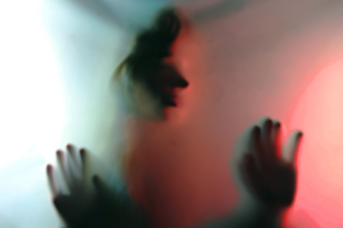
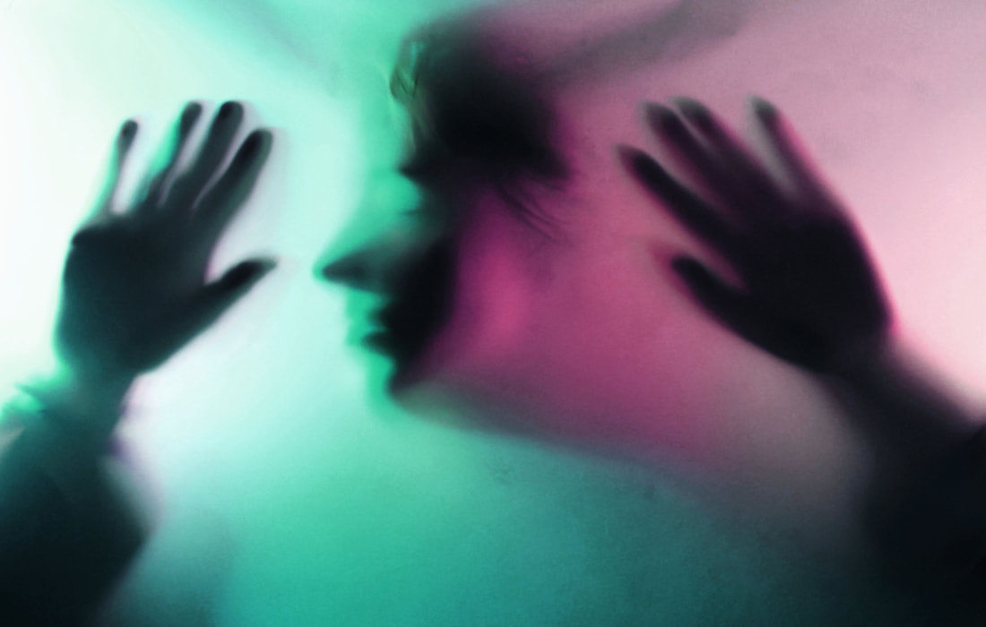
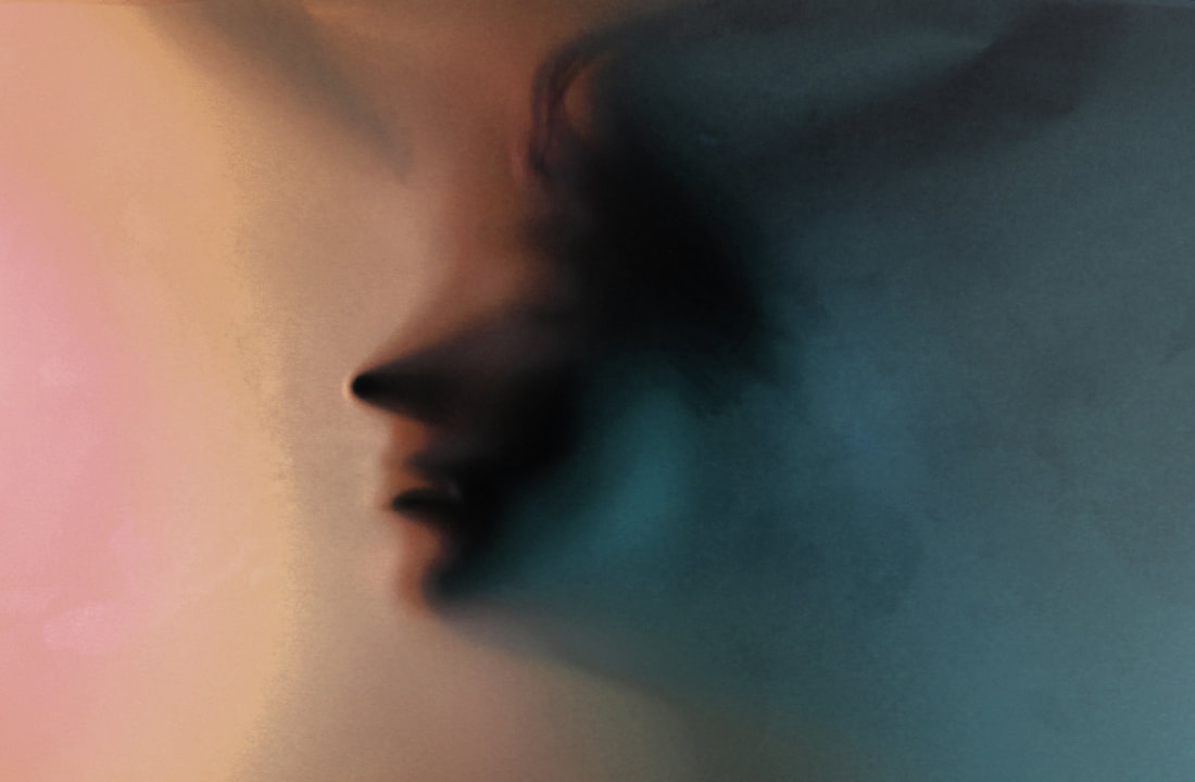
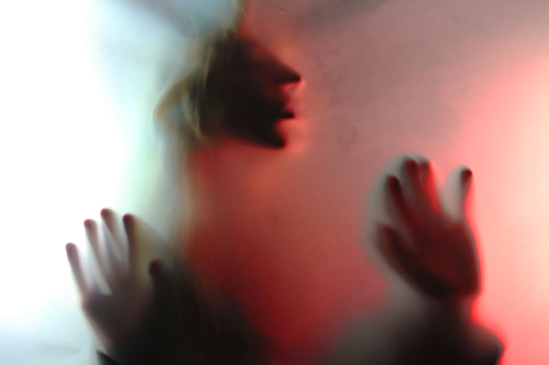
Bill Jacobson
Bill Jacobson (b. 1955, Norwich, Connecticut) is widely known for his out of focus photographs of both the figure and the landscape. His work is in the collections of the Guggenheim Museum, the Metropolitan Museum, the Whitney Museum, the Victoria and Albert Museum, and many others.


In 2012, he was the recipient of a fellowship from the John Simon Guggenheim Foundation.
He began his signature, indistinct out of focus images in 1989, and has since been exhibiting in galleries and museums throughout the US and Europe.
These early works, titled 'Interim Portraits' these pictures feature shadowy, pale figures that evoke an eerie ghost like photograph.
He began his signature, indistinct out of focus images in 1989, and has since been exhibiting in galleries and museums throughout the US and Europe.
These early works, titled 'Interim Portraits' these pictures feature shadowy, pale figures that evoke an eerie ghost like photograph.
The Photoshoot Set-Up
|
This is the set up we used for this Bill Jacobson inspired photoshoot we used two stand up lights for the lighting over the face to make the ghostly effect through the sand paper we have also decided to add colour unlike Jacobson's work which is primarily white, to get these colours we have used coloured paper over the lights
|
|
My response
What went well with these picture is that I have managed to capture the ghostly like images that Bill Jacobson
shows in his photographs but in my version of these pictures I have also focused on colour schemes which I have achieved by
putting different coloured paper in front of the two overhead light sources I have used. I photographed a wide
variety of photographs with different colours and positions
shows in his photographs but in my version of these pictures I have also focused on colour schemes which I have achieved by
putting different coloured paper in front of the two overhead light sources I have used. I photographed a wide
variety of photographs with different colours and positions
Edited versions
|
|
|
|

|
|
In editing these pictures in photoshop i have focused mainly on the shadows cast by the model and the vibrancy and
pigment of the different colours, for the shadows I have adjusted the contrast and the brightness to make the shadows darker and
more emphasised with the colouring I have increased the vibrance and also change the pigment on them which helps manipulate
the different shades and tones of the photographs so that the is more variety in the colours of the photos.
If I were to retake these photographs I would like to experiment with using Bill Jacobsons colour scheme of mainly white and
grey then compare the results of both final photographs.
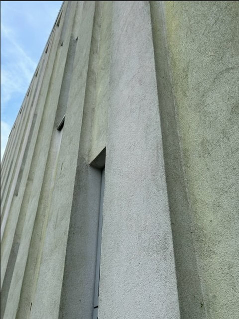
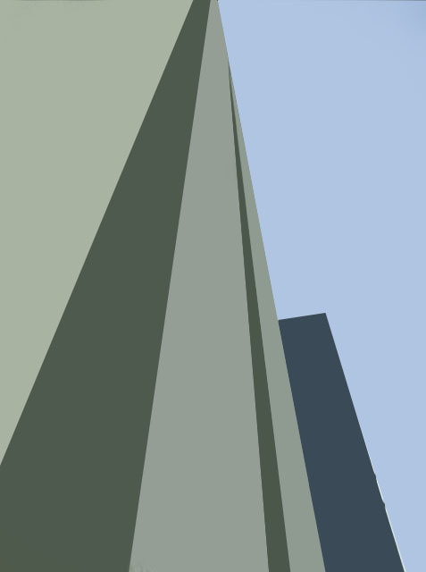
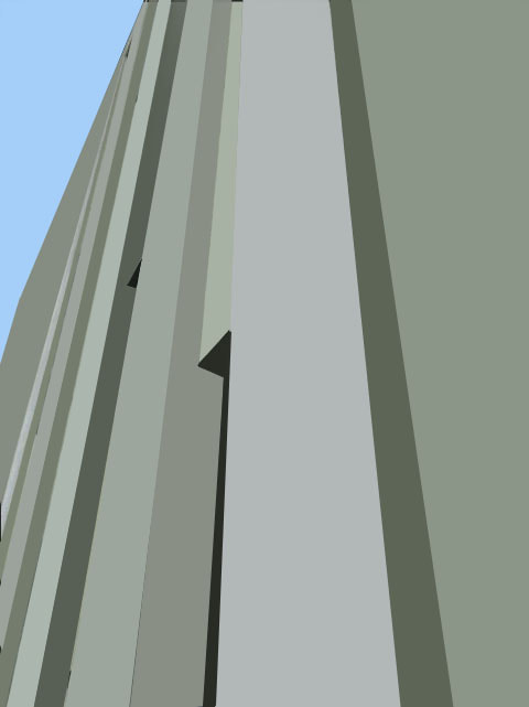
Johnny kerr
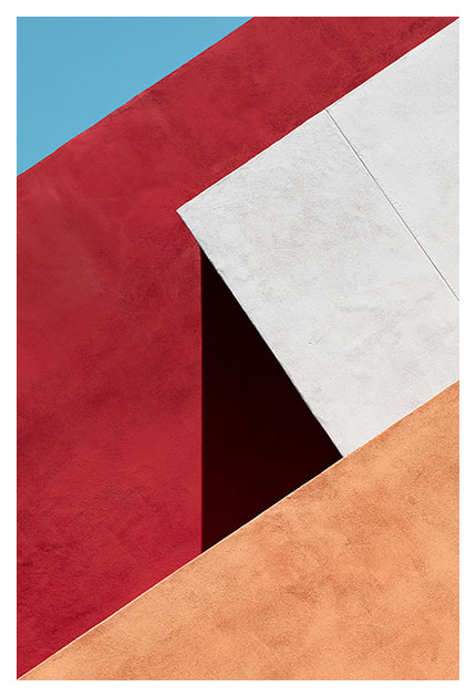
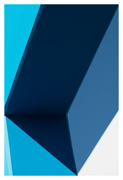
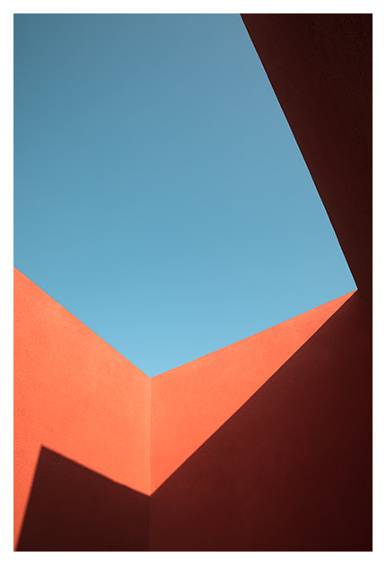
Johnny Kerr is an American artist and photographer, he is best known for his abstract photographs that show a colorful seemingly mundane Arizona metropolis.
Kerr spent hours photographing, waiting and observing how the lines, shapes and forms changed as the sun moved from morning to late afternoon, revealing new relationships of harmony or tension.
The ambiguous forms, shapes and textures of the almost featureless stucco exterior intrigued Kerr as a designer.
|
|
|
By observing how the structural lines intersected from various vantage points, Kerr was often able to confuse the visual perception of foreground and background. The pastel colour palette is inspired by the building’s southwest geography and was a challenging visual departure from my previous monochromatic approach to abstract architecture.
He is a Self-taught photographer, he has graphic design experience, and an appreciation for minimalism as having the largest influences on his work.
Johnny’s imagery often explores the abstract qualities of his subjects, placing them, to varying degrees, outside of their literal context. His use of space reflects his minimalist abstract style, while his continued evolution of style and subject matter represent an authentic curiosity.
My Response
When taking these photographs I have tried to take pictures of brightly coloured architecture that also has sharp straight lines like the buildings in Johnny Kerr's photographs do I think i have done this successfully if I were to redo this photoshoot I would try to get more photographs of obscurely coloured architecture like Johnny Kerr has done
My Editing process

First thing i do in this editing process is i take pictures of the shapes within building structures
|

The next thing i do is to transfer one of the pictures over to photoshop the first thing i do in their is to make a background copy of my picture which i will be editing onto
|

once i have by copy version i can then start editing it the first tool i use it the polygonal lasso tool this allows me to draw out and select a shape within the picture
|
|

|

|
|
Once i have my single selected shape i then use the eyedropper tool to select a single color within the selected shape after i have that color i can use the paint bucket tool to fill in the whole shape that singular color
|
Once filled in that singular color i am left with this colored in shape i can then continue this with all the other shapes in the image
|
This is the final image i end up with
|
Edited versions
Original
|
Edited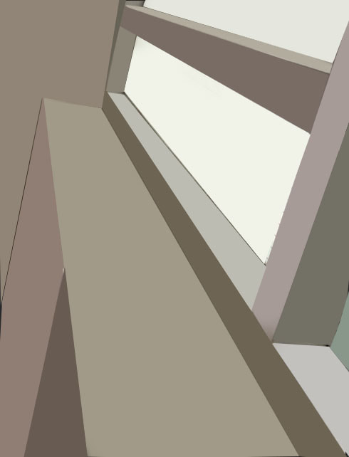
|
WWW
What went well with these picture is that I have been successful in editing these photographs to create this block colour
appearance in photoshop I have also photographed architecture with long sharp edges which are
better for when I am editing in photoshop after I have taken them it makes for cleaner final photographs.
EBI
These pictures could be even better if I had edited more simplistic architectural structures which would have made for a cleaner
final look which would have been more geometric looking like Johnny Kerrs photographs are.
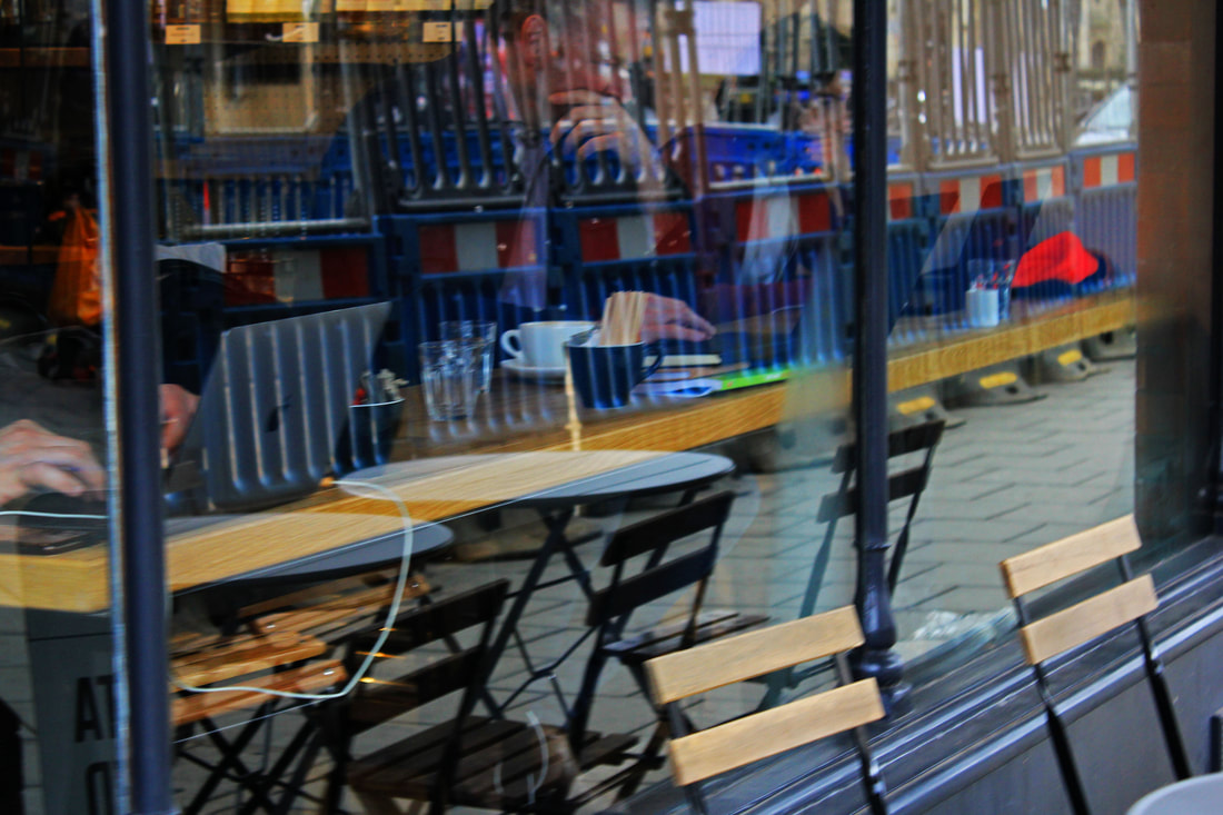
Saul Leiter
Saul Leiter has been documenting New York street life in black and white in since he first arrived there, he catches the eye with his use of obstructions, blurred movement and half-concealed details. Saul Leiter was an early pioneer of color photography using vibrant intriguing colors.

|

|

|
With distinctive imagery and with painter like qualities, In 1992, his work came to the attention of the curator Jane Livingston, who included him in her “New York School”: a group of noteworthy midcentury photographers, including Robert Frank and Diane Arbus, with a film noir vision of the city.
He developed a distinctive, dreamy style that played with shallow depths of field and a vibrant palette.
He developed a distinctive, dreamy style that played with shallow depths of field and a vibrant palette.
My response
In taking these pictures based around the photography of Saul Leiter I have focused for on his window reflection photographs I have tried to capture photographs that show everyday life getting photographs of people going around their life reflected back into shop windows.

|

|

When taking and editing these photographs I have focused a lot on the colour scheme trying to emulate the rich colour scheme that Saul Leiter includes in his photography I furthered this in photoshop where I have increased the vibrancey and the contrast to really make it standout, if I were to make these photographs even better I would explore Leiters humidity based photographs more.
Stephen Calcutt
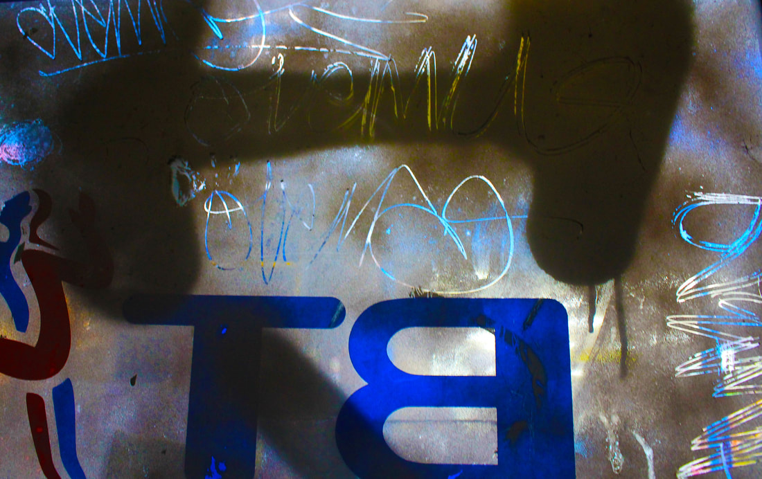
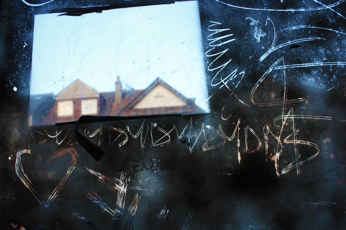
Stephens Calcutts street photography is a sequence of photographs using bus stops and shelters around the City of Birmingham. Graffiti can be great art, however he feels the graffiti scratched into the plexiglass windows of the bus stop feels like a violation.
He has yet to see any of these etchings that look great in their own right. The graffiti etched and scrawled in the bus stop windows seem to be expressions of frustration, anger, love or hate.
He has yet to see any of these etchings that look great in their own right. The graffiti etched and scrawled in the bus stop windows seem to be expressions of frustration, anger, love or hate.


He feels a windows full potential as a clear barrier between yourself and the elements are compromised when the view beyond is obscured, distorted and blurred by the scratches. Stephen uses the graffiti etched windows as a lens. he merges the graffiti and the view beyond, focusing his camera on the etched lines putting the view beyond out of focus.
The graffiti and view to merge into a single plane. He creates a new perspective that retains and emphasises the energy of the graffiti. Its swirls, zigzags, lines and curves, slash across the
The graffiti and view to merge into a single plane. He creates a new perspective that retains and emphasises the energy of the graffiti. Its swirls, zigzags, lines and curves, slash across the
My response
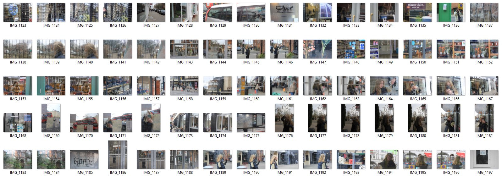
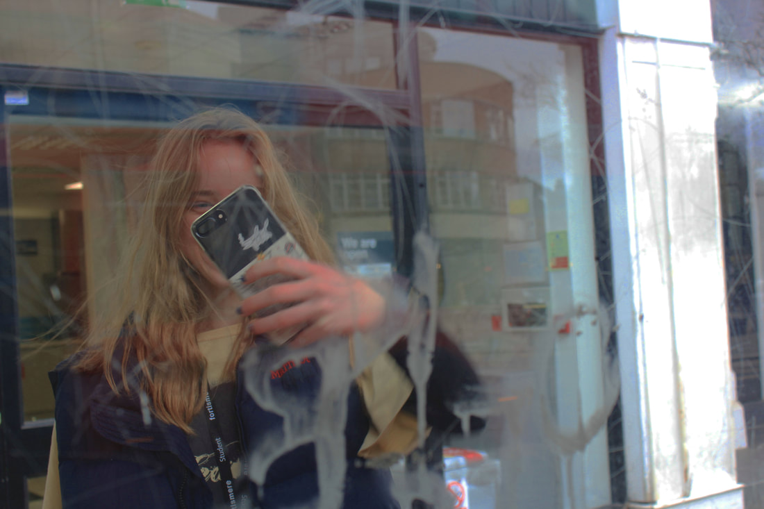
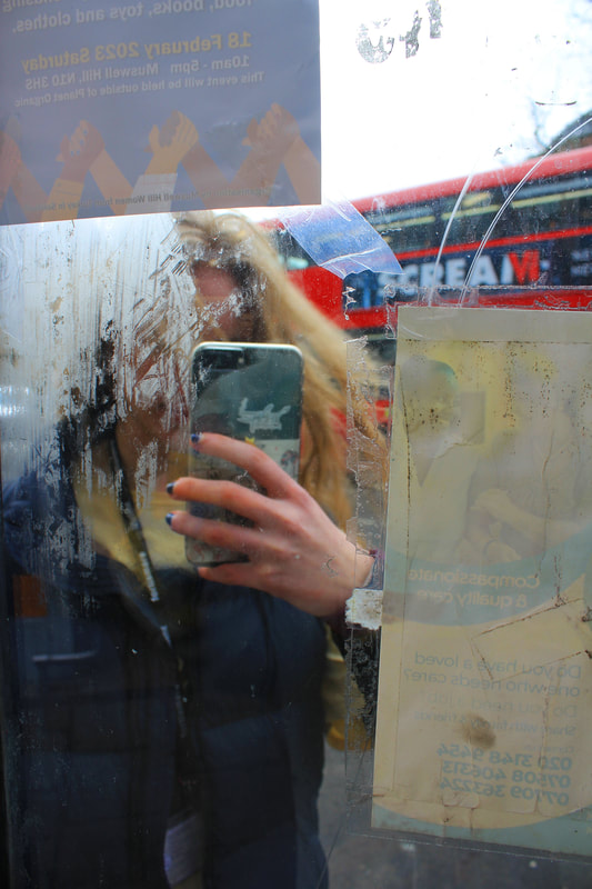
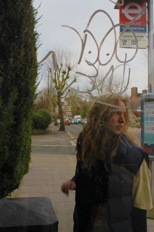
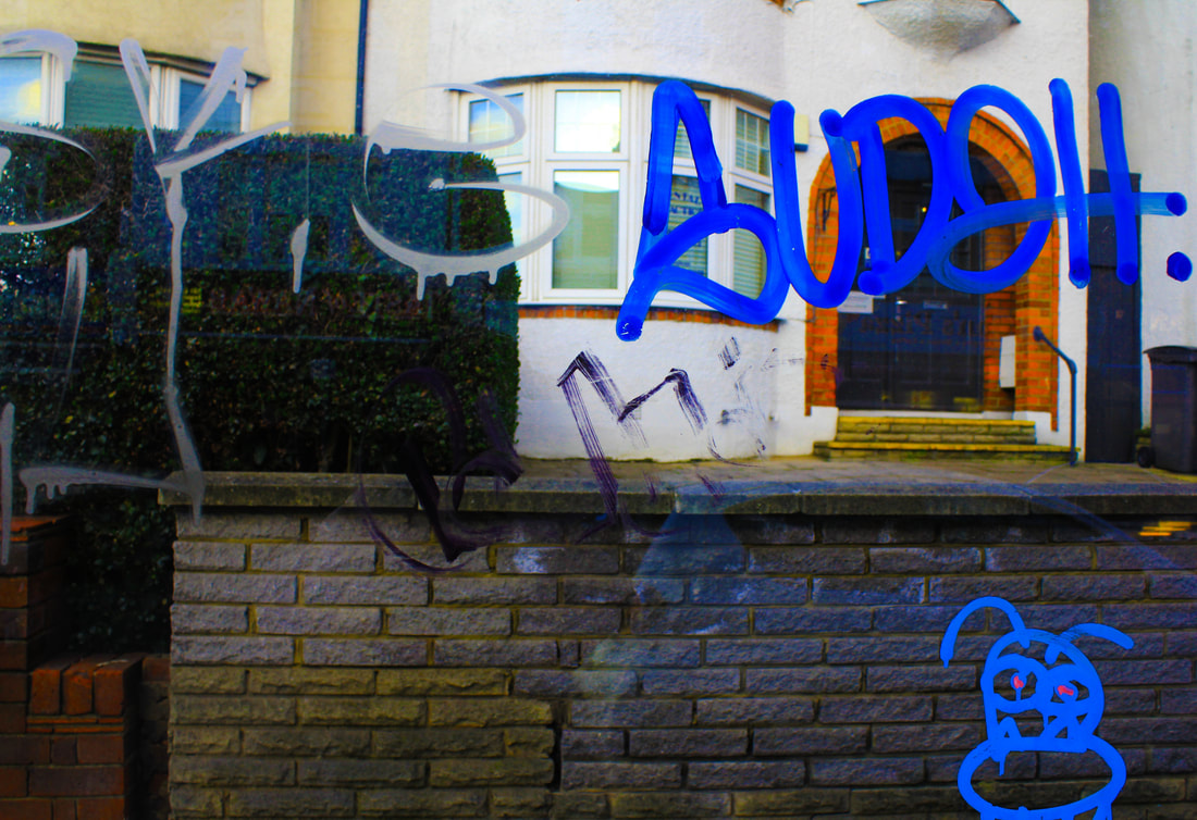
In taking these photographs I have mainly taken photographs at locations with lots of graphity such as phone booths and bus stops I have taken photographs of people through the vandalised glass to get an obscured image, in my photographs I have used more painted graphity than scratched graphity unlike what Stephens Calcutts does with his photographs
My edited versions
|
|

Because with majority of my photographs I have photographed through glass graffitied by painted than by graffitied
scratched which is unlike what Stephens Calcutts does with his photographs so most of the photographs I have taken are less obscured than his so if I were to retake these photographs I would try to adjust this aspect.
scratched which is unlike what Stephens Calcutts does with his photographs so most of the photographs I have taken are less obscured than his so if I were to retake these photographs I would try to adjust this aspect.
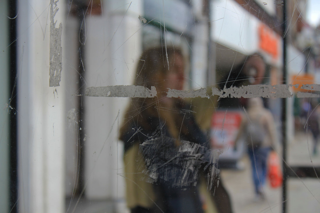
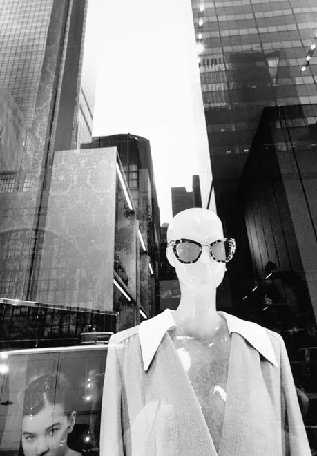
Lee Friedlander - Mannequin Photography
Lee Friedlander, in full Lee Norman Friedlander, (born July 14, 1934, Aberdeen, Washington, U.S.), American photographer known for his asymmetrical black-and-white pictures of the American “social landscape”—everyday people, places, and things. Friedlander's interest in photography struck when he was 14.

|

|
|
Working primarily with Leica 35mm cameras and black and white film, Friedlander's style focused on the "social landscape". His photographs used detached images of urban life, store-front reflections, structures framed by fences, and posters and signs all combining to capture the look of modern life.
My response
For these photographs based off of Lee Friedlander's photography based around mannequins I have taken pictures of
lots of different shop window mannequins on an everyday high street I also made sure to try and catch the reflection off of the glass
like Lee Friedlander does with their photographs reflecting the buildings and structures in-front of the shops
lots of different shop window mannequins on an everyday high street I also made sure to try and catch the reflection off of the glass
like Lee Friedlander does with their photographs reflecting the buildings and structures in-front of the shops
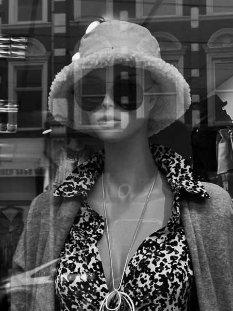
Edited versions

|


|
When editing these photographs in photoshop I have made them black and white in the same fashion of Lee
Friedlander's photographs by making them black and white It helps to emphasis the reflected buildings if I were to redo this
photoshoot I would focus more on creating a seamless photograph so that the mannequin and the reflection
are more like one image instead of a reflection
Friedlander's photographs by making them black and white It helps to emphasis the reflected buildings if I were to redo this
photoshoot I would focus more on creating a seamless photograph so that the mannequin and the reflection
are more like one image instead of a reflection
Strands
Strand 1 - Stephen Calcutt
Stephens Calcutts street photography is a sequence of photographs using bus stops and shelters around the
City of Birmingham. Graffiti can be great art, however he feels the graffiti scratched into the plexiglass windows of the bus stop feels like a violation. He has yet to see any of these etchings that look great in their own right. The graffiti etched and scrawled in
the bus stop windows seem to be expressions of frustration, anger, love or hate.


He feels a windows full potential as a clear barrier between yourself and the elements are compromised when the view beyond is obscured, distorted and blurred by the scratches. Stephen uses the graffiti etched windows as a lens. he merges the graffiti and the view beyond, focusing his camera on the etched lines putting the view beyond out of focus.
The graffiti and view to merge into a single plane. He creates a new perspective that retains and emphasises the energy of the graffiti. Its swirls, zigzags, lines and curves, slash across the
The graffiti and view to merge into a single plane. He creates a new perspective that retains and emphasises the energy of the graffiti. Its swirls, zigzags, lines and curves, slash across the
My Response
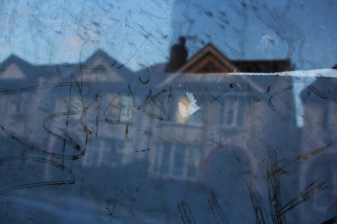
In response to Stephen Calcutt's work i have taken up-close photographs of graphite on both bus stops and phone booths focusing on the colours and shapes then in photoshop im going to increase the saturation to highlight the colours in each image more in the style of Stephen Calcutt. In taking these photographs I have mainly taken photographs at locations with lots of graphity such as phone booths and bus stops I have taken photographs through the vandalised glass to get an more obscured image, in my photographs I have used a mixture of painted graphity as well as scratched graphity like what Stephens Calcutts does with his photographs.
Edited versions
|

|
|
|
WWW
What went well with these picture is that I have used a mixture of painted graphity as well as scratched graphity,
I have also managed to edit the colours to increase the vibrancy like what Stephens Calcutts
does with his photographs
EBI
These pictures could be even better if I could get photographs of people obscured through the vandalised glass like
I have done in my previous development on Stephens Calcutts photography
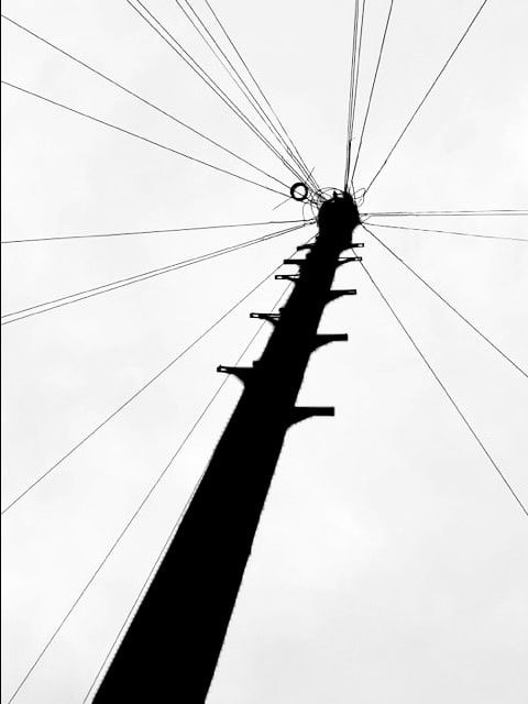
Strand 2 - Keld Helmer-Petersen
Keld Helmer-Petersen was a Danish photographer in his photography we are only presented with images these black and white images devoid of all colour, all mid tones have been removed.


He created and found these images, using both cameras and flat bed scanners to achieve the effects he was looking for, his images are of structures such as phone lines and construction sites.
My response
In this response to Keld Helmer-Petersen i have photographed phone-lines on a cloudy day to make these pictures i would try to take these pictures on a clear sky day this would make it much easier to edit as the cloudy sky adds a texture meaning achieving a blank white background in photoshop is made more difficult so to solve this i would take the pictures on a clearer day and perhaps introduce different structures
Editing process
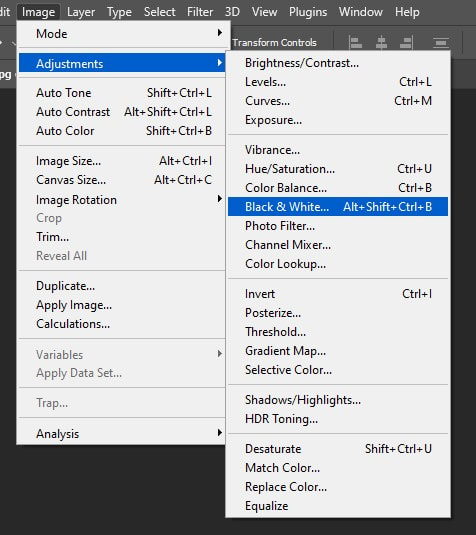
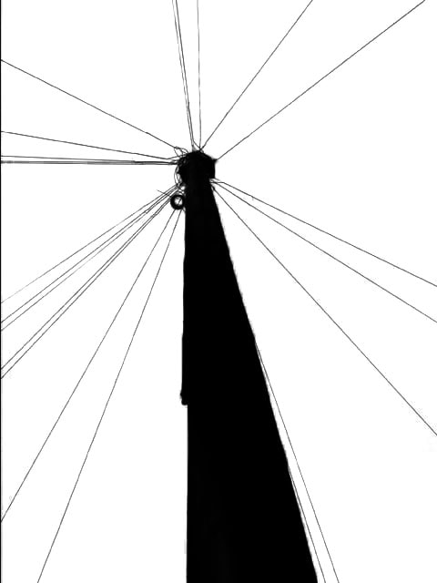
First thing i do with my chosen photo once i have it in photoshop is i adjust it to black and white

After i have got rid of all traces of colour to make a completely blank background i can then move onto adjusting the contrast and brightness to emphasise the black colour in the image
|

Next thing i do is adjust the colours to get rid of all traces of both light and dark blue this makes the background completely blank

To finalise this editing process i use the selection tool to select the main focus of the image i the using the paint tool make this completely black
|
Final edited versions
|
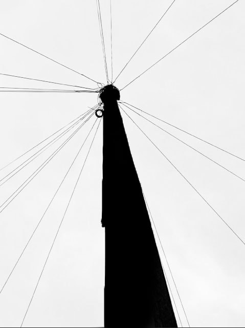
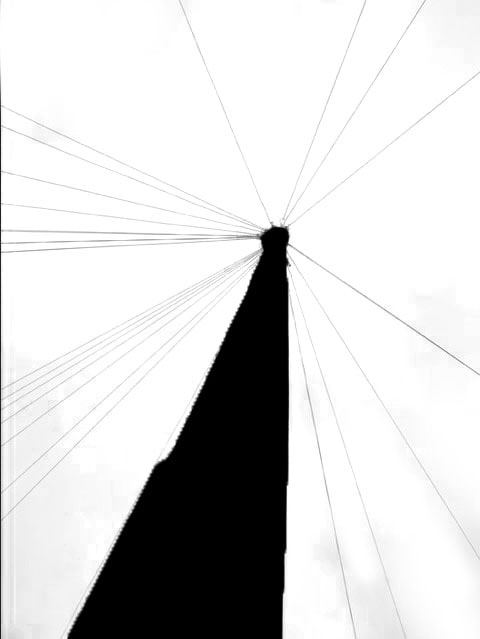
|
These photographs were more successful because by editing them to be black and white in
photoshop I eliminate the issue of taking. the photographs on a cloudy day and it also makes for a much cleaner image if
I were to retake these photographs I would try to explore different types of structures on the street the
I could edit at the same time.
photoshop I eliminate the issue of taking. the photographs on a cloudy day and it also makes for a much cleaner image if
I were to retake these photographs I would try to explore different types of structures on the street the
I could edit at the same time.
Strand 3
This is the strand in which I have decided to stick with and to keep on developing to create my own final piece
First development - Alexey Bogolepov
Alexey Bogolepov is a Russian photographer and artist who received a degree from the University of Alaska (BLA in Fine Art),
and took the 'Photography as Research' course at the PhotoDepartment Foundation in St Petersburg.
Born in 1985 Bogolepov is an artist who is currently living and working in Saint Petersburg, Russia. His work comprises
architectural photography, sculpture, video and installation in a broad exploration of modernism both in the post-Soviet states and worldwide. He is interested in making analytic art that produces political commentary on the subjects of power structure,
ideology of space, planning practices and systemic vision.
|

|

|
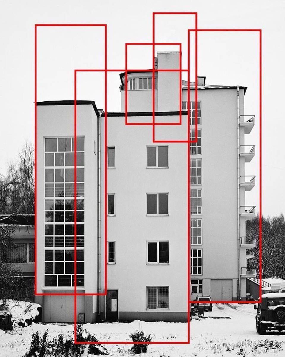
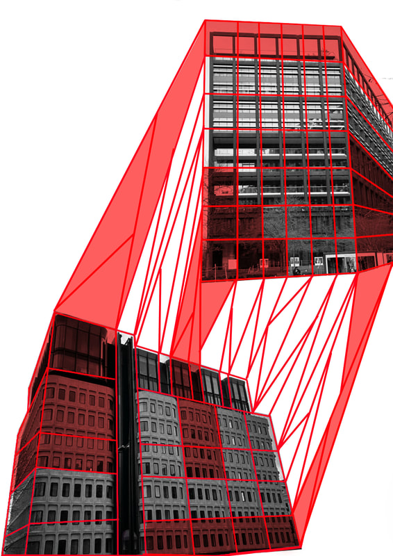
To portray this message he photographs different buildings making them black and white after photographed
then moving onto photoshop to draw vivid red lines over the top of the now black and white picture he uses these red lines to create straight lines in different geometric designs tracing the the shapes already shown in the buildings construction,
these bright lines contrast with the black and white building they are layered over this helps them to stand out more
making them more vivid and eye-catching
My response
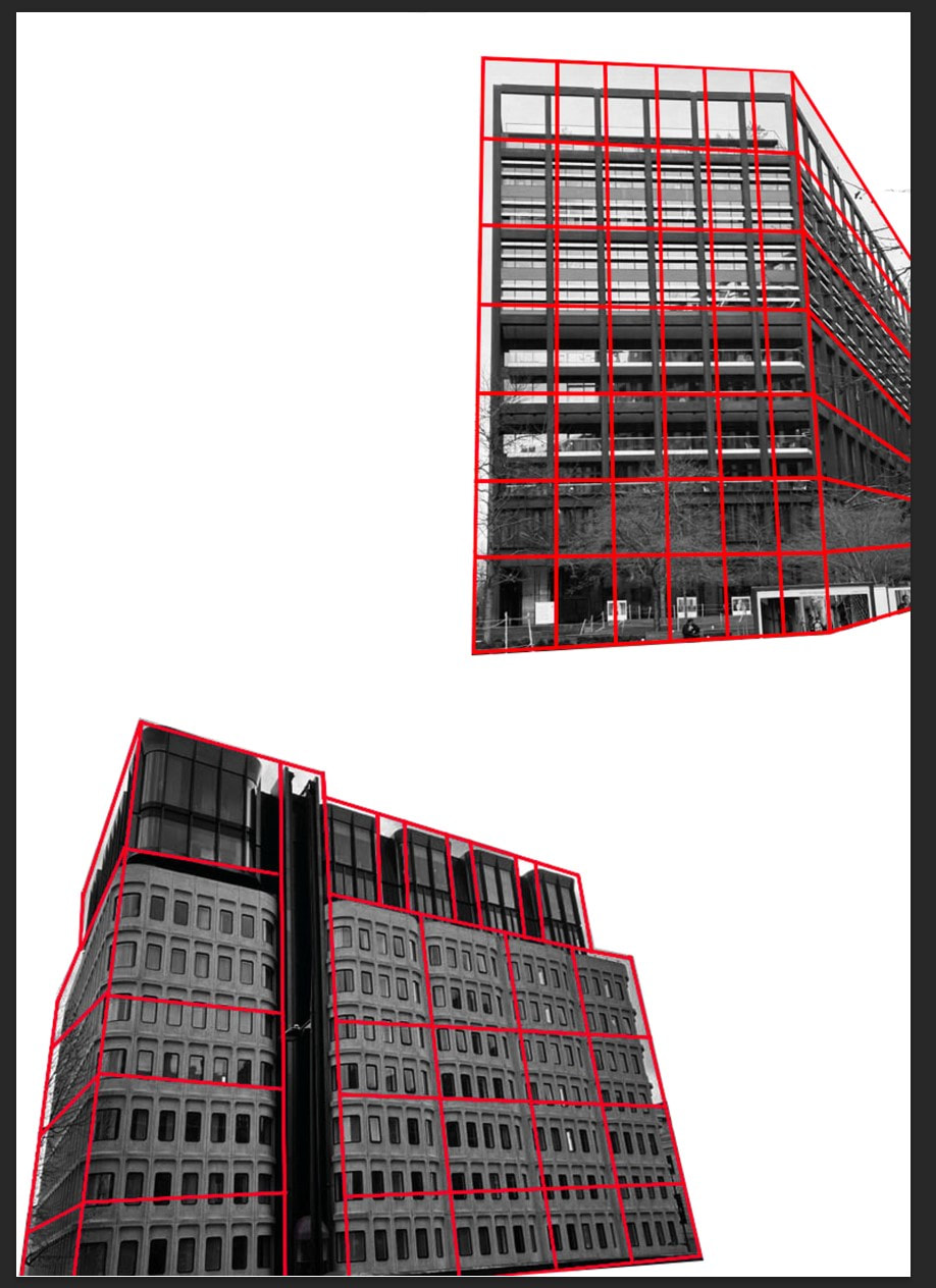
For this photoshoot In response to Alexey Bogolepov architecture based photography made sure to take pictures of
modern styled buildings around London with straight lines the geometric structure, I make sure to take photographs that I can
edit easily in photoshop to add in the straight red lines like Alexey Bogolepov does in his photographs
modern styled buildings around London with straight lines the geometric structure, I make sure to take photographs that I can
edit easily in photoshop to add in the straight red lines like Alexey Bogolepov does in his photographs
First edit
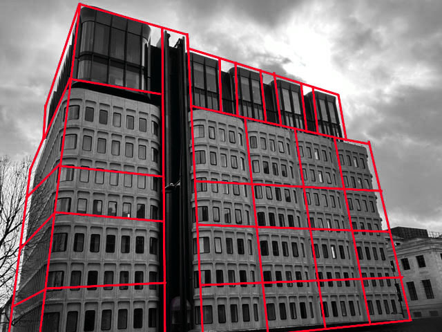
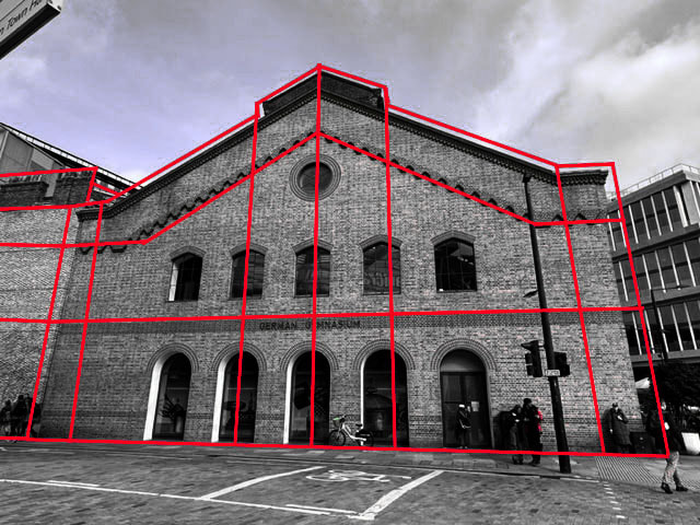
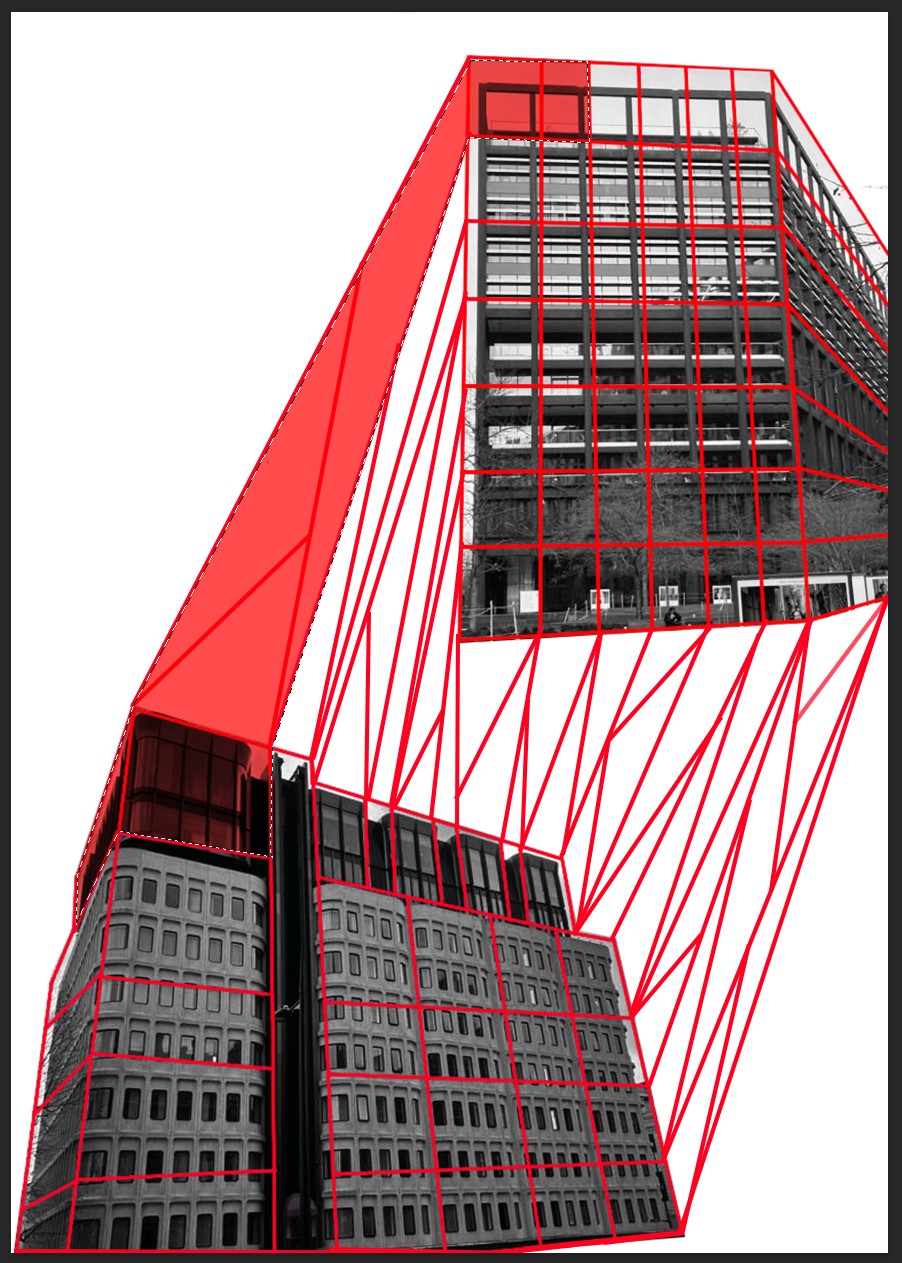
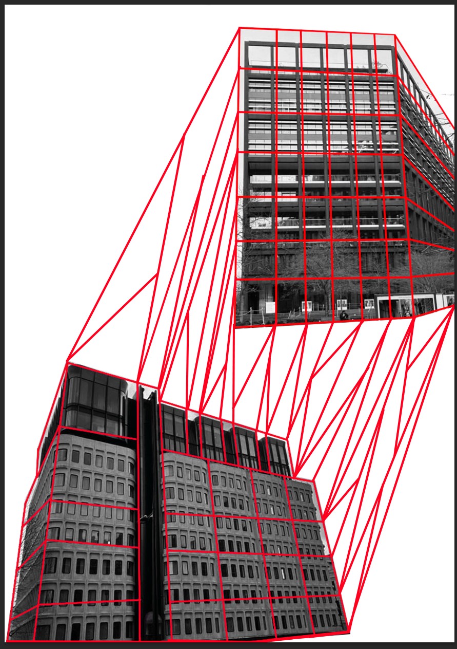
For this first edit I have selected four of the architecture photographs take I took In my previous photoshoot I have then moved these photographs into photoshop where I have altered the saturation so that the photos are now back and white, now that I have these black and white versions of my photographs I can started to incorporate the red outer frame that Bogolepov has in his photographs to do this I take the line tool and trace around the structural lines of each building and once I have my bases frame I change the colour to a vibrant red which helps it to stand out

|

|
|
|
WWW
What went well with these picture is that the bright red frame against the black and white architecture makes an effective contrast,
I have followed the lines of the building to create a structural type of photograph
EBI
These pictures could be even better if I could create a blank background so that the photographs
would standout more
Second development
For this edit my aim was to develop on from my previous images taking those finished photographs and improving them further to improve them I want to remove the background to make the building the main focus of the photograph I also want to experiment with adding in multiple photographs and linking them in some way also while playing around with colours.
Step by step editing process:
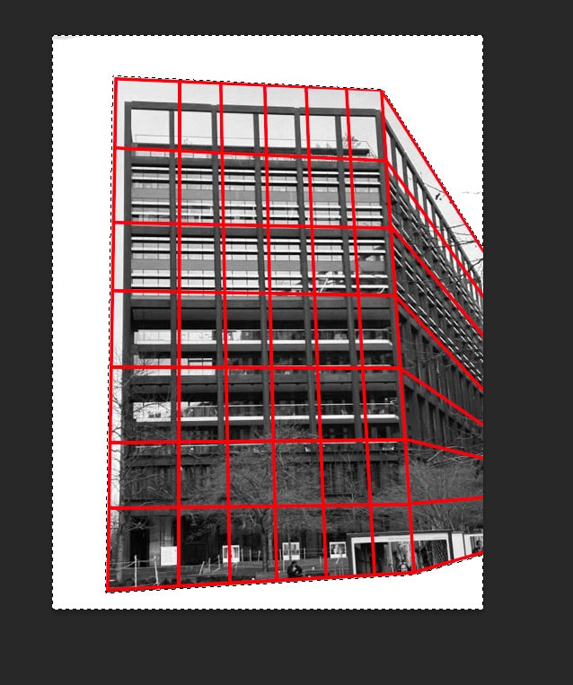
The first thing that I do in this editing process is to take one of
the previously edited photographs and bring it back into photoshop where I use the selection tool to outline everything but the building and when this is all selected I can using the eraser get rid of all the surroundings around the architecture leaving a blank space 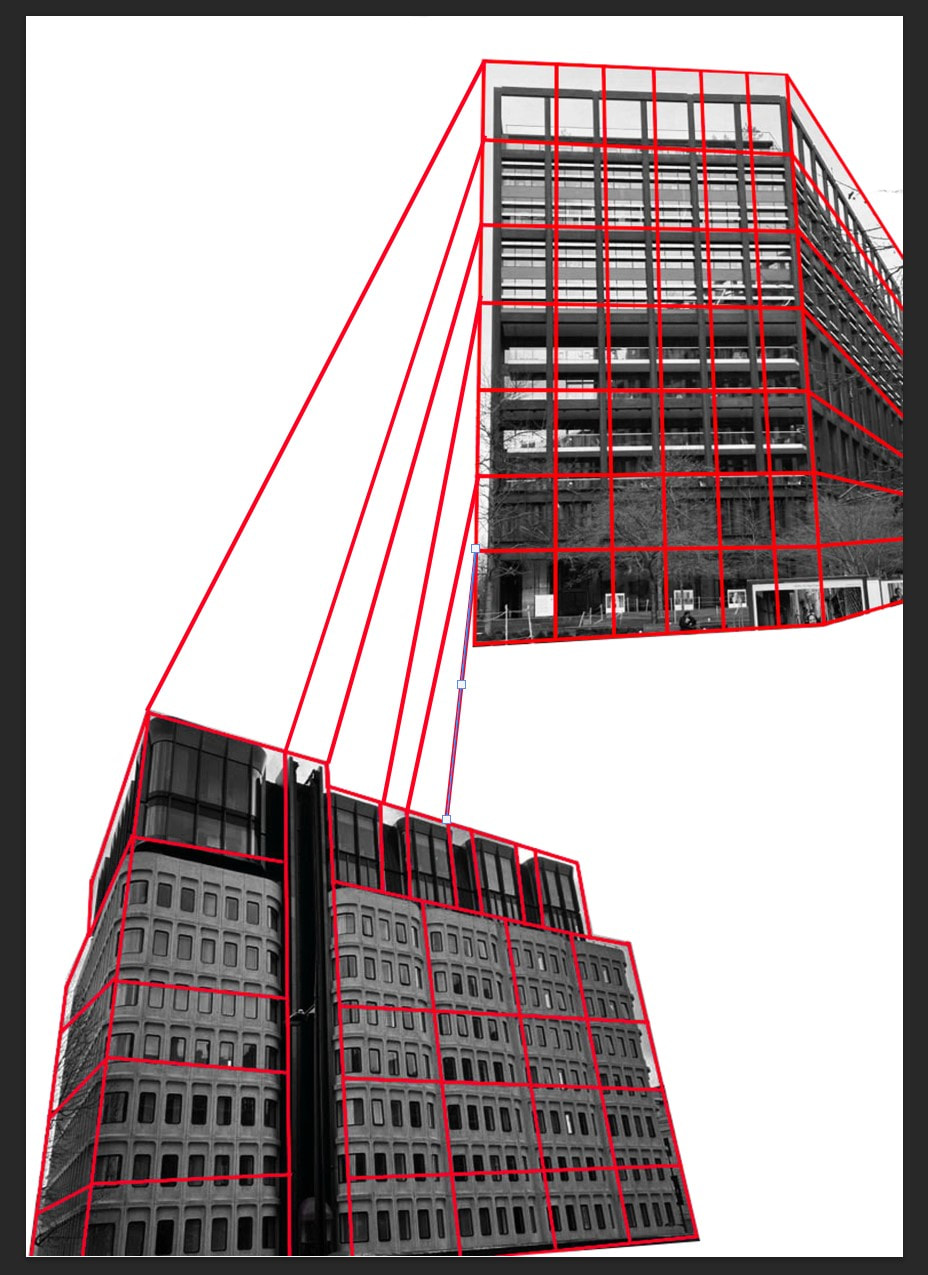
With these two photographs now next to each other I wanted to start to try joining them up so using the same lines that I did previously I started to connect lines together so that they matched
Now that I have drawn in all of my construction lines I want to play around with the colours to do this I have used the selection tool to outline different sections of the buildings which I have then filled in with the paint bucket too make it all red and I have finally lowered the opacity so it is more see through
|
With this now edited picture I repeat the same process on another edited photograph so I now have two edited building photos on a white background so using copy and past I put these two photographs onto one blank page so that they are side by side
Once all of the lines between the two buildings have been connected I started to add extra lines between the connecting lines this helps them to seem more like construction lines
Finally when I have repeated this step a couple times all over my two photographs I now have my final image.
|
Final edited photographs

|

|
With the final edits I have successfully taken the four previously separate edits and combined them to
make two larger pictures I have also introduced more colours by removing the background and replacing it with a blank backdrop it allows for more contrast between the black and white with the vibrant red tones of not only the lines but the filed in sections
for my next edit I would like to combine these two in photoshop to make one ultimate big photograph
Final edit
For my final photograph I have taken all of the elements which I have developed through out these final edits
and combined them onto one page to make one big piece in which I have used all the previous editing techniques in to
combine the buildings
and combined them onto one page to make one big piece in which I have used all the previous editing techniques in to
combine the buildings

Last development
For this final development I wanted to take my previous edit using that idea as the main theme for my final piece but I
instead wanted to experiment with using different physical materials to achieve a similar result and observing how this changes the final piece and the differences between using photoshop to create an edited photograph and using my own hands to
create a physical sculptural type of piece to do this I am going to experiment with blocks of styrofoam, paper, sewing pins and different red threads using these different materials I will attempt to recreate and improve my previous edit
EunHye Kang:
EunHye Kang is a Korean-born installation artist who is living and working in Brooklyn, New York. Kang graduated with a MFA from Cranbrook Academy of Art in 2013. she also received her BFA from Maryland Institute College of Art (MICA) in 2010 and her BS received from Seoul Women’s University in Seoul, South Korea in 2006.
EunHye Kang creates these intricate geometric installation in architectural spaces. She uses lines as a way to decompose the space. Also, she tries to create negative volume by using achromatic lines. With concepts of division and proportion, she aims to represent abstract shape and contour in the spaces.
Her line work started from the geometric and abstract patterns which are inspired from the lines of Korean alphabet, ‘Han-geul’. Because of Han-geul’s geometric and modern patterns with vertical lines, horizontal lines, squares, triangles, and circles, it has strong potential as a design instrument.
During last several years, my two-dimensional works have developed to the installation work in the wide space and architecture in scale. In the spaces that gave great inspiration to me, I represented the inspiration as an abstract pattern. My interest in the pattern was moved deeper into the interest in the line, further I focused on the “point” comprising the line. As a result, I attempted to create the work starting from the points. While working with space, I began to use the lines as a way to decompose the space.
Recently, I am especially focusing on creating negative volume by using the achromatic lines, representing the space by division and proportion, and making the shape and contour. The strings give volume, movement, gravity and density. I am curious to imagine the abstract form in the empty space and actually do it in the space. They create numerous faces and optical illusion. I am trying to make a live op-art installation in the space with strings and build my imagination in the space.
Examples of her work:


Photographs taken:
For this photoshoot I went around London and made sure to take pictures of modern styled buildings with straight lines the geometric structure, but this time I wanted to make sure to take photographs that I were more unique and interesting for when I add in the straight red lines like Alexey Bogolepov does in his photographs
WWW
what went well with these photographs is that I was able to capture a wide variety of photographs of buildings with unique
and interesting structures which will make my final products more interesting .
EBI
These photographs could have been even better if I had also got some more simply structured buildings as well as
other structures to make editing them easier as this will be my first time using this technique with thread and pin weaving
Edited photographs
I selected three photographs from the previous photoshoot to edit into black and white first before I print them out,
when picking out the photos I made sure to select ones with unique but more simplistic structures so that I can edit them easier with the thread and pins in the next stage of my developing of these photographs.
when picking out the photos I made sure to select ones with unique but more simplistic structures so that I can edit them easier with the thread and pins in the next stage of my developing of these photographs.

|
|
|
WWW
what went well with these photographs is that I was able to capture the right balance between simplistic structure but
aslo interesting angles
EBI
These photographs could have been even better if I could have taken more clear photographs with clearer backgrounds but this will be less noticeable after I edit then because most focus will be directed towards the brightly coloured thread
Step by step process:
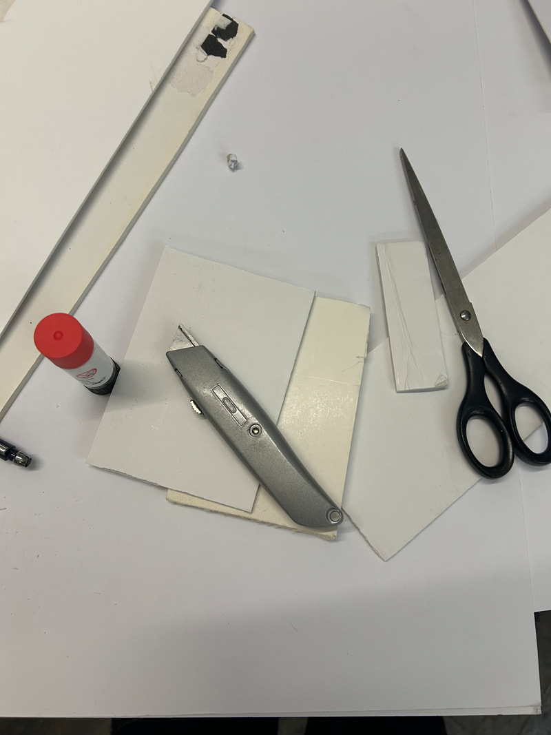
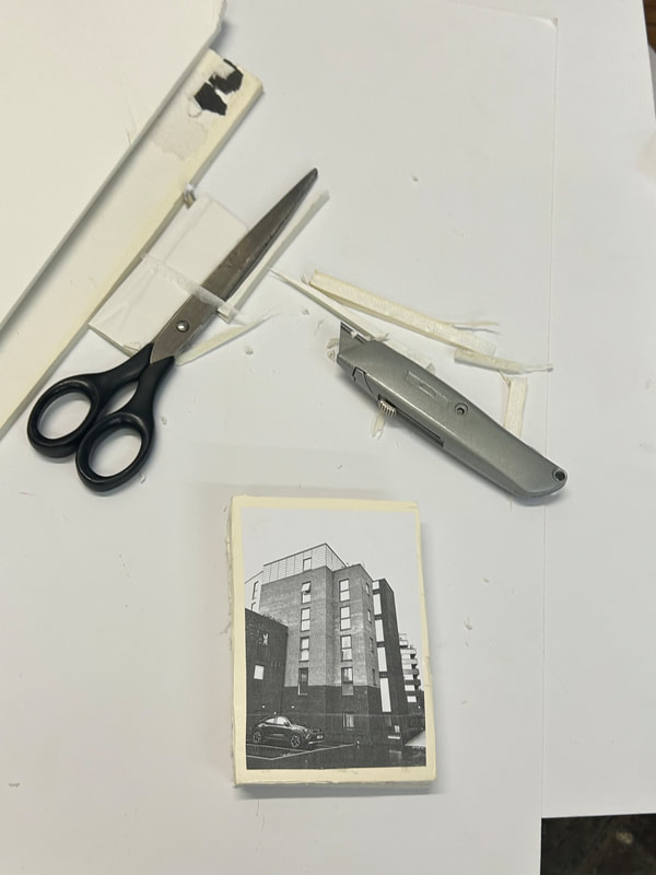
To make these sculptural pieces i needed to use several different materials and techniques the items I have used are sewing pins, foam boards, craft knife, printout photographs, red embroidery thread and glue.
In this process I started off by printing out photographs I have taken of different buildings in black and white I
make sure to print a variety of different sizes.
In this process I started off by printing out photographs I have taken of different buildings in black and white I
make sure to print a variety of different sizes.

|
|
|
|

|
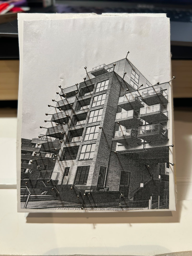
once I have these cut out I start to cut out pieces of foam board the same size using my craft knife I have to cut out at least five for each photograph so that my pin doesn't go all the way through, when I have all of these sections of foam board I can start to stack them together fixing them together with glue and gluing the picture on top of the stack. now that I have the base I can start to add in the pins and thread first adding the pins putting them onto
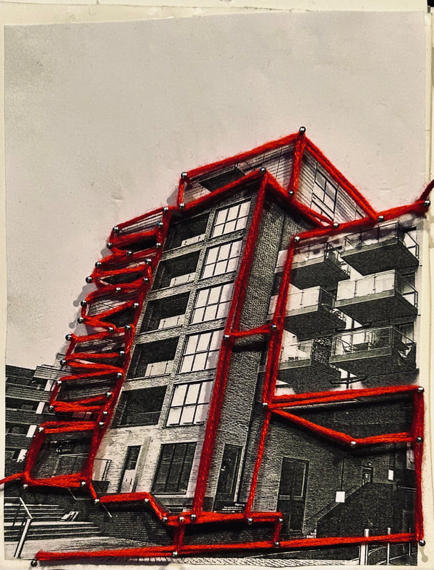
Final Photographs:
|

|

|
WWW
what went well with these photographs is that I was able weave the thread to capture the lines of the structures well as the angles and the vibrant read thread that I used successfully contrasted against the black and white photograph beneath it.
EBI
These photographs could have been even better if I hadn't lost some quality on the photographs when I printed them out they not as focused as they were previously I also think if I used thinner thread I would have better results
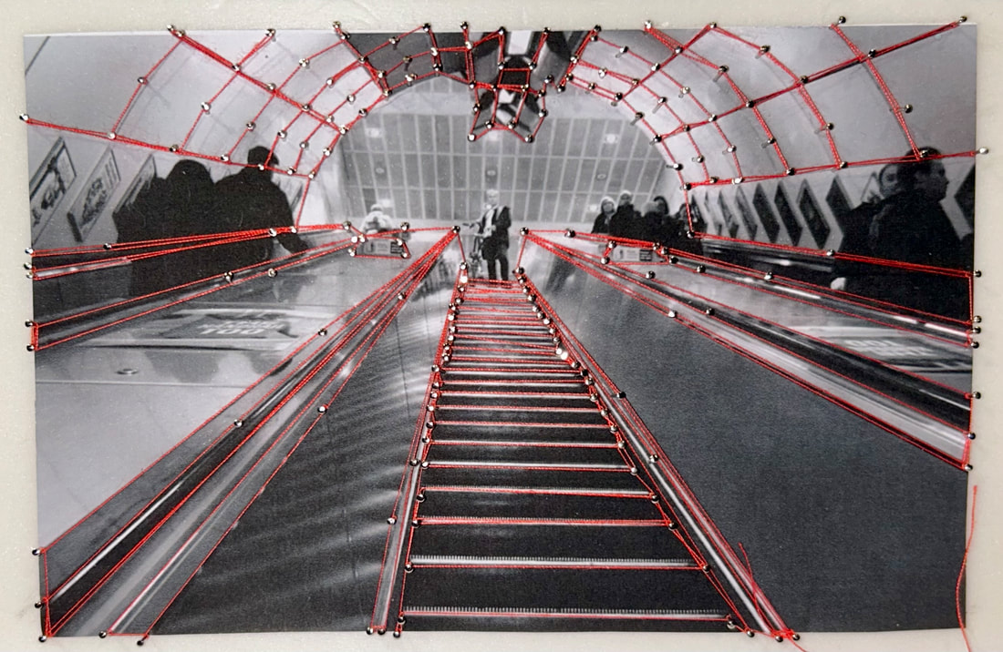
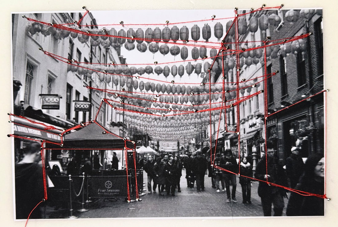
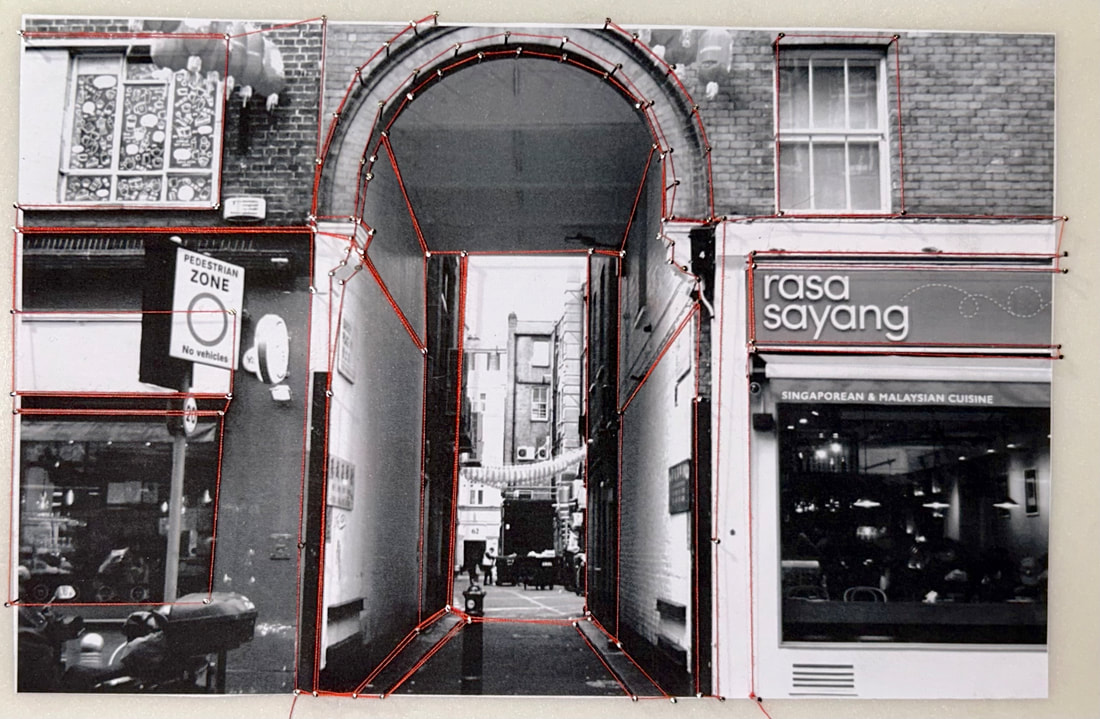
Second attempt
For this second attempt at my thread weaving photographs I wanted to build upon my previous development and move onto more complex photographs now that I have more experience with the basics of the technique I am using so to do this I want to diversify from only photograph London buildings and move onto capturing the environment and the different unique structures which even thought it will make the process a lot more difficult it will result in very interesting and complex final creation
Photographs taken:
Because in these photographs my aim is to capture the environment and the different structures around London so I travel around to lots of different areas to take photographs I was mainly focused of photographing different unique and well know structures,
I was particularly intrigued by the different shapes made by the different structures and the angle at which I photographed them from for instance on the underground train the shape of the tunnel or the lines going up the escalator and the skyline over the thames or the lanterns strung up in china town and especially the view over the millennium bridge.
I was particularly intrigued by the different shapes made by the different structures and the angle at which I photographed them from for instance on the underground train the shape of the tunnel or the lines going up the escalator and the skyline over the thames or the lanterns strung up in china town and especially the view over the millennium bridge.
WWW
what went well with these photographs is that I think I successful in capturing photographs of iconic and well know
structures around London I also think I was successful in photographing different shapes and angles which will make for much more interesting photographs when it comes to editing them
EBI
These photographs could have been even better if I could have taken clearer photographs with less people or
obstructions in the way but this will be a less noticeable after I edit them because most focus will be directed towards the brightly coloured thread which will be I intricate patterns over the photographs
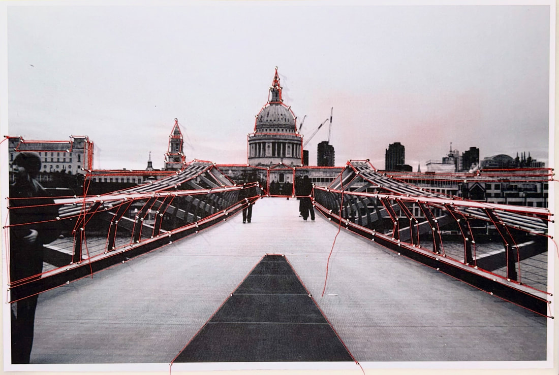
Final pieces
With these final development pieces I followed the exact same process as I did in the previous development using
stacked pieces of foam board but this time I made it neater around the edges I also used the same flat head sewing pins but I had them sticking out more this time which made weaving the thread easier overall because this time I am using thinner sewing
thread instead of embroidery thread which overall looks better as it allows for more intricate details and acts as more of a frame and outline than the other thread but because its thiner its a lot harder to control and is more slippery when weaving around the pins this is why having the further out is more helpful in keeping them in place.
|
|
|
|

|

|
Overall this I think this final piece was very successful in capturing the intricate details even though I was working with such difficult materials the thinner thread allowed for both the picture and the lines to show .
